In today’s data-driven business environment, organizations increasingly rely on tools like Microsoft Power BI to turn raw data into actionable insights. At the core of Power BI’s flexibility and ease of use are its templates—pre-designed report structures that allow users to create compelling and interactive visualizations quickly. As the data landscape continues to evolve in 2024, leveraging Power BI templates is more essential than ever for businesses aiming to extract value from their data.
This article will take an in-depth look at Power BI templates, their benefits, and the best options available to supercharge your data visualizations. From sales dashboards to healthcare operations templates, we’ll cover everything you need to know to start using Power BI templates to drive better business outcomes.
What Are Power BI Templates?
Power BI templates are pre-built report structures that come with predefined data models, layouts, and visualizations. Some templates may also include sample data to demonstrate functionality. Whether you’re new to Power BI or an experienced user, templates help jump-start the reporting process by providing ready-made frameworks that save time and enhance the user experience.
Templates are valuable for several reasons: they standardize reporting across teams, reduce the learning curve for new users, and incorporate best practices in data visualization. With templates, users can focus more on interpreting data and less on building reports from scratch.
Benefits of Using Power BI Templates
- Time Efficiency
The most obvious advantage of Power BI templates is the significant time savings they offer. Instead of starting from scratch to build a report, you can use a template as a foundation and customize it according to your needs. Pre-designed layouts, data models, and visualizations allow you to get up and running faster, giving you more time to focus on analyzing the data and extracting insights.
- Consistency Across Reports
Using templates ensures that reports across your organization maintain a consistent look and feel. This uniformity not only helps with branding but also makes it easier for stakeholders to navigate and interpret different reports. When every department is using the same template or set of templates, it minimizes confusion and makes cross-team reporting more efficient.
- Best Practices Integration
Most Power BI templates are built by experts who understand industry standards for data visualization and dashboard design. This built-in expertise ensures that the reports you create using these templates adhere to best practices, such as choosing the right chart types, organizing data logically, and using visual cues effectively. This can be especially beneficial for users who are new to Power BI or less experienced with designing dashboards.
- Rapid Prototyping
Power BI templates are also great for rapid prototyping. If you’re unsure about the best way to present your data, you can quickly test out different template designs and layouts to see what works best. This flexibility allows you to experiment with different visualizations and report structures without having to invest a lot of time in the setup process.
- Learning Tool
For beginners, templates serve as valuable learning resources. By working with existing templates, users can reverse-engineer how complex reports are built. This hands-on experience helps users understand the underlying data models, learn how to arrange visualizations effectively, and discover advanced Power BI features, such as drill-throughs and dynamic filtering.
Top 10 Power BI Templates for 2024
Now that we’ve explored the benefits of Power BI templates, let’s dive into the top 10 templates for 2024. These templates are designed to cater to various business functions and industries, from sales to healthcare. Each template comes with unique features that make it ideal for specific use cases, helping organizations get the most out of their data.
Sales Performance Dashboard
The Sales Performance Dashboard is one of the most popular Power BI templates, designed to help sales teams track and optimize their performance. It provides a comprehensive overview of key sales metrics, enabling sales managers and executives to make informed decisions.
Key Metrics & Visuals:
- Revenue trends over time
- Sales by product or service category
- Customer acquisition costs (CAC)
- Sales team performance comparisons
- Geographical sales distribution
Key Features:
- Interactive filters for date ranges and product categories
- Drill-down capabilities for detailed analysis of sales figures
- Visual cues like conditional formatting to highlight areas of concern or success
Why It’s Useful: This template offers sales professionals an easy-to-digest visual representation of performance metrics, helping them identify trends and opportunities for improvement. Additionally, the visual cues and drill-down capabilities make it easy to present findings to stakeholders.
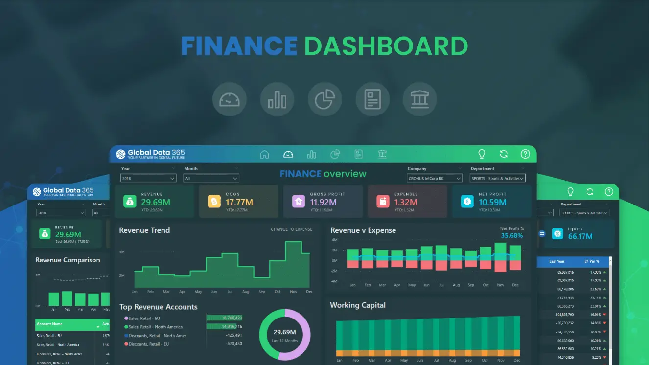
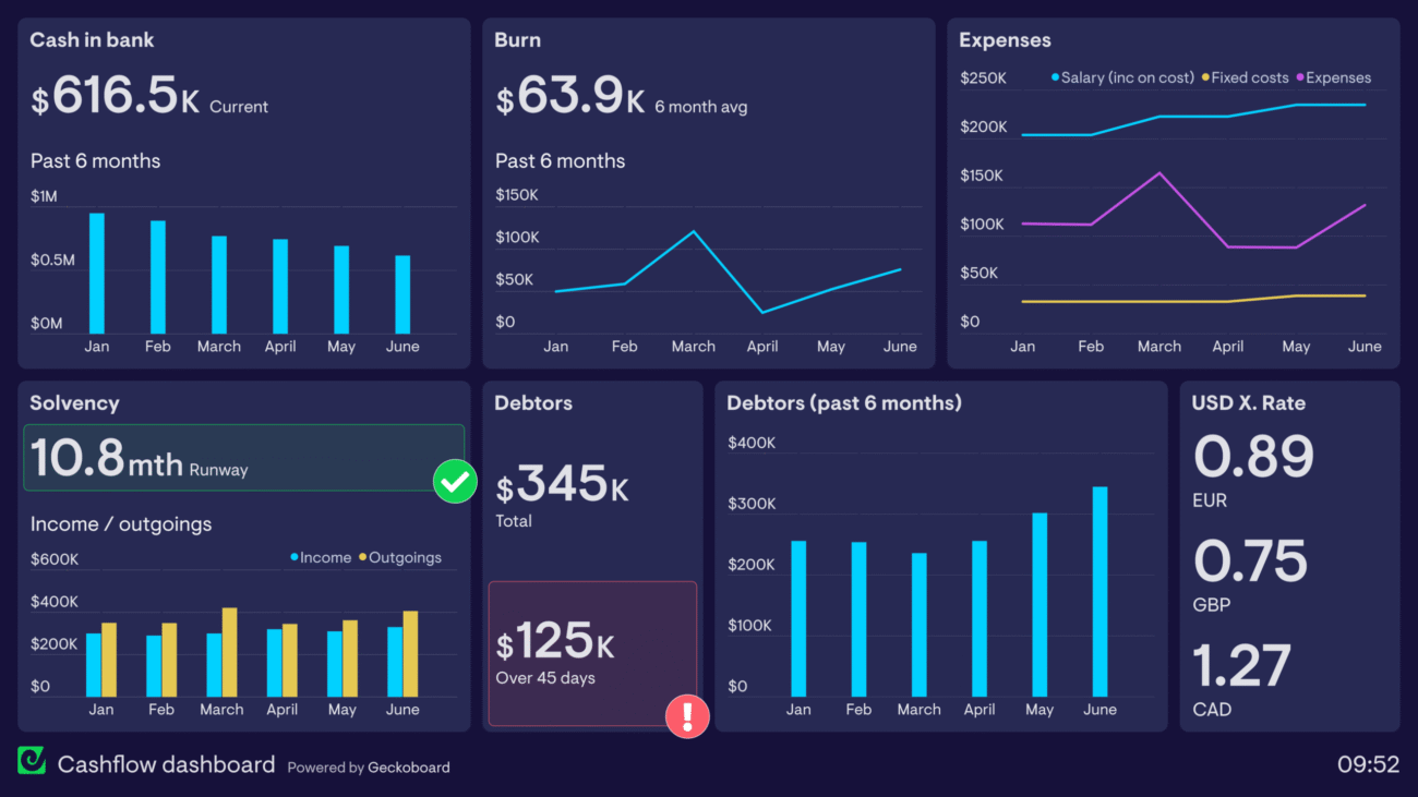
Financial Analysis Template
The Financial Analysis Template is designed for CFOs, financial analysts, and business owners who need to monitor their company’s financial health closely. It allows users to visualize their organization’s financial data in a meaningful way, making it easier to spot trends and anomalies.
Key Metrics & Visuals:
- Profit and loss (P&L) statements
- Balance sheet overviews
- Cash flow analysis
- Key financial ratios (e.g., ROE, ROI, EBITDA)
- Budget vs. actual comparisons
Key Features:
- Time series analysis for tracking financial trends over time
- What-if scenario modeling for financial projections and planning
- Integration with common accounting software like QuickBooks or SAP
Why It’s Useful: This template helps businesses keep a finger on the pulse of their financial performance. By visualizing complex financial data, it becomes easier to communicate financial health to board members, investors, or internal stakeholders.
HR Analytics Dashboard
The HR Analytics Dashboard is a must-have for HR departments aiming to make data-driven decisions. This template enables HR professionals to track key metrics related to employee retention, recruitment, training, and workforce diversity.
Key Metrics & Visuals:
- Employee turnover rates
- Recruitment funnel analysis
- Training and development metrics
- Diversity and inclusion statistics
- Employee satisfaction scores (via surveys)
Key Features:
- Customizable KPIs for different HR focus areas
- Sentiment analysis of employee feedback and survey results
- Predictive analytics for workforce planning and attrition risk
Why It’s Useful: HR teams can use this dashboard to identify trends in employee engagement, predict turnover, and ensure that recruitment strategies are aligned with business goals. The dashboard is also invaluable for reporting on the effectiveness of HR initiatives, such as diversity programs or training sessions.
Marketing Campaign Tracker
For marketing teams, the Marketing Campaign Tracker template is an indispensable tool. It allows marketers to track the performance of their campaigns across different channels, helping them optimize marketing efforts for better ROI.
Key Metrics & Visuals:
- Campaign performance metrics (clicks, conversions, ROI)
- Multi-channel comparison (email, social media, PPC, etc.)
- Customer segmentation analysis
- A/B testing results
- Budget allocation and spend tracking
Key Features:
- Real-time data integration with platforms like Google Analytics, Facebook Ads, and HubSpot
- Custom goal-setting for different campaigns
- Attribution modeling for multi-touch campaigns
Why It’s Useful: This template gives marketers real-time insights into campaign performance, enabling them to quickly identify winning strategies and optimize their marketing budget. It’s particularly useful for analyzing which channels deliver the best return on investment.
Supply Chain Optimization Template
The Supply Chain Optimization Template is geared toward logistics and operations managers who need to streamline their supply chain processes. It provides insights into inventory management, supplier performance, and order fulfillment rates.
Key Metrics & Visuals:
- Inventory levels and turnover rates
- Supplier performance metrics
- Order fulfillment rates
- Transportation costs and efficiency
- Demand forecasting
Key Features:
- Geospatial mapping for logistics routes and inventory distribution
- Predictive analytics for inventory management and demand forecasting
- Scenario planning for supply chain disruptions
Why It’s Useful: This template gives operations managers a holistic view of the supply chain, helping them identify bottlenecks and inefficiencies. It’s particularly useful for businesses that operate in complex global supply chains, where real-time visibility is crucial.
Customer Experience Dashboard
The Customer Experience Dashboard is designed for businesses focused on improving customer satisfaction and reducing churn. It visualizes data from customer feedback, journey mapping, and service level agreements (SLAs) to provide insights into the customer experience.
Key Metrics & Visuals:
- Customer satisfaction scores (CSAT, NPS)
- Customer journey mapping
- SLA compliance
- Customer feedback analysis
- Churn prediction and prevention
Key Features:
- Sentiment analysis of customer feedback
- Integration with CRM systems like Salesforce or HubSpot
- Real-time alerts for negative customer experiences
Why It’s Useful: Understanding and improving customer experience is essential for businesses in 2024, especially in competitive industries like retail and hospitality. This template helps businesses track key customer satisfaction metrics and take proactive steps to improve retention.
Project Management Overview
For project managers, the Project Management Overview template is an excellent way to keep track of multiple projects simultaneously. It provides a high-level view of project progress, resource allocation, and risks, making it easier to manage project timelines and budgets.
Key Metrics & Visuals:
- Gantt charts for project timelines
- Resource utilization rates
- Budget tracking and forecasting
- Task completion status
- Risk assessment matrices
Key Features:
- Integration with popular project management tools like Asana or Microsoft Project
- Customizable KPIs based on project needs
- Team performance metrics for better resource management
Why It’s Useful: This template allows project managers to stay on top of multiple projects, ensuring that tasks are completed on time and within budget. It’s particularly useful for organizations that need to juggle several projects at once while managing resources effectively.
E-commerce Performance Dashboard
For online retailers, the E-commerce Performance Dashboard is a must-have tool. It provides a detailed view of key performance indicators (KPIs) related to sales, product performance, and customer behavior, helping e-commerce businesses optimize their operations.
Key Metrics & Visuals:
- Sales trends and forecasts
- Product performance analysis
- Customer acquisition costs (CAC)
- Shopping cart abandonment rates
- Website traffic and conversion rates
Key Features:
- Integration with e-commerce platforms like Shopify, WooCommerce, or Magento
- Seasonal trend analysis for sales forecasting
- Customer segmentation based on purchasing behavior
Why It’s Useful: This dashboard helps e-commerce businesses monitor the performance of their online stores, track product sales, and optimize marketing spend. The integration with e-commerce platforms ensures real-time data visibility, making it easier to adapt to changes in customer behavior.
Social Media Analytics Template
In the digital age, social media has become a critical part of any marketing strategy. The Social Media Analytics Template is designed to help businesses track their social media performance across platforms, monitor engagement, and optimize their content strategies.
Key Metrics & Visuals:
- Engagement rates (likes, shares, comments) across platforms
- Follower growth trends
- Content performance analysis
- Sentiment analysis of social media mentions
- Influencer campaign tracking
Key Features:
- Real-time integration with major social media platforms (Facebook, Instagram, LinkedIn, etc.)
- Competitive benchmarking against industry standards
- ROI calculation for social media campaigns
Why It’s Useful: This template allows social media managers to stay on top of engagement metrics and track the success of their campaigns in real-time. It helps businesses identify which platforms and content types are driving the most engagement, leading to better content strategies.
Healthcare Operations Dashboard
For healthcare providers, the Healthcare Operations Dashboard offers essential insights into facility performance, patient care, and resource management. This template helps administrators monitor patient flow and optimize healthcare operations for better outcomes.
Key Metrics & Visuals:
- Patient admission and discharge rates
- Average length of stay (ALOS)
- Emergency room wait times
- Staff utilization rates
- Patient satisfaction scores
Key Features:
- HIPAA-compliant data handling for sensitive patient information
- Integration with Electronic Health Record (EHR) systems
- Predictive analytics for patient flow management and resource allocation
Why It’s Useful: In the healthcare sector, efficiency is critical. This template helps healthcare administrators optimize operations by providing real-time insights into patient flow, resource allocation, and staff performance. It’s particularly useful for identifying bottlenecks and improving patient outcomes.
How to Choose the Right Power BI Template
Selecting the appropriate Power BI template depends on your business’s specific needs and data requirements. Here are some tips to help you choose the right template:
- Industry Relevance
Start by choosing templates that are designed for your industry or that can be easily adapted to your sector’s needs. For example, a healthcare organization would benefit from a Healthcare Operations Dashboard, while an online retailer would likely need an E-commerce Performance Dashboard.
- Data Compatibility
Ensure the template’s data model aligns with your existing data structures or can be easily modified. Some templates integrate seamlessly with popular software solutions (e.g., CRM systems or accounting software), while others might require more customization to work with your data sources.
- Customization Options
Look for templates that offer flexibility in terms of visual customization. Can you modify colors, fonts, and logos to match your brand? Can you add or remove metrics to reflect the key performance indicators (KPIs) that matter most to your business?
- User Skill Level
Consider the complexity of the template in relation to your team’s expertise with Power BI. While some templates are beginner-friendly, others may require advanced knowledge of Power BI’s features, such as DAX formulas, custom visuals, or data modeling.
- Scalability
Select templates that can scale with your business. As your data grows, you’ll need templates that can handle increased data volumes and complexity without sacrificing performance.
Customizing Power BI Templates
While templates provide an excellent starting point, customization is key to making them truly effective for your specific needs. Here are some best practices for customizing Power BI templates:
- Branding
Adjust colors, fonts, and logos to align with your organization’s brand guidelines. A well-branded dashboard not only looks professional but also reinforces brand identity across reports.
- Data Sources
Replace any sample data in the template with your actual data sources. Depending on the template, this may involve connecting to various databases, cloud platforms, or third-party applications.
- Metrics and KPIs
Templates often come with predefined metrics, but they may not always align with your business’s needs. Modify existing visualizations or add new ones to reflect the specific KPIs that are important for your organization.
- Interactivity
Enhance the user experience by adding interactive elements like slicers, drill-through actions, and tooltips. This allows users to explore data more intuitively and extract deeper insights.
- Accessibility
Ensure your customized template meets accessibility standards, especially if your reports will be used by a broad audience. This may involve adding screen reader support, adjusting contrast ratios, or ensuring that all text is readable.
Best Practices for Using Power BI Templates
To get the most out of Power BI templates, follow these best practices:
- Start with a Clear Goal
Before selecting a template, define what you want to achieve with your report. Are you tracking sales performance, optimizing supply chain operations, or improving customer experience? Having a clear goal will help you choose the right template and metrics.
- Keep It Simple
Avoid cluttering your dashboard with too many visuals or metrics. Focus on the most important KPIs and use white space to improve readability. A clean, well-organized report is easier for stakeholders to interpret.
- Use Consistent Formatting
Maintain a consistent look and feel across all pages of your report. This includes using the same font styles, colors, and chart types. Consistency makes reports easier to read and helps reinforce your brand identity.
- Leverage Power BI’s Features
Take advantage of Power BI’s advanced features, such as bookmarks, drill-through pages, and custom tooltips, to enhance user interaction. These features make reports more dynamic and allow users to explore data in greater depth.
- Regular Updates
Keep your data fresh by setting up automatic refreshes and updating your visuals as needed. Regular updates ensure that stakeholders always have access to the most current information.
- Gather Feedback
Collect feedback from end-users to continuously improve your reports. Understanding how people are using your templates can help you refine the design, add useful metrics, or remove unnecessary elements.
Conclusion
Power BI templates are powerful tools that can significantly enhance your data visualization and reporting capabilities. By leveraging these pre-built solutions, businesses can save time, ensure consistency, and benefit from industry best practices. Whether you’re in sales, finance, HR, or any other field, there’s likely a Power BI template that can help you unlock the full potential of your data.
As you explore the world of Power BI templates, remember that the key to success lies in choosing the right template for your needs and customizing it effectively. With the right approach, these templates can transform your data into compelling stories that drive informed decision-making across your organization.
Thoughtful Question for Users:
Which Power BI template from this list do you find most relevant to your work, and how would you customize it to better suit your specific needs? Share your thoughts and experiences with using Power BI templates in the comments below!