In the ever-evolving landscape of data visualization, Power BI stands out as a powerhouse for transforming raw data into actionable insights. Among its many features, the calendar visual in Power BI has emerged as a game-changer for time-based analysis. Whether you’re tracking sales trends, monitoring project timelines, or analyzing productivity patterns, the Power BI calendar visual offers an intuitive and visually appealing way to present your data. In this comprehensive guide, we will explore the ins and outs of this powerful tool, helping you unlock its full potential and elevate your data storytelling to new heights.
Understanding the Power BI Calendar Visual
At its core, the Power BI calendar visual is a dynamic, interactive representation of time-based data. It allows users to view and analyze information in a familiar calendar format, making it easier to spot trends, identify patterns, and make data-driven decisions based on temporal insights.
The visual can be customized to fit various use cases, whether it be analyzing daily productivity or tracking long-term sales trends. By utilizing this visual, Power BI users can present temporal data in a way that resonates with stakeholders and makes the data easily interpretable.
Key Features of Power BI Calendar Visual:
- Customizable appearance to match your branding or report theme
- Interactive elements for drilling down into specific dates or periods
- Ability to display multiple metrics simultaneously
- Support for various time granularities (daily, weekly, monthly, yearly)
- Integration with other Power BI visuals and features for comprehensive analysis
Why Use a Calendar Visual in Power BI?
Before we dive into the technical aspects, let’s explore why the calendar visual is such a valuable addition to your Power BI toolkit. Time-based data is among the most common forms of analysis, and visualizing that data in a calendar format can help users grasp trends and insights much more intuitively. Here are a few reasons why the Power BI calendar visual should be your go-to tool for time-based analysis:
1. Intuitive Time-Based Analysis
The calendar format is universally understood, making it easy for users of all levels to grasp temporal patterns quickly. Whether you’re visualizing daily sales performance or tracking project deadlines, the calendar format allows for fast comprehension of time-based trends.
2. Enhanced Data Storytelling
Visual representations of time-based data can reveal insights that might be missed in traditional tables or charts. The calendar visual helps in breaking down complex temporal data into an easily digestible form, making your reports more impactful and engaging.
3. Improved Decision Making
By presenting data in a familiar calendar view, stakeholders can make more informed decisions based on clear temporal context. For instance, business leaders can easily identify peak times for sales or notice productivity dips during certain periods, enabling more strategic planning and resource allocation.
4. Versatility Across Industries
From retail sales to project management, the calendar visual adapts to various business needs and sectors. Whether you’re analyzing school attendance patterns, marketing campaign schedules, or employee time tracking, the calendar visual is versatile enough to provide valuable insights in any domain.
5. Engagement and Interactivity
Interactive elements encourage users to explore the data, leading to deeper insights and more engaged analysis. With the ability to drill down into specific dates or periods and interact with other visuals in your report, users can better understand the data in context and find the answers to their specific questions.
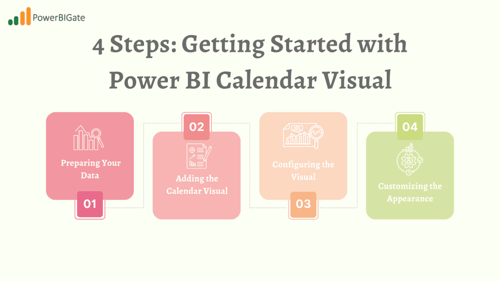
Getting Started with Power BI Calendar Visual
Now that we understand the value of the calendar visual, let’s walk through the process of creating and customizing one in Power BI. This step-by-step guide will take you from preparing your data to implementing advanced techniques that make your visualizations stand out.
Step 1: Preparing Your Data
Before you can create a calendar visual, you need to ensure your dataset includes date information. Power BI’s calendar visual relies on a date column to organize data over time, so a clean and well-structured dataset is crucial.
Data Requirements:
- A date column: This will be used to map your data to specific dates on the calendar.
- One or more measure columns: Examples of these might include sales, event counts, or hours worked.
If your dataset doesn’t already contain a date column, you can create one by using Power BI’s date functions or through DAX expressions. This step ensures that your data is ready to be used in the calendar visual.
Step 2: Adding the Calendar Visual
Once your data is prepared, the next step is to add the calendar visual to your report.
- Open your Power BI report.
- Navigate to the Visualizations pane.
- Look for the Calendar icon and click to add it to your report canvas.
This will generate a default calendar visual, which you can then configure to display your data.
Step 3: Configuring the Visual
After adding the calendar visual, you’ll need to map your data to it. Power BI makes it easy to configure the visual by dragging and dropping fields into the appropriate areas.
- Drag your date column to the “Date” field in the visual.
- Add your measure(s) (e.g., sales, events, tasks) to the “Values” field.
- Adjust the calendar view (monthly, weekly, or daily) based on your specific reporting needs.
This step will populate the calendar visual with your data, ready for further customization.
Step 4: Customizing the Appearance
To make your calendar visual fit seamlessly into your report, you’ll want to customize its appearance. Power BI offers a wide range of customization options to ensure your calendar matches your branding and visual style.
Customization Options:
- Use the Format pane to modify colors, fonts, and borders.
- Adjust the calendar header and cell styles to match your report theme.
- Configure tooltips and interactions for enhanced user experience.
These customizations not only make your reports look more professional but also improve readability and user engagement.
Advanced Techniques for Power BI Calendar Visual
Once you’ve mastered the basics, it’s time to explore some advanced techniques that can take your calendar visual to the next level. These features allow for deeper analysis and a more interactive user experience.
1. Implementing Conditional Formatting
Conditional formatting allows you to highlight specific dates or values based on predefined rules. This can help users quickly identify important data points or trends, such as highlighting high sales days or color-coding weekends.
How to implement:
- Select your calendar visual.
- In the Format pane, find the “Conditional formatting” section.
- Choose the element you want to format (e.g., cell background).
- Set up rules based on your data (e.g., highlight weekends, color-code based on sales thresholds).
This feature makes it easy for users to interpret your data at a glance, improving the overall effectiveness of your visual.
2. Utilizing Drill-Through Functionality
Drill-through allows users to navigate from the calendar to a more detailed report page for specific dates or periods. This adds an additional layer of interactivity and depth to your reports.
How to set up drill-through:
- Create a destination page for detailed information.
- On the calendar visual, go to the Format pane.
- Under Drill-through, select your destination page.
- Configure which fields to pass as filters.
With drill-through enabled, users can click on a specific date in the calendar and be taken to a detailed report page with more granular information.
3. Incorporating Dynamic Date Ranges
Dynamic date ranges allow users to adjust the time period displayed in the calendar visual interactively. This is particularly useful when users want to compare data over different time periods without having to navigate away from the report.
Implementing dynamic date ranges:
- Create a date slicer or parameter to control the time range.
- Use DAX measures to calculate dynamic date ranges based on user inputs.
- Apply these measures to your calendar visual’s date field.
By enabling dynamic date ranges, your calendar visual becomes more flexible and allows users to explore different time periods with ease.
4. Enhancing with Custom Tooltips
Custom tooltips provide additional context and information when users hover over specific dates in the calendar. This feature is great for adding depth to your visualizations without overcrowding the main view.
Creating custom tooltips:
- Design a separate report page for your tooltip.
- In the calendar visual’s Format pane, find the “Tooltips” section.
- Select your custom tooltip page.
- Configure which fields to display in the tooltip.
Tooltips can include extra metrics, trends, or other contextual information that adds value to your report without taking up extra space on the main canvas.
5. Integrating with Other Visuals
The true power of the calendar visual shines when integrated with other Power BI elements. By linking the calendar to other visuals on the report page, you can create a more comprehensive analysis experience.
Ideas for integration:
- Use sync slicers to filter multiple visuals simultaneously.
- Create a dashboard with the calendar as a central element.
- Implement bookmarks for predefined views of your calendar data.
Integrating the calendar with other visuals enriches your report and provides users with a cohesive data analysis experience.
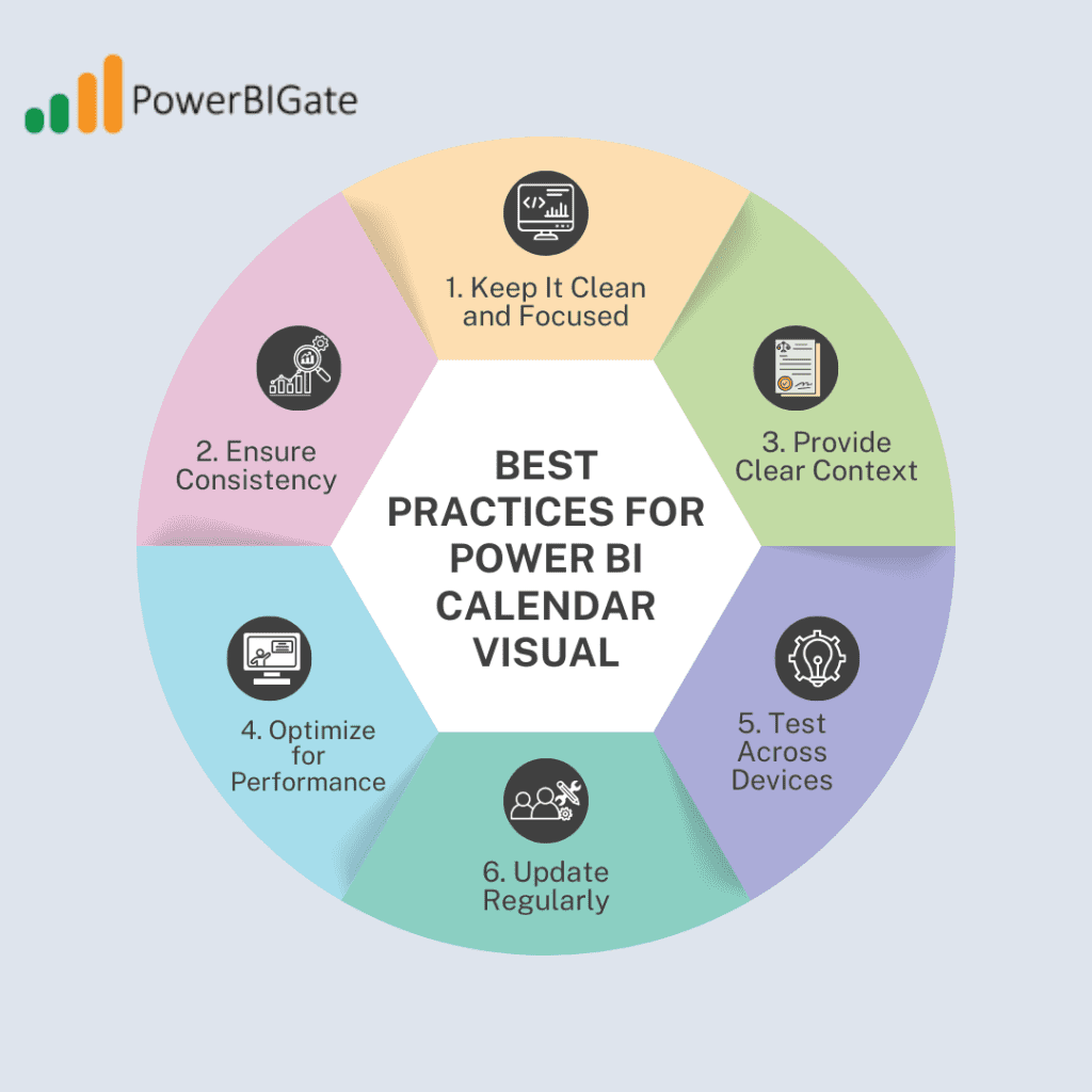
Best Practices for Power BI Calendar Visual
To ensure your calendar visual is both effective and user-friendly, consider these best practices. Proper planning and design can make a big difference in how your reports are received.
1. Keep It Clean and Focused
Avoid cluttering your calendar with too much information. Focus on key metrics and use conditional formatting judiciously to emphasize important data points.
2. Ensure Consistency
Maintain a consistent color scheme and formatting style across your entire report, including the calendar visual. This helps in creating a professional and cohesive report that’s easy to navigate.
3. Provide Clear Context
Use titles, legends, and annotations to provide context for the data displayed in your calendar. This helps users understand the purpose of the visual and interpret the data correctly.
4. Optimize for Performance
Large datasets can slow down calendar visuals. To mitigate performance issues, use data aggregations and optimize your data model for better performance. Avoid displaying excessive details in the calendar itself; instead, use drill-through pages for granular data.
5. Test Across Devices
Ensure your calendar visual looks good and functions well on various screen sizes and devices. With many stakeholders accessing reports on mobile devices, optimizing for different form factors is crucial.
6. Update Regularly
Keep your calendar data current to maintain its relevance and usefulness. For time-based visuals, outdated data can quickly become irrelevant or even misleading.
Overcoming Common Challenges
While the Power BI calendar visual is powerful, users may encounter some challenges. Below are solutions to common issues you may face when working with the calendar visual.
1. Limited Space for Data Display
When working with smaller calendar visuals, there may not be enough room to display all relevant data.
Solution:
Use tooltips and drill-through pages to provide additional details without cluttering the main view. This way, users can still access important information without overwhelming the calendar visual.
2. Performance Issues with Large Datasets
Handling large datasets can slow down the performance of your calendar visual, leading to a less responsive user experience.
Solution:
Implement data aggregation to reduce the volume of data displayed. Consider using DirectQuery mode selectively, and ensure your data model is optimized for faster processing.
3. Difficulty in Comparing Multiple Time Periods
If you need to compare different time periods, it can be challenging to do so within a single calendar visual.
Solution:
Use bookmarks or custom navigation to switch between different time frames easily. You can also consider creating multiple calendar visuals side-by-side, each displaying a different time period for easy comparison.
4. Inconsistent Data Granularity
If your dataset contains inconsistent date formats or granularity (e.g., some data is recorded daily, while other data is recorded monthly), this can lead to inaccurate visualizations.
Solution:
Create calculated columns or measures to standardize your date data before using it in the calendar visual. This ensures that all data is presented consistently and accurately.
5. Lack of Built-in Time Intelligence Functions
The calendar visual does not come with built-in time intelligence functions, which can limit your ability to perform advanced temporal analysis.
Solution:
Leverage DAX time intelligence functions to create custom measures for advanced analysis. Functions like DATEADD, PREVIOUSMONTH, and YTD can help you perform more sophisticated temporal calculations and comparisons.
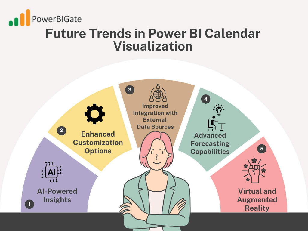
Future Trends in Power BI Calendar Visualization
As Power BI continues to evolve, we can expect exciting developments in calendar visualization. These emerging trends and technologies will likely make the calendar visual even more powerful and versatile.
1. AI-Powered Insights
Future versions of Power BI may incorporate AI to automatically highlight significant patterns or anomalies in your calendar data. These insights could help users identify trends they might have otherwise missed, reducing the need for manual analysis.
2. Enhanced Customization Options
We might see more advanced customization features, allowing for even more unique and brand-specific calendar designs. For example, future updates may include greater flexibility in formatting and styling individual calendar cells or headers.
3. Improved Integration with External Data Sources
Expect better support for real-time data updates and integration with external calendaring systems. This will allow for more seamless integration of time-based data from different platforms, improving the usability and versatility of the calendar visual.
4. Advanced Forecasting Capabilities
Built-in predictive analytics could allow users to visualize future trends directly within the calendar visual. This feature could be particularly useful for businesses looking to forecast sales, project timelines, or other time-based metrics.
5. Virtual and Augmented Reality Support
As VR and AR technologies advance, we may see three-dimensional calendar visualizations for immersive data exploration. Imagine being able to navigate through your data calendar in a virtual environment, providing a new level of interaction and insight.
Conclusion: Elevate Your Time-Based Analysis with Power BI Calendar Visual
The Power BI calendar visual is more than just a pretty way to display dates—it’s a powerful tool for uncovering temporal insights and driving data-informed decisions. By mastering its features, from basic setup to advanced techniques, you can transform your time-based data into compelling visual stories that resonate with stakeholders and drive action.
Key Takeaways:
- Prepare your data carefully, ensuring clean and consistent date information.
- Customize your calendar visual to align with your brand and report theme.
- Leverage advanced features like conditional formatting and drill-through for deeper insights.
- Integrate the calendar visual with other Power BI elements for a comprehensive analysis.
- Stay updated on new features and trends to continually enhance your calendar visualizations.
By implementing the strategies and best practices outlined in this guide, you’ll be well-equipped to create impactful, insightful, and visually stunning calendar visualizations in Power BI. Whether you’re tracking sales performance, managing projects, or analyzing any time-based data, the calendar visual will become an indispensable tool in your data analysis arsenal.
Thoughtful Question for User Comments:
How have you leveraged the Power BI calendar visual in your own projects, and what unique challenges or innovative solutions have you discovered in presenting time-based data to your stakeholders? Share your experiences and insights to help the community grow and learn together.