The Power BI Gallery is a testament to Microsoft’s commitment to democratizing data visualization. This robust repository of custom visuals, report templates, and community contributions has transformed the way professionals approach data storytelling. By offering a wide range of pre-built solutions, the Gallery simplifies reporting processes and empowers users to create visually compelling, insightful reports with minimal effort.
For experienced data professionals, the Power BI Gallery provides access to cutting-edge tools and advanced visualizations that can elevate reporting capabilities. Whether it’s custom visuals like Sankey diagrams, geospatial heat maps, or industry-specific templates, the Gallery helps streamline complex tasks and enhances decision-making. Certified visuals from Microsoft and contributions from partners also ensure high-quality, secure components that can be trusted for enterprise use.
Beginners in business intelligence will find the Gallery to be an invaluable resource. With pre-configured templates and dashboards, even those new to data visualization can quickly get up to speed and deliver professional-quality reports. The Power BI Gallery offers solutions across various industries and business functions, making it versatile enough for any organization.
Ultimately, the Power BI Gallery is more than just a collection of tools—it’s a community-driven platform where users can share, learn, and continuously improve their reporting strategies. By tapping into its resources, users can maximize their reporting potential, transforming data into actionable insights that drive business success.
In this comprehensive guide, we’ll explore the core features of the Power BI Gallery, including how to navigate the platform, the best ways to utilize custom visuals and templates, and how to contribute to this ever-evolving ecosystem. We’ll also look at real-world success stories that demonstrate the tangible impact of using the Power BI Gallery to elevate data reporting and storytelling.
What is the Power BI Gallery?
The Power BI Gallery is Microsoft’s centralized platform where users can discover, download, and share Power BI content. Think of it as an app store, but specifically designed for Power BI components that can significantly speed up your data visualization efforts. Whether you need pre-built visuals, report templates, dashboard layouts, or even data connectors, the Gallery is your go-to hub for finding these resources.
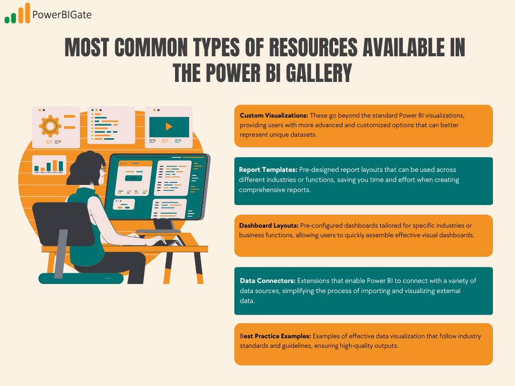
Some of the most common types of resources available in the Power BI Gallery include:
- Custom Visualizations: These go beyond the standard Power BI visualizations, providing users with more advanced and customized options that can better represent unique datasets.
- Report Templates: Pre-designed report layouts that can be used across different industries or functions, saving you time and effort when creating comprehensive reports.
- Dashboard Layouts: Pre-configured dashboards tailored for specific industries or business functions, allowing users to quickly assemble effective visual dashboards.
- Data Connectors: Extensions that enable Power BI to connect with a variety of data sources, simplifying the process of importing and visualizing external data.
- Best Practice Examples: Examples of effective data visualization that follow industry standards and guidelines, ensuring high-quality outputs.
Why the Power BI Gallery Matters for Data Professionals
In today’s data-driven world, standing out through effective visualization is critical to making informed business decisions. With the Power BI Gallery, data professionals can leverage a wealth of resources that improve efficiency, drive innovation, and maintain high-quality visualizations. Here are several key benefits:
- Time Efficiency: Accessing pre-built templates and visualizations saves hours of work that would otherwise go into creating dashboards and reports from scratch. With readily available components, you can focus on analyzing data rather than spending time on design.
- Innovation: The Gallery is an evolving hub of cutting-edge visualization techniques. Users can explore new approaches created by other data professionals and adopt them into their own workflows, staying ahead of the curve with the latest trends.
- Quality Assurance: Many components in the Gallery are certified by Microsoft, ensuring that they meet certain standards of security, performance, and compatibility. This means you can trust the quality and reliability of the tools you use.
- Community Learning: The Power BI Gallery fosters a sense of collaboration and learning by offering users the chance to explore real-world implementations, success stories, and best practices shared by the community.
Navigating the Power BI Gallery
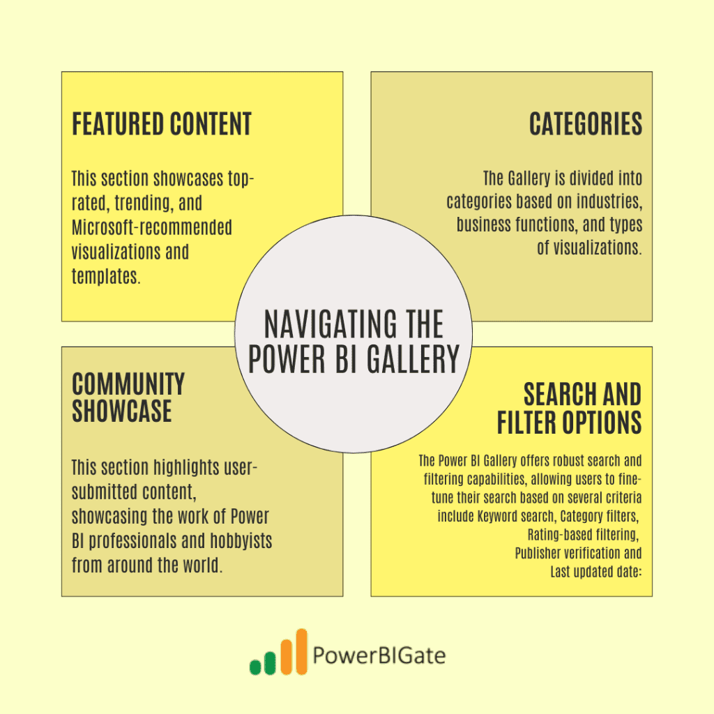
Navigating the Power BI Gallery effectively will help you find the most relevant resources quickly. The Gallery is well-organized, offering several key sections to simplify your search:
Finding Your Way Around
- Featured Content: This section showcases top-rated, trending, and Microsoft-recommended visualizations and templates. It’s a great starting point for new users looking to explore the Gallery’s most popular offerings.
- Categories: The Gallery is divided into categories based on industries, business functions, and types of visualizations. Whether you’re working in healthcare, finance, or operations, there are solutions tailored to your specific needs.
- Community Showcase: This section highlights user-submitted content, showcasing the work of Power BI professionals and hobbyists from around the world. You can explore implementation examples and success stories to gain inspiration and insight into how other organizations use Power BI.
- Search and Filter Options: The Power BI Gallery offers robust search and filtering capabilities, allowing users to fine-tune their search based on several criteria:
- Keyword search: Find visuals, templates, or solutions using relevant keywords.
- Category filters: Narrow down your results based on the type of visualization or business function.
- Rating-based filtering: Sort visuals and templates by user ratings to ensure you’re selecting the most well-received content.
- Publisher verification: Prioritize components created by verified publishers for enhanced quality assurance.
- Last updated date: Ensure you’re using up-to-date components by sorting based on the most recent updates.
Custom Visualizations in the Power BI Gallery
One of the key strengths of Power BI is its ability to go beyond basic charts and graphs through custom visualizations. The Power BI Gallery offers a wide variety of these visuals, created by Microsoft, community members, and certified partners.
Types of Custom Visuals
- Certified Visuals: These are visuals that have been verified by Microsoft for security and performance. They undergo regular testing to ensure they are stable and enterprise-ready. These visuals are ideal for businesses that require a higher level of assurance in terms of security and reliability.
- Community Visuals: These are user-created visuals that, while not certified, often push the boundaries of what’s possible in Power BI. These visuals tend to be more innovative and experimental, providing solutions for niche use cases or specific data visualization challenges.
- Partner Visuals: These visuals are created by Microsoft’s trusted partners and often come with premium features and dedicated support. They’re perfect for organizations looking for specialized solutions and professional-grade visualizations.
Popular Custom Visualizations
Here are some of the most popular custom visualizations you’ll find in the Power BI Gallery:
- Advanced Charts: These include sophisticated visualizations like Sankey diagrams, sunburst charts, and custom scatter plots. These charts are great for depicting complex relationships within datasets.
- Maps and Geospatial Visualizations: Power BI’s mapping capabilities are enhanced through custom visuals like custom territory maps, heat maps, and route visualizations, which are perfect for businesses with location-based data.
- KPI and Metrics Visualizations: Custom visualizations such as advanced gauges, custom cards, and metric wheels help businesses track key performance indicators (KPIs) more effectively.
Templates and Solutions
In addition to custom visuals, the Power BI Gallery also offers templates and pre-built solutions designed to address the needs of specific industries and business functions.
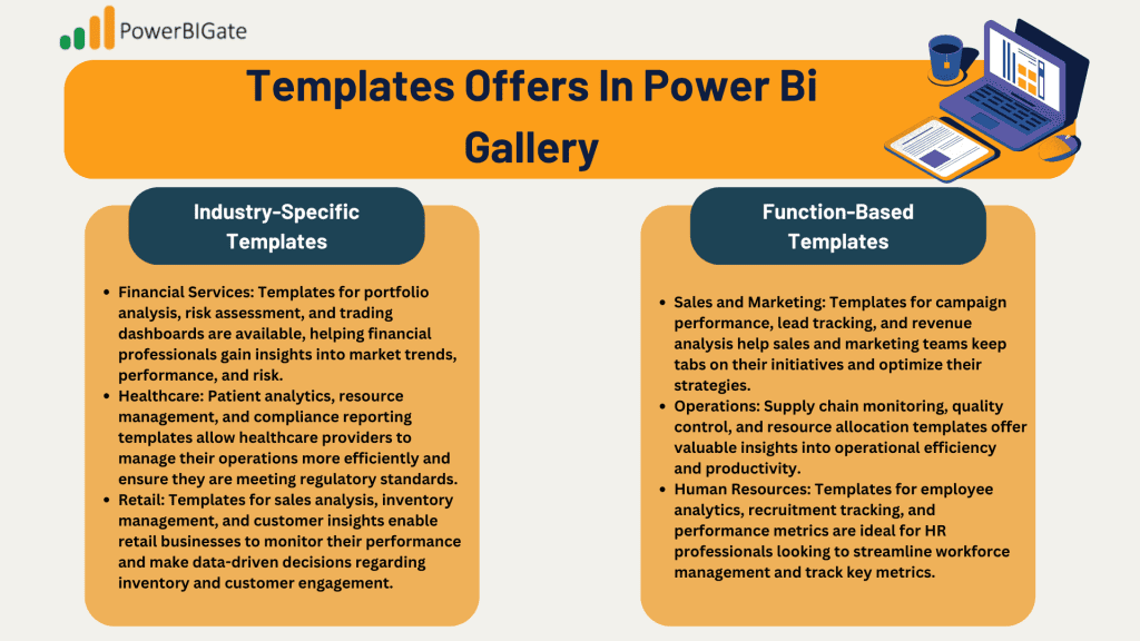
Industry-Specific Templates
Industry-specific templates offer ready-made solutions tailored to particular sectors. These templates are invaluable for businesses looking to standardize their reporting across different departments or locations.
- Financial Services: Templates for portfolio analysis, risk assessment, and trading dashboards are available, helping financial professionals gain insights into market trends, performance, and risk.
- Healthcare: Patient analytics, resource management, and compliance reporting templates allow healthcare providers to manage their operations more efficiently and ensure they are meeting regulatory standards.
- Retail: Templates for sales analysis, inventory management, and customer insights enable retail businesses to monitor their performance and make data-driven decisions regarding inventory and customer engagement.
Function-Based Templates
Templates are also organized by business function, making it easy to find the right solutions for your specific needs.
- Sales and Marketing: Templates for campaign performance, lead tracking, and revenue analysis help sales and marketing teams keep tabs on their initiatives and optimize their strategies.
- Operations: Supply chain monitoring, quality control, and resource allocation templates offer valuable insights into operational efficiency and productivity.
- Human Resources: Templates for employee analytics, recruitment tracking, and performance metrics are ideal for HR professionals looking to streamline workforce management and track key metrics.
Best Practices for Using the Power BI Gallery
Choosing the right visualizations and templates from the Power BI Gallery is crucial to ensure successful implementation. Here are some best practices to keep in mind:
Selection Criteria
When selecting components from the Power BI Gallery, consider the following factors:
- Compatibility: Ensure the components you choose are compatible with the version of Power BI you’re using, as well as with your data model. Additionally, some visuals may have performance implications, so be sure to test them with your data before committing to their use.
- Support and Updates: Check how frequently a visual or template is updated and whether the developer provides ongoing support. A visual that is no longer maintained may cause issues down the line.
- Documentation: High-quality components will often include detailed documentation, including implementation guides, use cases, and troubleshooting resources. This will make it easier to integrate the component into your existing reports and ensure smooth operation.
Implementation Tips
For successful implementation, follow these key guidelines:
- Testing: Before rolling out a new visual or template, validate it with sample data to ensure it functions as expected. Conduct performance testing to see how it handles large datasets, and ensure that end users find it intuitive and useful.
- Customization: Many visuals can be customized to match your organization’s branding and reporting needs. Consider modifying colors, labels, and other design elements to ensure consistency across your reports.
- Maintenance: As with any software, regular updates and performance monitoring are essential. Stay on top of updates to your chosen visuals and templates to avoid compatibility issues and to benefit from new features and improvements.
Contributing to the Power BI Gallery
One of the most exciting aspects of the Power BI Gallery is its community-driven nature. You can contribute your own custom visuals and templates to the Gallery, helping other users benefit from your expertise.
Submission Guidelines
To ensure your submission meets Microsoft’s quality standards, follow these guidelines:
- Quality Standards: Code quality is paramount. Ensure that your visual is stable, efficient, and secure. Your submission should also include thorough testing protocols to identify and fix any potential issues before release.
- Documentation Requirements: High-quality documentation is essential for helping other users understand how to implement and use your visual or template. Provide usage instructions, sample implementations, and detailed technical specifications.
- Maintenance Commitment: Submissions to the Gallery require ongoing support. Be prepared to update your visual or template regularly, provide support channels for users, and maintain version control to avoid confusion with future updates.
The Future of the Power BI Gallery
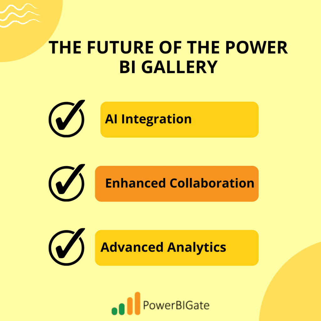
The Power BI Gallery is constantly evolving, and there are several exciting developments on the horizon. Here are some trends to watch for in the coming years:
- AI Integration: Expect to see more custom visuals and templates that incorporate artificial intelligence to provide automated insights, predictive visualizations, and natural language processing capabilities.
- Enhanced Collaboration: Microsoft is continually improving Power BI’s collaboration features, with future updates likely to include real-time co-creation, version control for report building, and enhanced comment threads for better communication.
- Advanced Analytics: As machine learning and advanced analytics become more embedded in the Power BI ecosystem, users will gain access to more sophisticated visualizations that can handle predictive modeling and advanced statistical analysis.
Power BI Gallery Success Stories
Let’s look at how organizations of all sizes are using the Power BI Gallery to drive measurable impact in their data reporting and visualization efforts.
Enterprise Implementation
Large enterprises have successfully implemented Power BI Gallery visuals and templates at scale. For example, a multinational corporation was able to integrate Power BI Gallery visuals into their global reporting structure, allowing them to standardize reports across regions while saving hundreds of hours in development time. The result was a significant improvement in decision-making speed and accuracy, as well as an enhanced ability to track KPIs across different markets.
Small Business Solutions
For small businesses, the Power BI Gallery offers cost-effective solutions that enable rapid deployment. One small e-commerce business used the Gallery to implement a sales analysis dashboard, giving them insights into customer behavior and inventory levels. The time saved on developing custom dashboards from scratch allowed them to focus on scaling their operations and improving customer satisfaction.
Measurable Impact
Success metrics from Power BI Gallery implementations typically include:
- Time saved in development: Pre-built templates and visuals reduce development time, allowing teams to focus on analysis rather than building from scratch.
- Improved decision-making: With better visualizations and data storytelling, organizations can make faster, more informed decisions that impact business outcomes.
- Enhanced user engagement: Engaging visualizations from the Power BI Gallery can drive user engagement and make complex data more accessible to non-technical stakeholders.
Conclusion
The Power BI Gallery is much more than a simple repository of visualizations and templates—it’s a dynamic ecosystem fostering innovation in data visualization. This platform offers users access to a wealth of resources, including custom visuals, report templates, and dashboards, all designed to elevate the quality and impact of their reporting. By leveraging the Power BI Gallery, organizations can enhance their data storytelling, enabling more effective decision-making and insights.
For seasoned Power BI professionals, the Gallery serves as a hub for cutting-edge tools and community-driven solutions that can save time and provide advanced functionality. For beginners, it’s an excellent starting point, offering easy access to pre-built solutions that reduce the learning curve. The range of industry-specific templates and function-based visuals ensures that users across different sectors can find tailored solutions to meet their unique business needs.
By mastering the resources within the Power BI Gallery, users can significantly boost their reporting capabilities, moving beyond basic charts to create visually engaging and insightful reports. Whether you’re optimizing internal processes or sharing data stories with stakeholders, the Power BI Gallery provides the tools you need to excel.
Engagement Question
We’d love to hear about your experiences with the Power BI Gallery! Have you discovered a custom visualization or template that has truly transformed your reporting strategy? Whether it’s an advanced chart, an industry-specific template, or a unique dashboard layout, we’re interested in learning how these tools have impacted your approach to data storytelling.
Perhaps you’ve found a custom visualization that allowed you to present complex data in a clearer, more compelling way, or a report template that drastically reduced the time it took to create a presentation-ready dashboard. Maybe a data connector streamlined your workflow, allowing you to integrate new data sources seamlessly into your reports.
We’re also keen to hear about any challenges you’ve faced when implementing these tools. Were there hurdles in adapting a community-created visualization to fit your data model? Or perhaps you struggled to customize a template to align with your specific reporting requirements. Sharing both your successes and challenges will help others in the Power BI community learn and grow.
Ultimately, the Power BI Gallery is built on the idea of collaboration and shared learning, and your experiences can provide valuable insights for others. So, don’t hesitate to share how these tools have made an impact on your work, and what tips you’d offer to those looking to enhance their own data visualization strategies. We look forward to hearing your stories in the comments below!