Introduction
In the realm of data visualization, Power BI stands out as a powerful tool for transforming raw data into compelling visual stories. Among its diverse chart types, the clustered column chart, or “biểu đồ cột cụm” in Vietnamese, holds a special place. This versatile chart type allows users to compare multiple data series across different categories, making it an invaluable asset for data analysts and business professionals alike. Whether you’re presenting sales performance, budget comparisons, or tracking project progress, the clustered column chart is an indispensable visualization tool for effective communication.
In this comprehensive guide, we’ll dive deep into the world of clustered column charts in Power BI, exploring their benefits, the step-by-step creation process, advanced customization options, and best practices for maximizing their impact. Additionally, we’ll address some common challenges and troubleshooting techniques, providing you with the knowledge to create clean, insightful, and professional charts that tell compelling data stories.
What is a Clustered Column Chart?
Before diving into the specifics of creating and customizing clustered column charts in Power BI, it’s essential to first understand what they are and why they’re so useful.
A clustered column chart, also known as a grouped column chart, is a variation of the standard column chart. It displays two or more data series side by side, grouped by a common category. Each group of columns represents a category, while the individual columns within each group represent different data series.
For example, imagine you’re tracking the sales of different product lines across three regions. A clustered column chart allows you to display each region’s sales performance side by side within each product category, making comparisons clear and straightforward.
Why Use Clustered Column Charts?
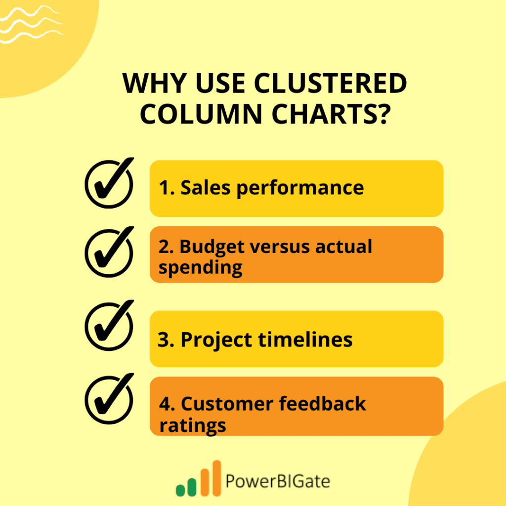
This chart type is particularly effective when you need to compare values across multiple categories and data series simultaneously. For example, a clustered column chart is perfect when visualizing:
- Sales performance of various products across different regions.
- Budget versus actual spending for different departments over multiple years.
- Project timelines where multiple teams are responsible for different phases of the project.
- Customer feedback ratings across multiple service categories, broken down by demographic groupings.
The ability to represent multiple series of data in a visually intuitive manner is what makes clustered column charts stand out. The visual clarity of these charts ensures that patterns and trends within the data become apparent quickly.
Benefits of Using Clustered Column Charts
The clustered column chart is favored by analysts and business users alike due to its numerous advantages. Let’s explore these benefits in greater detail:
1. Easy Comparison
Clustered column charts make it simple to compare values both within and across categories. By placing multiple series side by side for each category, viewers can quickly determine how one series compares to others. This is particularly useful when stakeholders need to assess performance or identify outliers.
For example, if you’re comparing the sales of different products in three different regions, the side-by-side arrangement lets you easily spot trends such as which product performs best in each region.
2. Visual Clarity
The side-by-side arrangement of columns offers clear distinctions between data series, minimizing confusion and making it easier for viewers to identify important insights. The grouped structure helps in analyzing data more efficiently, as it visually clusters related data points together.
3. Space Efficiency
By grouping related data together, clustered column charts make efficient use of space on your dashboard or report. Rather than having separate charts for each data series, everything is combined into one, reducing visual clutter and maximizing the information displayed.
4. Flexibility
Clustered column charts can handle multiple data series without becoming overly complex or cluttered, making them an ideal solution for comparative analysis. Whether you’re dealing with financial data, sales performance, or operational metrics, the flexibility of clustered column charts allows you to display many categories without overwhelming your audience.
5. Familiarity
Most audiences are already familiar with column charts, making clustered column charts easy to interpret and understand. This familiarity minimizes the learning curve, ensuring that your viewers can quickly comprehend the story you’re telling through your data.
Creating a Clustered Column Chart in Power BI
Now that we understand the value of clustered column charts, let’s walk through the process of creating one in Power BI. Whether you’re a beginner or an experienced user, these steps will help you create clean and insightful clustered column charts for your reports.
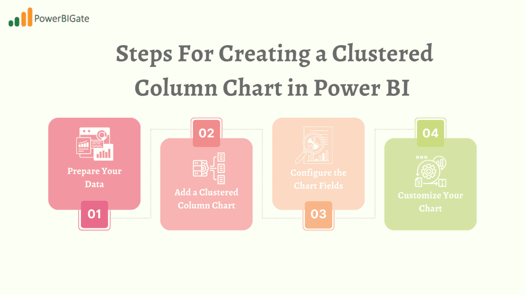
Step 1: Prepare Your Data
Before creating any visual in Power BI, data preparation is key. Ensure your data is structured in a way that allows for easy visualization. To create a clustered column chart, you’ll need:
- A column for categories (e.g., Product Categories)
- A column for subcategories or series (e.g., Regions)
- One or more columns for values (e.g., Sales Amount, Budget)
Proper data structuring is critical to ensure your visualizations are accurate and meaningful. Ideally, your dataset should be clean, with minimal or no missing values, and properly categorized for seamless aggregation within Power BI.
Step 2: Add a Clustered Column Chart
In Power BI Desktop, follow these steps to add a clustered column chart:
- Open Power BI Desktop and load your dataset.
- Navigate to the “Visualizations” pane on the right-hand side.
- Click on the clustered column chart icon, which looks like several vertical bars side by side. This will add an empty chart template to your report canvas.
- You’ll see placeholders for Axis, Legend, and Values in the “Fields” pane. These correspond to the various elements that will form your chart.
Step 3: Configure the Chart Fields
Configuring the fields properly is critical to ensuring that your clustered column chart displays the correct data:
- Drag your category field (e.g., Product Category) to the “Axis” section.
- Drag your series field (e.g., Regions or Departments) to the “Legend” section.
- Drag your value field (e.g., Sales Amount or Budget) to the “Values” section.
Once these fields are populated, Power BI will automatically generate the clustered column chart, displaying your data as grouped columns according to the categories and series you’ve defined.
Step 4: Customize Your Chart
Power BI offers a wealth of customization options to enhance the appearance and functionality of your clustered column chart. Let’s explore these in detail:
a) Colors
Using the paint roller icon in the “Visualizations” pane, you can access the formatting options. Under “Data colors,” you can change the colors of your columns to match your brand’s color scheme or to improve visual contrast between the data series. Consistent and deliberate use of color can help make your chart more aesthetically pleasing and easier to interpret.
b) Title
Adding a descriptive title to your chart is essential for clarity. Under the “Title” section, you can adjust the font, size, and color of your title to ensure it stands out and conveys the context of the chart at a glance.
c) Legend
Customize the legend position, font, and size to ensure it complements your chart without overwhelming it. The legend should clearly identify the data series represented by each column color.
d) Axis Labels
Adjust the font, size, and angle of your axis labels to enhance readability. In cases where category names are long, consider rotating the labels to prevent overlap and maintain visual clarity.
e) Data Labels
Adding data labels to the individual columns can be useful for precise value representation. This feature is particularly helpful when the difference between columns is subtle, allowing viewers to quickly identify exact figures without hovering over the chart.
f) Gridlines
Power BI allows you to adjust the visibility and style of gridlines within your chart. Depending on your chart’s complexity, you may choose to show or hide gridlines to either enhance or reduce visual clutter.

Advanced Techniques for Clustered Column Charts
Once you’ve mastered the basics, Power BI offers a range of advanced techniques to make your clustered column charts even more powerful and informative. Let’s explore some of these techniques:
1. Sorting
Power BI may not always sort your data in the most meaningful way by default. Sorting your chart correctly is crucial to tell your data story effectively.
- To change the sort order, click on the ellipsis (…) in the top-right corner of your chart and select “Sort by”. Choose the appropriate field (e.g., sort by category, series, or value) and specify the sort direction (ascending or descending).
Proper sorting ensures that your data is presented logically, making it easier for viewers to interpret.
2. Conditional Formatting
Conditional formatting is an advanced feature that allows you to apply different colors or styles to your columns based on their values. This can be particularly useful for highlighting high or low values, or for creating a more visually impactful chart that emphasizes specific data points.
- In the “Fields” pane, click the dropdown arrow next to your value field, select “Conditional formatting”, and then choose “Color scales.”
- From there, you can select a color scale (e.g., green for high values, red for low values) and adjust the settings as needed.
This technique is useful for drawing attention to important trends, such as top-performing products or underperforming regions.
3. Reference Lines
Adding reference lines can provide important context and benchmarks for your data. For instance, you may want to include a reference line that shows an industry benchmark or a target value.
- To add a reference line, navigate to the “Analytics” pane in the Visualizations menu and click the “+” next to “Reference line.”
- You can choose the type of reference line (e.g., Constant, Min, Max, Average) and customize its appearance (e.g., color, label).
Reference lines are valuable for creating context, as they allow viewers to gauge whether specific data points are above or below a certain threshold.
4. Drill-Through
Drill-through functionality allows users to dig deeper into the data behind a specific column in your chart. This is useful when you want to provide additional details without overwhelming the primary chart.
- To set up drill-through, create a new page in your report for the detailed information.
- Then, right-click on the field in the “Fields” pane you want to use for drill-through, and select “Add to drill-through.”
Now, users can right-click on a column in your clustered chart and select “Drill through” to access the detailed breakdown.
5. Dynamic Formatting with DAX
Using measures and DAX (Data Analysis Expressions) in Power BI allows you to apply dynamic formatting that changes based on your data. For example, you could color columns red if they fall below a certain threshold and green if they surpass it.
- Create a measure using DAX that defines the formatting rules based on your dataset, and then apply it through Conditional Formatting in the Fields pane.
Dynamic formatting adds another layer of sophistication to your clustered column charts, allowing them to adapt dynamically based on real-time data changes.
Best Practices for Effective Clustered Column Charts
While clustered column charts are powerful tools, their effectiveness depends on how well they’re designed and implemented. To ensure that your charts are impactful and communicate your data story clearly, here are some best practices to keep in mind:
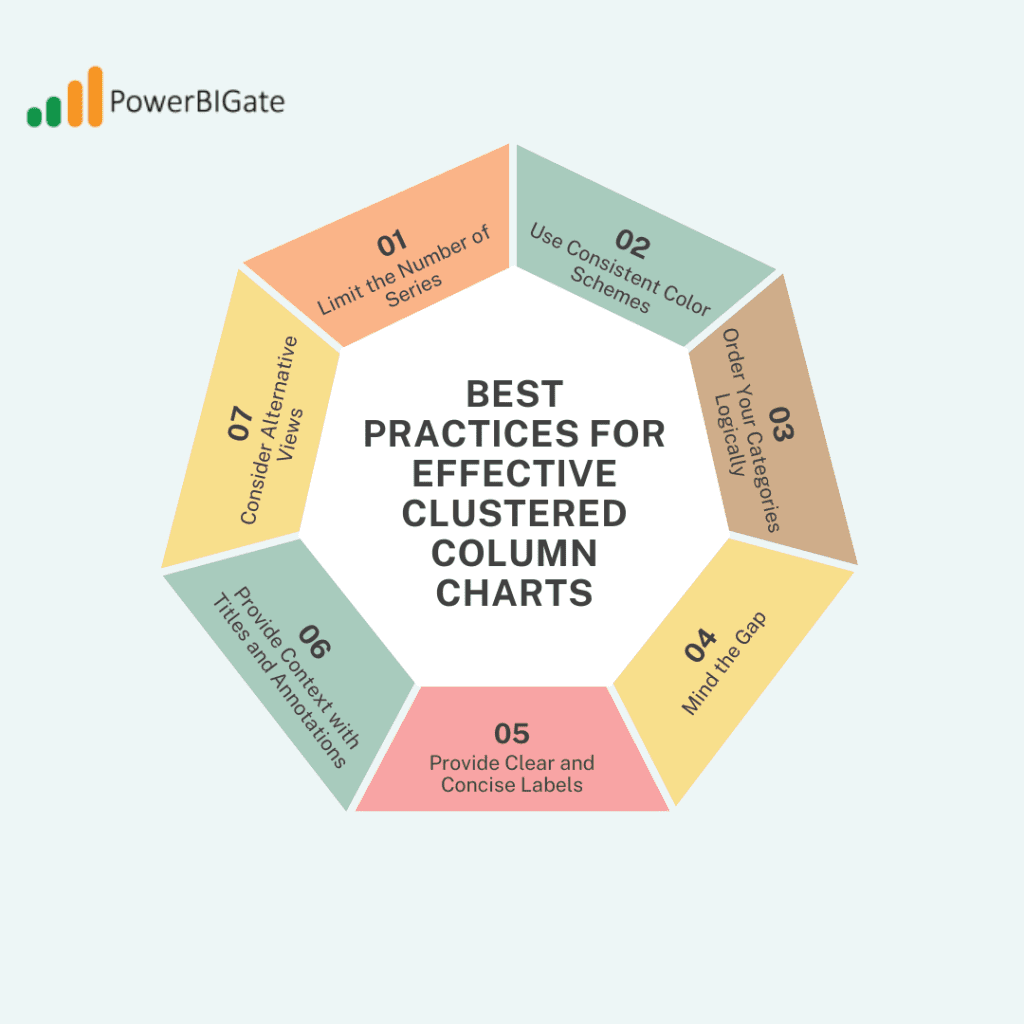
1. Limit the Number of Series
While clustered column charts can handle multiple series, too many can make the chart cluttered and difficult to read. Aim to include no more than 3-5 series for optimal clarity. If you have more data to represent, consider splitting the chart into multiple visuals or using a scrollable axis.
2. Use Consistent Color Schemes
Assign consistent colors to your series across different charts to make comparisons easier. For example, if “Region A” is blue in one chart, ensure it is blue in all other charts within your report. This consistency helps build familiarity and prevents confusion.
3. Order Your Categories Logically
The order in which you arrange your categories matters. Whether you arrange them alphabetically, by value, or in a custom order that aligns with your data story, logical category ordering makes it easier for viewers to interpret the chart. Consider what will be most intuitive for your audience.
4. Mind the Gap
Adjusting the column width and series padding is key to creating a visually appealing chart. Too much white space can make your chart look sparse, while too little can result in clutter. Experiment with the spacing to find the right balance for your data.
5. Provide Clear and Concise Labels
Your axis labels, legend entries, and data labels should be clear and easy to read at a glance. Avoid long, complicated labels, and consider using abbreviations if space is limited. Ensure that all labels are relevant and contribute to the chart’s clarity.
6. Provide Context with Titles and Annotations
Use titles, subtitles, and annotations to give your audience the context they need to interpret the chart correctly. For instance, if you’re comparing sales performance against a yearly target, explicitly mention this in the title or add a reference line to highlight the target.
7. Consider Alternative Views
Sometimes, a clustered column chart may not be the best choice. Be open to using other chart types if they better suit your data and message. For example, if your data has a hierarchical structure, a stacked column chart may provide a more insightful view. Alternatively, a line chart may be better suited for tracking changes over time.

Troubleshooting Common Issues
Even with careful planning and execution, you may encounter challenges when working with clustered column charts in Power BI. Here are some common issues and their solutions:
1. Overlapping Labels
If your category labels are too long or numerous, they may overlap, reducing readability. To resolve this issue, consider rotating the labels, using a smaller font, or abbreviating long category names. Alternatively, you can enable a scrolling axis, which allows users to scroll through a long list of categories.
2. Mismatched Scales
When comparing very different values (e.g., revenue versus number of transactions), some columns may appear disproportionately small. To address this, consider using a logarithmic scale, which can help balance the differences. Alternatively, you can create separate charts for significantly different value ranges.
3. Too Many Categories
If you have too many categories, your chart may become cluttered. One solution is to group minor categories into an “Other” category, or to create a chart that allows users to filter categories dynamically.
4. Performance Issues
Large datasets can slow down chart rendering in Power BI, especially if your chart includes multiple series or categories. To improve performance, consider using aggregations or summarized data. You can also enable data reduction techniques in Power BI, such as limiting the data points displayed.
5. Inconsistent Colors
Ensure that you use a consistent color palette across your entire report for better visual coherence. Power BI offers tools to manage color consistency across charts, including the ability to create a custom theme that applies your chosen color palette to all visuals.
Conclusion
Clustered column charts in Power BI are powerful tools for visualizing and comparing data across multiple categories and series. By mastering the creation process, exploring advanced techniques, and following best practices, you can create compelling, insightful charts that effectively communicate your data story.
Remember, the key to a successful clustered column chart lies not just in its technical execution, but in how well it serves your analytical goals and resonates with your audience. Always consider the context of your data, the message you want to convey, and the needs of your viewers when designing your charts.
As you continue to work with clustered column charts in Power BI, you’ll discover new ways to leverage their capabilities and overcome challenges. Each dataset and analytical question presents a unique opportunity to refine your skills and create more impactful visualizations.
Thoughtful Question for Users:
How have you used clustered column charts in your Power BI reports to uncover insights or tell compelling data stories? What challenges have you faced, and what techniques have you found most effective in overcoming them? Share your experiences and tips in the comments below to help our community of data enthusiasts grow and learn together!
