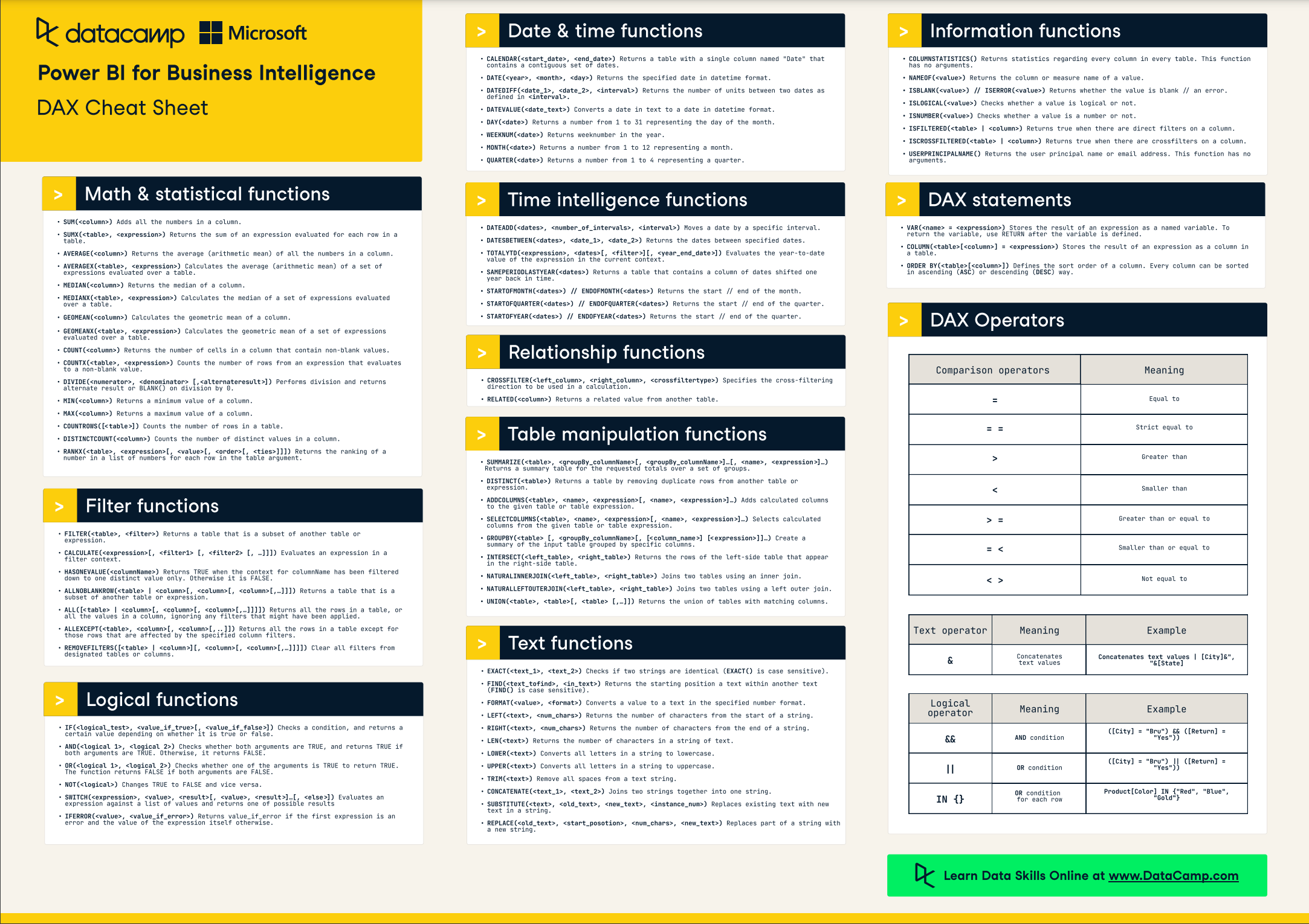
Power BI is a powerful tool for data visualization and business intelligence, offering a wide range of features that enable in-depth analysis and insights. Among its many capabilities, Power BI provides advanced analytical functions that go beyond basic aggregation and filtering. In this article, we’ll delve into the world of statistical analysis within Power BI, exploring how these advanced functions can be utilized to uncover valuable insights and drive data-driven decision-making. Our journey will take us through a comprehensive understanding of statistical measures, their application in Power BI, and the practical benefits they bring to various industries. By the end, you should have a firm grasp of how to enhance your data analysis skills using these advanced techniques.
Understanding Statistical Analysis
Statistical analysis is the science of collecting, exploring, and interpreting data to uncover patterns, relationships, and insights. It involves the use of mathematical techniques and statistical measures to summarize and describe data sets, enabling data-driven decisions and predictions.The core objective of statistical analysis is to extract meaningful information from raw data, providing a deeper understanding of the underlying patterns and trends. This can involve describing the central tendency (mean, median, mode), variability (standard deviation, variance), correlations, and probabilities associated with the data.Power BI incorporates a range of statistical functions that automate these calculations, making it easier for analysts and users to apply sophisticated analytical techniques without needing advanced programming skills.
Why Statistical Analysis Matters
Statistical analysis is crucial for several reasons. Firstly, it provides a quantitative approach to decision-making, reducing reliance on intuition or guesswork. By analyzing data statistically, businesses can identify patterns that may not be immediately obvious, leading to more informed strategic choices.Additionally, statistical analysis enables a more nuanced understanding of data. Basic aggregation, such as sums and averages, can provide a general overview, but statistics offer insights into data distribution, outliers, and potential relationships between variables. This depth of understanding is invaluable for identifying problems, opportunities, and potential solutions.Furthermore, statistical techniques form the foundation for more advanced analytical methods, including machine learning and predictive analytics. By grasping statistical concepts, users can better utilize the full capabilities of Power BI and similar tools, unlocking a world of predictive modeling and intelligent decision-making.
Measures of Central Tendency: Mean, Median, and Mode
Measures of central tendency, also known as measures of central location, provide a summary statistic that represents a “typical” value within a data set. In other words, they give an indication of the center or average of the data distribution. The three most common measures of central tendency are the mean, median, and mode.
Mean
The mean, or average, is the sum of all values in a data set divided by the number of values. It is the most commonly used measure of central tendency and is sensitive to extreme values or outliers.
Formula:Example:You have the following test scores: 85, 92, 78, 96, and 65.So, the mean score is 84.
Median
The median is the middle value of a data set when it is ordered from smallest to largest. If there is an even number of values, the median is the average of the two middle values. The median is less affected by outliers compared to the mean.Example:Using the same test scores: 85, 92, 78, 96, and 65.Ordering the values: 65, 78, 85, 92, 96The median is 85, as it is the middle value.
Mode
The mode is the value or values that appear most frequently in a data set. A data set can have one mode (unimodal), two modes (bimodal), three modes (trimodal), or no mode if all values occur equally frequently (uniform distribution).Example:You have the following data set: 3, 6, 6, 9, 12, 12, 12, 15The mode is 12, as it appears most frequently.
Using Central Tendency Measures in Power BI
In Power BI, measures of central tendency can be calculated using the built-in functions Average, Median, and MAXX (where X is the column name) for the mean, median, and mode, respectively.For instance, to calculate the average sales for a particular product, you could use the Average function, specifying the sales column and any relevant filters.
Measuring Variability: Standard Deviation and Variance
While measures of central tendency provide a snapshot of the center of a data distribution, they don’t give information about the spread or variability of the data. This is where standard deviation and variance come into play.
Standard Deviation
Standard deviation is a measure of the amount of variation or dispersion in a data set. It quantifies how spread out the values are from the mean. A small standard deviation indicates that the data points are close to the mean, while a large standard deviation suggests greater variability.
Formula:Where Variance is calculated as:Example:You have the following test scores: 85, 92, 78, 96, and 65.So, the standard deviation is approximately 8.06.
Using Standard Deviation and Variance in Power BI
In Power BI, standard deviation can be calculated using the STDEV.P or STDEV.S functions, depending on whether you want to consider the entire population or a sample. Variance can be calculated using the VAR.P or VAR.S functions, respectively.For instance, to assess the variability in sales performance, you could calculate the standard deviation using STDEV.P(Sales) and then visualize this on a chart to identify any outliers or unusual patterns.
Correlation Analysis
Correlation analysis is a statistical technique used to measure and describe the relationship between two variables. It helps to determine if changes in one variable are associated with changes in another, and the strength and direction of that relationship.
Correlation Coefficient
The correlation coefficient, often denoted as “r,” quantifies the strength and direction of the linear relationship between two variables, X and Y. The value of “r” ranges from -1 to +1:
- A correlation coefficient of +1 indicates a strong positive correlation, meaning as X increases, Y also increases.
- A correlation coefficient of -1 indicates a strong negative correlation, meaning as X increases, Y decreases.
- A correlation coefficient of 0 indicates no linear correlation between the variables.
Formula:
The correlation coefficient is given by:Where:
- is the covariance of X and Y
- is the standard deviation of X
- is the standard deviation of Y
Example:
You are analyzing the relationship between advertising spend (X) and sales revenue (Y) for a product. A correlation coefficient of +0.85 is calculated. This indicates a strong positive correlation, suggesting that as advertising spend increases, sales revenue tends to increase as well.
Using Correlation Analysis in Power BI
Power BI provides the CORREL function to calculate the correlation coefficient between two variables. This can be incredibly useful for identifying relationships between different data points.For instance, you could calculate the correlation between customer satisfaction ratings and the number of support tickets raised. A positive correlation might suggest that customers who engage more with support are more satisfied, while a negative correlation could indicate that the product needs improvement to reduce the need for support interactions.
Probability and Distribution
Probability and distribution are fundamental concepts in statistics, helping to understand the likelihood of different outcomes and how data is spread.
Probability
Probability is a numerical description of the chance that a specific event will occur. It is a value between 0 and 1, where 0 indicates impossibility and Multiplier indicates certainty.Example:You flip a fair coin. The probability of getting heads is 0.5 (or 50%), as there are two possible outcomes (heads or tails), and each is equally likely.
Probability Distributions
A probability distribution describes the likelihood of obtaining each possible value in a data set. It provides information about the spread and shape of the data. Common probability distributions include the normal distribution, binomial distribution, and Poisson distribution.
Normal Distribution
The normal distribution, also known as the Gaussian distribution, is a continuous probability distribution that is symmetric and characterized by its bell-shaped curve. Many natural phenomena, such as heights and test scores, tend to follow a normal distribution.
The probability density function (PDF) of a normal distribution is given by:Where:
- is the probability density at point x
- is the mean (center) of the distribution
- is the standard deviation (spread) of the distribution
Binomial Distribution
The binomial distribution is a discrete probability distribution that models the number of successes in a fixed number of independent Bernoulli trials. Each trial has two possible outcomes (success or failure), and the probability of success remains constant across trials.
Formula:The probability of obtaining exactly “k” successes in “n” trials with probability “p” of success on each trial is given by:Where:
- is the binomial coefficient (“n” choose “k”)
- is the probability of success on a single trial
Using Probability and Distribution in Power BI
Power BI provides functions to work with probability and distributions. For instance, the NORMAL.DIST function calculates the probability associated with a normal distribution, given a specific mean and standard deviation.You could use this to model scenarios, such as the likelihood of a new product launch resulting in sales above a certain threshold, based on historical data.
Advanced Statistical Functions in Power BI
Power BI offers a host of advanced statistical functions that go beyond the basics. These functions enable more nuanced and sophisticated analyses, providing deeper insights into data.
Percentile and Quartile Functions
Percentile and quartile functions help to understand the distribution of data and identify values that fall within specific percentiles or quartiles.Example:You have a data set of employee ages and want to identify the cutoff age for the top 25%. You can use the PERCENTILE.INC function to calculate this value, which represents the age above which only 25% of employees are older.
Rank Functions
Rank functions assign a rank to each value in a data set based on its position relative to other values. This is useful for identifying top or bottom performers and understanding the distribution of data.Example:You are analyzing sales performance and want to rank your sales team based on their total sales. The RANK.EQ function can be used to assign a unique rank to each salesperson, with ties receiving the same rank.
Trend Analysis
Trend analysis functions help to identify patterns and trends in data over time. These functions can smooth out fluctuations and highlight the underlying direction of change.Example:You are tracking website traffic over time and want to identify any seasonal patterns. The TREND function can be used to calculate a linear trend line, helping to visualize whether traffic tends to increase or decrease at certain times of the year.
Forecasting
Forecasting functions enable the projection of future values based on existing data. These functions use historical data to create predictive models and estimate future outcomes.Example:You have historical sales data and want to forecast sales for the next quarter. The FORECAST.LINEAR function can be used to predict sales based on a linear trend, taking into account seasonality and other factors.
Practical Applications of Statistical Analysis in Power BI
Statistical analysis in Power BI has a wide range of practical applications across various industries. Here are some examples:
Retail and E-commerce
- Sales Analysis: Retailers can analyze sales data to identify trends, correlations, and patterns. For instance, they might discover a positive correlation between promotional discounts and sales, helping to optimize pricing strategies.
- Inventory Management: Statistical functions can be used to forecast inventory needs and optimize stock levels, reducing costs and minimizing stockouts.
- Customer Segmentation: Customer data can be analyzed to identify distinct customer segments based on purchasing behavior, enabling more targeted marketing campaigns.
Healthcare
- Patient Outcomes: Healthcare providers can analyze patient data to identify factors influencing treatment outcomes. This might include correlations between patient demographics and treatment success, helping to personalize care plans.
- Resource Allocation: Statistical analysis can optimize resource allocation by forecasting demand for specific services, ensuring adequate staffing and supply levels.
- Epidemiology: During a pandemic, statistical models can be used to forecast infection rates, helping governments make informed policy decisions.
Finance
- Investment Strategies: Financial analysts can use correlation analysis to identify relationships between different investments, helping to build diversified portfolios that balance risk and return.
- Risk Management: Statistical functions can be applied to historical financial data to model and predict potential losses, aiding in risk management and regulatory compliance.
- Fraud Detection: Banks can use statistical techniques to identify unusual patterns or outliers in transaction data, helping to detect and prevent fraudulent activities.
Enhancing Data Visualization with Statistical Insights
Combining statistical analysis with Power BI’s visualization capabilities can create powerful and insightful dashboards. Here are some tips for enhancing your data visualizations with statistical insights:
- Use Trend Lines: Incorporate trend lines in line charts to highlight patterns and forecast future values. This helps users quickly grasp the direction of change.
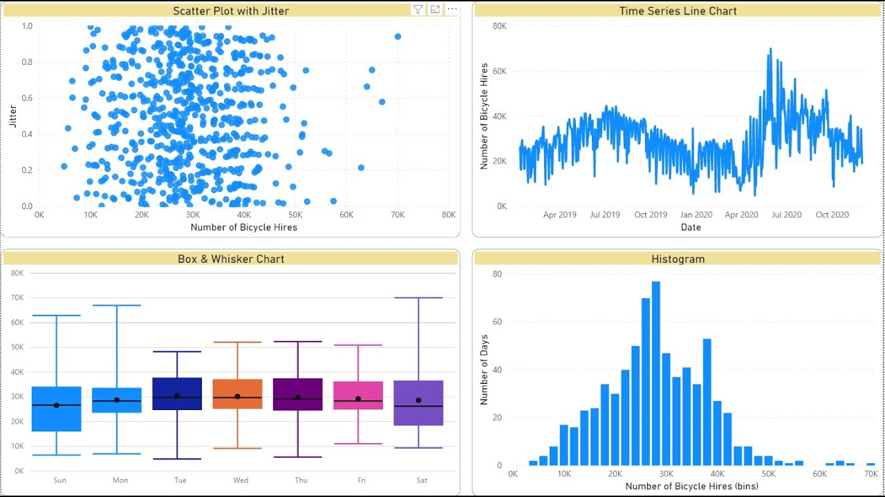
- Visualize Distributions: Use histograms, box plots, or density plots to visualize data distributions. This provides insights into the spread and shape of the data, helping users identify outliers or skewness.
- Correlate Data: Create scatter plots with trend lines to visualize correlations between two variables. This can reveal hidden relationships and suggest potential causal links.
- Add Percentiles: Include percentile values in bar or column charts to provide context. For instance, showing that the top 10% of customers account for 50% of sales can offer valuable insights.
- Dynamic Reporting: Utilize Power BI’s interactive features to allow users to explore data dynamically. This could include drill-down options, slicers, or filters that enable users to focus on specific segments of interest.
Best Practices and Considerations
When using advanced analytical functions in Power BI, it’s important to keep in mind certain best practices and considerations:
- Data Quality: Ensure that your data is clean, consistent, and accurate. Statistical analysis is only as good as the data it’s based on. Implement data validation and cleansing techniques to maintain data integrity.
- Sample Size: Be mindful of the sample size when interpreting results. Small sample sizes may not accurately represent the entire population, leading to biased conclusions.
- Causation vs. Correlation: Remember that correlation does not imply causation. Just because two variables are correlated does not mean that one causes the other. Consider external factors and perform further analysis to establish causality.
- Outliers: Outliers can significantly impact statistical measures, especially the mean and standard deviation. Consider the impact of outliers and decide whether they should be treated as valid data points or removed from the analysis.
- Contextual Understanding: Always interpret statistical results within the context of the data and the broader situation. Consider the practical significance of the findings, not just the statistical significance.
Conclusion and Further Exploration
Statistical analysis in Power BI opens up a world of insights and understanding, enabling data-driven decisions and strategic planning. In this article, we’ve explored a range of statistical measures and their practical applications, providing a foundation for leveraging Power BI’s advanced analytical capabilities.There is much more to uncover, and further exploration could include:
- Delving into predictive analytics and machine learning, utilizing Power BI’s AI capabilities to forecast outcomes and make intelligent decisions.
- Exploring time series analysis, which focuses on understanding data collected over time, helping to identify trends, seasonality, and patterns in temporal data.
- Investigating advanced statistical techniques, such as regression analysis, hypothesis testing, and clustering, which provide deeper insights into data relationships and patterns.
As you continue on your data analysis journey, remember that statistical analysis is a powerful tool for extracting valuable insights from data. By understanding and applying these techniques effectively, you can unlock the full potential of your data and drive impactful decisions.Question for Reflection:How might the advanced analytical functions discussed in this article be applied to your own data analysis projects? What specific insights or improvements do you hope to achieve by incorporating statistical analysis into your Power BI reports and dashboards?
Pingback: Unlocking Business Intelligence: A Comprehensive Guide to Power BI Licensing - Master your Data with PowerBI