
If you’re still emailing spreadsheets around for monthly reviews, it’s time to level up. A Power BI financial dashboard centralizes revenue, expenses, margins, and cash flow into a single, interactive view. This guide walks you from blank canvas to a production-ready dashboard—with practical steps you can follow in Power BI Desktop.
You’ll learn how to connect to Excel or your accounting system, clean and model data, calculate KPIs with DAX, and design a clean, executive-friendly layout. We’ll also cover slicers, conditional formatting, and themes so your dashboard looks polished and on-brand.
Finally, you’ll publish to the Power BI Service, set up data refresh, and share it securely with stakeholders—no more manual email chaos.
CTA: Need expert help to set this up fast? Email info@powerbigate.com, call +1 281 631 3767, or book a 30-min Google Meet. We’ll get you live—quickly and cleanly.
Table of Contents
ToggleWhat You’ll Build (and Why It Matters)
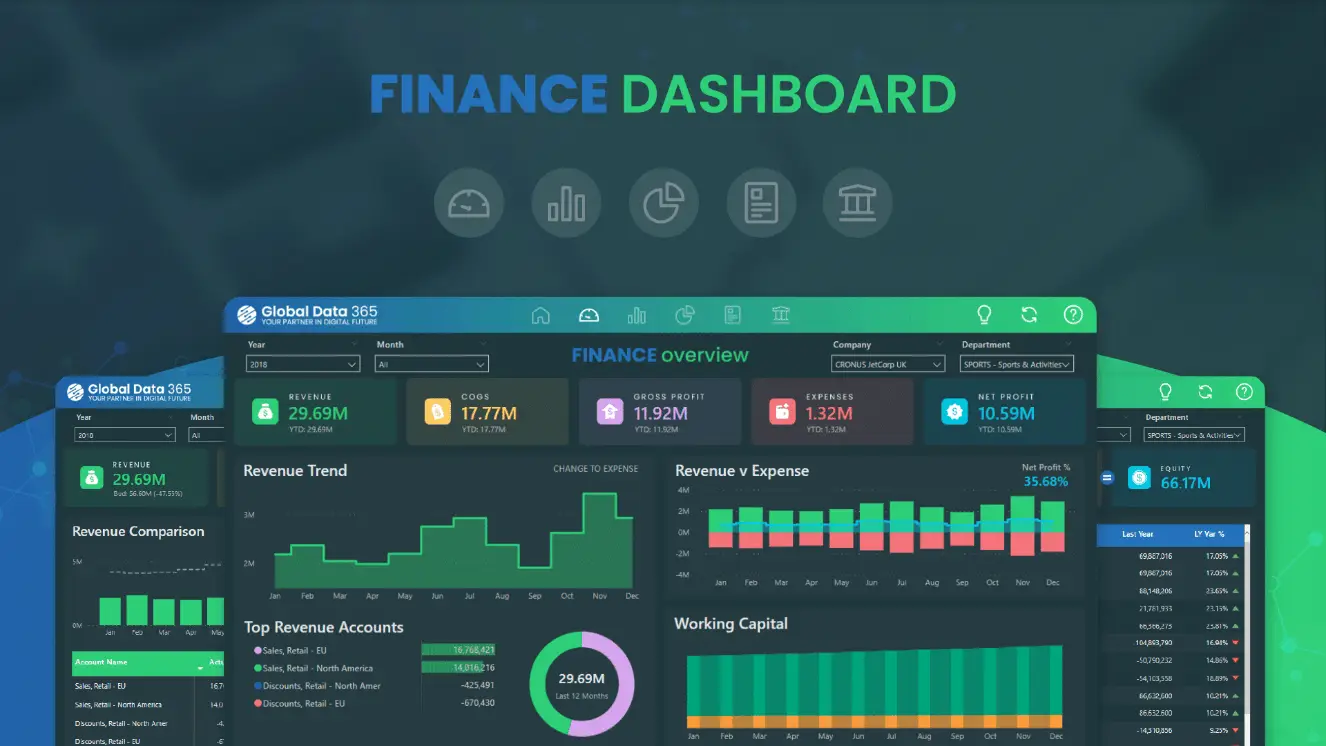
You’ll build a Finance Executive Overview that highlights:
-
Top KPIs (Revenue, Gross Profit, Net Profit, Cash Balance, Burn Rate)
-
Trends over time (Revenue vs. Expenses line chart)
-
Expense breakdown (by category/department)
-
P&L table with Actual vs Budget and variance
-
Interactive slicers (Date, Region, Business Unit, Product)
This dashboard speeds up decision-making, creates a single source of truth, and reduces manual reporting time dramatically.
Prerequisites & Sample Data Structure
You’ll need:
-
Power BI Desktop (free)
-
Access to source data (Excel/CSV, SQL, or accounting tool like QuickBooks/Xero)
-
A short list of KPIs and questions your stakeholders care about
Recommended tables (minimum viable set):
| Table | Key Columns (examples) | Notes |
|---|---|---|
FactTransactions |
Date, AccountName, Type (Revenue/COGS/Opex), Dept, Region, Product, Amount | Granular ledger or aggregated monthly figures |
Budget |
Date, AccountName, Dept, Region, Product, BudgetAmount | Same grain as transactions for easy compare |
ChartOfAccounts |
AccountName, AccountGroup (Revenue/COGS/Opex/Other), DisplayOrder | Drives groupings and sorting |
Departments |
DeptID, DeptName | Optional lookup |
Products |
ProductID, ProductName, Category | Optional lookup |
Date |
Date, Year, Quarter, Month, MonthName, MonthIndex | Required for time intelligence |
Pro tip: If you’re new to Power BI data sources, see Power BI Data Sources: Where Does Power BI Pull Data From?
Step 1: Connect Your Financial Data
Open Power BI Desktop → Get Data. Common starting points:
-
Excel/CSV exports from your accounting tool
-
Direct connectors (e.g., SQL Server, Azure SQL, Snowflake)
-
Accounting apps (QuickBooks/Xero via connectors or exported files)
Pick the tables above (transactions, budget, chart of accounts, etc.). Load them into Power BI.
Step 2: Model Your Data (Relationships + Date Table)
Go to Model view. Create relationships:
-
FactTransactions[Date]→Date[Date](Many-to-One, single direction) -
Budget[Date]→Date[Date] -
FactTransactions[AccountName]→ChartOfAccounts[AccountName]
Create a dedicated Date table if you don’t have one:
Date =

ADDCOLUMNS(

CALENDAR(DATE(2022,1,1), DATE(2026,12,31)),

"Year", YEAR([Date]),

"Month", FORMAT([Date], "MMM"),

"MonthIndex", YEAR([Date])*100 + MONTH([Date]),

"Quarter", "Q" & FORMAT([Date], "Q")

)
Mark it as Date Table (Modeling → Mark as date table → choose Date[Date]).
This unlocks time intelligence like YTD, PY (prior year), and rolling periods.
Step 3: Clean & Transform with Power Query
Click Transform Data to open Power Query. Typical steps:
-
Remove duplicates and empty rows
-
Normalize column types (Date, Text, Decimal)
-
Split columns (e.g., “Account – Subaccount”)
-
Merge/Append tables (e.g., combine multiple exports)
-
Add derived columns (e.g., sign adjustments for expenses if needed)
-
Reference normalized tables to avoid repetition
Keep the query steps readable (rename steps) so maintenance is painless.
Related read: Power BI Metadata Management for naming, lineage, and governance best practices.
Step 4: Define Core Finance KPIs (with DAX)
In Report view, create core measures in a dedicated Measures table.
Base measures
Revenue :=

SUMX(

FILTER(FactTransactions, FactTransactions[Type] = "Revenue"),

FactTransactions[Amount]
)SUMX(
FILTER(FactTransactions, FactTransactions[Type] = “COGS”),
FactTransactions[Amount] )
SUMX(
FILTER(FactTransactions, FactTransactions[Type] = “Opex”),
FactTransactions[Amount] )
Ratios & margins
Gross Margin % :=

DIVIDE([Gross Profit], [Revenue])DIVIDE([Net Profit], [Revenue])
Budget comparisons
Revenue (Budget) := SUM(Budget[BudgetAmount])
Revenue Variance := [Revenue] – [Revenue (Budget)]
Revenue Variance % :=
DIVIDE([Revenue Variance], [Revenue (Budget)])
Time intelligence (examples)
Revenue YTD := TOTALYTD([Revenue], 'Date'[Date])

Revenue PY := CALCULATE([Revenue], DATEADD('Date'[Date], -1, YEAR))

Revenue YoY % := DIVIDE([Revenue] - [Revenue PY], [Revenue PY])
Need a primer on KPI selection? See Essential Financial KPIs Every Power BI Dashboard Should Track.
Step 5: Build the Dashboard Layout
Use a simple, executive-friendly grid:
-
Top row (KPI cards)
-
Revenue, Gross Profit, Net Profit, Gross Margin %, Net Margin %, Cash Balance (if available)
-
-
Middle row (trend & composition)
-
Chart A: Revenue vs. Expenses over time (line chart)
-
Chart B: Expense breakdown by category/department (bar or treemap)
-
-
Bottom row (detail)
-
P&L Matrix (Rows: AccountGroup → AccountName; Columns: Month/Quarter; Values: Actual, Budget, Variance)
-
Ready-to-use image assets:
-
(Insert) Monthly Revenue vs Expenses: upload pbi_finance_revenue_expenses.png
-
(Insert) Expense Breakdown by Category: upload pbi_finance_expense_breakdown.png
You can download them here:
Chart 1 • Chart 2
Step 6: Add Visuals (Charts, Tables & Slicers)
Recommended visuals
| Visual | Purpose | Fields |
|---|---|---|
| Card | KPIs (Revenue, Net Profit, Margins) | Measures |
| Line chart | Revenue vs. Expenses trend | Axis: Date[Month]; Values: [Revenue], [COGS] + [Opex] |
| Clustered bar | Expense by category/department | Axis: AccountGroup/Dept; Value: [Amount] |
| Matrix | P&L (Actual vs Budget + Variance %) | Rows: Accounts; Columns: Month; Values: measures |
| Slicers | Date, Region, Dept, Product | Filter tables |
Variance highlighting (Matrix)
-
Conditional formatting → Data bars or Color scale on Variance % (e.g., negative = red, positive = green).
Interactivity tips
-
Enable cross-filtering between charts
-
Add Tooltips with extra metrics (e.g., YoY%)
For industry-specific visuals and benchmarks, see Power BI for SaaS Companies.
Step 7: Formatting, Themes, and Branding
-
Apply a Theme (View → Themes). Consider uploading a JSON theme with your brand colors and font pairings.
-
Keep backgrounds light and contrast high for readability.
-
Use Gridlines and Snap to grid to keep spacing consistent.
-
Limit decimals on currency and percentages.
-
Pin consistent title bars for each section (e.g., “Executive KPIs”, “P&L Detail”).
Comparing tooling choices for finance teams? Read Power BI vs Excel for Financial Reporting and the quick comparison Power BI vs Excel.
Step 8: Publish, Share, and Refresh
-
Publish: File → Publish → Select a workspace in Power BI Service.
-
Share: Grant access to stakeholders via their Microsoft accounts; define app permissions if packaging as an App.
-
Refresh: Configure Scheduled Refresh (e.g., daily at 6 AM). For on-prem sources, set up a Gateway.
Distribution tips
-
Create dashboard tiles pinned from report pages for an exec snapshot.
-
Build App navigation (Overview → P&L → Expenses) for clarity.
-
Enable mobile layout so leaders can view KPIs on phones.
QA & Performance Tips
-
Row-level checks: Subtotal by account group should reconcile to trial balance.
-
Reconcile periods: Spot-check 3 random months vs. source.
-
Performance: Prefer import mode with slim, numeric columns; disable auto date/time; use summarized fact tables (monthly grain) for speed if details aren’t needed.
-
Measure table: Centralize DAX measures; avoid calculated columns when a measure suffices.
Common Mistakes to Avoid
-
Tracking too many KPIs—limit to what drives decisions.
-
No Date table—breaks YTD/PY logic.
-
Mixing actuals and budgets at different grains (e.g., daily vs monthly).
-
Inconsistent account mappings—keep
ChartOfAccountsauthoritative. -
Heavy visuals on one page—split into tabs/sections to maintain performance.
(Chart Placements)
-
Chart 1: Monthly Revenue vs Expenses (Line) — use the image from:
Download -
Chart 2: Expense Breakdown by Category (Bar) — use the image from:
Download
Example P&L Matrix Layout (for your report)
| Account Group | Jan | Feb | Mar | Q1 Total | Budget Q1 | Var $ | Var % |
|---|---|---|---|---|---|---|---|
| Revenue | 120k | 130k | 125k | 375k | 360k | 15k | 4.2% |
| COGS | 72k | 76k | 74k | 222k | 216k | 6k | 2.8% |
| Opex | 20k | 22k | 21k | 63k | 66k | -3k | -4.5% |
| Net Profit | 28k | 32k | 30k | 90k | 78k | 12k | 15.4% |
(Populate from your measures; the table above is illustrative so you can mirror formatting and fields.)
Key Page-Level Slicers (recommended)
-
Date (Month, Quarter, Year)
-
Dept / Cost Center
-
Region
-
Product / Category
-
Scenario (Actual, Budget, Forecast) if modeled
Key Takeaways
-
A great first financial dashboard focuses on a handful of decision-driving KPIs.
-
Clean, consistent data modeling (Date table, COA mapping, relationships) is 80% of success.
-
Use DAX measures for all critical calculations—keep them centralized and documented.
-
Keep the design clean: KPI cards → trends → details; enable slicers for exploration.
-
Publish to the Service, secure sharing, and schedule refresh to automate reporting.
Summary
You’ve seen how to go from raw exports to a polished, interactive Power BI financial dashboard: connect and cleanse data, model relationships, define DAX KPIs, design a clear layout, and publish with refresh. Start simple, validate numbers against your ledger, and iterate with stakeholder feedback.
Final CTA: Want a done-for-you build or a quick sanity check on your model?
Email info@powerbigate.com, call +1 281 631 3767, or grab time on our Google Meet. We’ll help you ship a trustworthy dashboard—fast.
FAQs
Q1. What visuals should I start with?
Begin with Card visuals for KPIs, Line for Revenue vs Expenses, Bar for expense breakdown, and a Matrix for P&L details. Add slicers for Date/Dept/Region.
Q2. How do I compare Actuals vs Budget?
Create a Budget table at the same grain as actuals and write measures like [Revenue (Budget)], [Revenue Variance], and [Revenue Variance %]. Use a Matrix to show side-by-side.
Q3. Can I refresh dashboards automatically?
Yes—publish to the Power BI Service and set Scheduled Refresh. If your data is on-prem, configure an On-Premises Data Gateway.
Q4. How do I scale to multiple business units?
Add a