Introduction
In today’s data-driven world, the ability to present information clearly and effectively has become increasingly crucial. Power BI, Microsoft’s powerful business intelligence tool, offers a rich array of visualization options that transform raw data into meaningful insights. This comprehensive guide will walk you through everything you need to know about Power BI graphs and how to leverage them for maximum impact.
Getting Started with Power BI Graph Types
Before diving into complex visualizations, it’s essential to understand the basic graph types available in Power BI. These fundamental charts serve as the building blocks for more sophisticated data storytelling.
Bar and Column Charts
Bar and column charts are among the most widely used visualizations in Power BI. They excel at comparing values across different categories and showing trends over time.
Key features include:
- Clustered Bars: Useful for comparing multiple categories side by side.
- Stacked Bars: Show the contribution of each sub-category to the total, allowing for part-to-whole relationships.
- 100% Stacked Bars: Useful for proportional analysis where the total is represented as 100%.
Line and Area Charts
Perfect for displaying trends over time, line charts help identify patterns and seasonality in your data.
Key applications include:
- Tracking KPI Progress: Visualizing key performance indicators over a period to assess trends.
- Analyzing Stock Market Data: Showing price movements over time.
- Visualizing Cumulative Totals: Area charts add an extra dimension by showing the volume beneath the line, making them ideal for cumulative analysis.
Pie and Donut Charts
While often debated among data visualization experts, pie and donut charts can be effective for illustrating proportions. However, they should be used sparingly and only when the total is less than five categories.
Considerations:
- Simplicity: Best for simple datasets with limited categories.
- Use Cases: Visualizing market share, budget allocations, or survey results.
Combo Charts
Combo charts combine the features of bar and line charts, allowing users to visualize multiple types of data in one view.
Benefits include:
- Comparative Analysis: Effectively display two different metrics on the same graph, such as revenue and profit margins.
- Enhanced Insights: Facilitate deeper understanding of relationships between metrics.
Advanced Visualization Techniques
Custom Color Schemes and Formatting
Creating a professional look requires attention to detail in formatting.
Tips for effective formatting:
- Consistent Color Schemes: Align with brand guidelines to create a cohesive look.
- Appropriate Font Sizes and Styles: Ensure readability across different display devices.
- Clear Titles and Labels: Use descriptive titles and axis labels for clarity.
- Add Data Labels Where Necessary: Enhance the visual with data labels that provide immediate context.
Interactive Elements
Power BI’s strength lies in its interactivity. Enhance your graphs with:
- Drill-Through Capabilities: Allow users to click on data points for deeper analysis.
- Tooltips: Provide additional information when hovering over elements.
- Cross-Filtering: Enable the selection of data points in one visual to filter related visuals.
- Bookmarks for Different Views: Save specific visual states for easy access.
Best Practices for Power BI Graph Design
Creating effective visualizations goes beyond choosing the right graph type.
Data-to-Ink Ratio
Following Edward Tufte’s principle, maintain a high data-to-ink ratio by:
- Removing Unnecessary Gridlines: Clean visuals improve focus.
- Minimizing Decorative Elements: Avoid clutter that distracts from the data.
- Using White Space Effectively: Enhances readability and comprehension.
- Focusing on Essential Information: Direct attention to what matters most.
Mobile Optimization
With increasing mobile usage, ensure your visualizations work well on smaller screens:
- Design for Touch Interfaces: Make elements large enough for easy selection.
- Use Responsive Layouts: Adapt visualizations to various screen sizes seamlessly.
- Test on Multiple Device Sizes: Ensure consistent appearance and usability.
- Implement Mobile-Friendly Interactions: Simplify interactions for on-the-go users.
Creating Custom Visuals in Power BI
Using the Custom Visuals Marketplace
Power BI’s marketplace offers numerous custom visualizations, expanding the functionality of your reports.
Steps to utilize custom visuals:
- Research Available Options: Explore the marketplace for suitable visuals.
- Install and Implement Custom Visuals: Integrate them into your reports as needed.
- Customize Settings for Your Needs: Adjust the visuals for specific reporting requirements.
- Create Unique Combinations: Combine different visuals to enhance data storytelling.
Developing Your Own Visuals
For advanced users, creating custom visuals offers unlimited possibilities.
Getting Started:
- Learn Power BI’s Developer Tools: Familiarize yourself with the development environment.
- Understand D3.js for Custom Visualization: D3.js is a powerful JavaScript library for creating dynamic visualizations.
- Test and Debug Custom Visuals: Ensure they perform well in various scenarios.
- Share with the Community: Contribute to the Power BI community by sharing your creations.
Performance Optimization
Data Model Considerations
Optimize your data model for better visualization performance.
Key strategies include:
- Create Efficient Relationships: Properly define relationships between tables to enhance query performance.
- Use Appropriate Data Types: Choose data types that minimize resource consumption.
- Implement Calculated Columns Wisely: Limit the number of calculated fields to maintain efficiency.
- Manage Table Sizes: Keep tables lean by removing unnecessary data.
Caching and Refresh Strategies
Maintain smooth performance with proper data management.
Recommendations:
- Set Up Incremental Refresh: Only refresh data that has changed, reducing load times.
- Use DirectQuery When Appropriate: Allows real-time querying without the need for large data loads.
- Implement Row-Level Security: Ensure users only access data relevant to them, optimizing resource usage.
- Monitor Performance Metrics: Regularly assess the performance of your reports.
Advanced Analytics Integration
AI-Powered Insights
Leverage Power BI’s AI capabilities to enhance data analysis.
Applications include:
- Anomaly Detection: Automatically identify outliers in your data.
- Trend Analysis: Use AI to uncover underlying trends that may not be immediately visible.
- Forecasting: Generate predictions based on historical data.
- Key Influencers Identification: Highlight the factors most affecting key metrics.
Statistical Analysis
Incorporate statistical elements into your visualizations for a deeper understanding of your data.
Examples include:
- Box and Whisker Plots: Visualize the distribution and variability of your data.
- Statistical Distributions: Illustrate how data points are distributed across different ranges.
- Regression Analysis: Understand relationships between variables.
- Correlation Matrices: Examine how various variables relate to one another.
Real-World Applications and Case Studies
Financial Dashboards
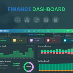
Create effective financial visualizations to provide insights into your organization’s performance.
Key visualizations include:
- Waterfall Charts: Illustrate profit and loss flows.
- Gauge Charts: Track KPIs against targets.
- Matrix Visuals: Offer detailed breakdowns of financial data.
- Card Visualizations: Highlight key financial metrics at a glance.
Sales and Marketing Analytics
Develop compelling sales visualizations to optimize marketing efforts and drive sales.
Effective visuals include:
- Funnel Charts: Analyze sales processes from lead generation to conversion.
- Maps: Visualize geographical sales performance and customer distribution.
- Scatter Plots: Show correlations between sales metrics.
- Decomposition Trees: Analyze root causes of sales performance.
Future Trends in Power BI Visualization
Emerging Technologies
Stay ahead with upcoming visualization trends that leverage new technologies.
Innovations to watch for:
- Augmented Reality Integration: Enhance data visualization experiences with AR.
- Natural Language Processing: Enable users to interact with data using natural language queries.
- Advanced AI Capabilities: Improve predictive analytics and automated insights.
- Real-Time Streaming Visuals: Display live data updates for instant insights.
Industry-Specific Solutions
Adapt visualizations for specific sectors to meet unique needs.
Industry applications include:
- Healthcare Analytics: Visualize patient outcomes and treatment effectiveness.
- Manufacturing Metrics: Track production efficiency and quality factors.
- Retail Performance: Analyze inventory turnover and customer behaviors.
- Education Statistics: Assess student performance and resource allocation.
Troubleshooting Common Issues
Performance Problems
Address common performance challenges that may arise when using Power BI.
Solutions include:
- Optimize DAX Queries: Improve the efficiency of your calculations.
- Manage Memory Usage: Monitor and adjust memory consumption for optimal performance.
- Implement Pagination: Reduce load times by breaking data into manageable pages.
- Use Bookmarks Effectively: Streamline navigation through complex reports.
Visual Design Challenges
Solve common design issues that can hinder effective data presentation.
Common challenges include:
- Color Contrast Problems: Ensure readability with high-contrast color schemes.
- Layout Inconsistencies: Maintain uniformity across visuals for a polished look.
- Mobile Responsiveness: Test visuals on multiple devices to ensure functionality.
- Cross-Browser Compatibility: Ensure visuals work seamlessly across different web browsers.
Conclusion: Mastering Power BI Graphs
Creating effective Power BI graphs requires a combination of technical knowledge, design principles, and business understanding. By following the guidelines and best practices outlined in this article, you can create compelling visualizations that drive better decision-making in your organization.
Remember that the most effective visualizations are those that tell a clear story while maintaining simplicity and user engagement. Continue experimenting with different visualization types and combinations to find what works best for your specific use case.
Engaging Question for Comments
What’s your most challenging visualization problem in Power BI, and how did you solve it? Share your experience with specific graph types or custom visuals that helped you overcome data presentation challenges in your projects.
Have you used any unique combinations of Power BI visuals to solve complex business problems? We’d love to hear about your creative solutions and how they impacted your data storytelling capabilities.


