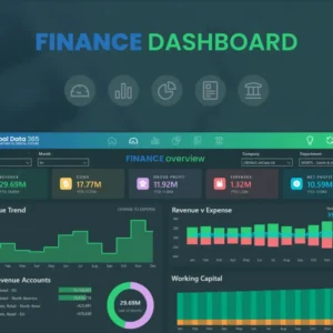
Effective data visualization is essential for making informed business decisions, and Power BI offers a powerful platform to achieve just that. In this comprehensive blog, we will explore the best practices for formatting your Power BI reports to create compelling and insightful visualizations. By following these guidelines, you can enhance the user experience, improve data interpretation, and make your reports stand out.
Consistent and Clean Design
A well-structured report with a consistent design is crucial for creating a professional look. Maintaining a clean layout, using a consistent color scheme, and ensuring alignment throughout the report are fundamental aspects of report formatting. Consistency enhances readability and helps users navigate through the report effortlessly. When users interact with your report, the consistent design elements provide a sense of familiarity, making it more user-friendly.
Meaningful Report Titles
The first impression matters, and that is where meaningful report titles come into play. Start your report with clear and descriptive titles that accurately reflect the report’s content. These titles should convey the essence of the report and provide context to users about the data they are about to explore. Well-thought-out report titles make it easier for users to understand the report’s purpose, objectives, and the data they can expect to encounter.
Legible Fonts and Font Sizes
Legible fonts and font sizes play a crucial role in ensuring that your reports are easily readable. When selecting fonts, prioritize clarity over aesthetics. Stick to a maximum of two font families—one for headings and another for body text—to maintain a cohesive look. Use font sizes that are large enough to be read comfortably, especially for key data points and labels.
Conditional Formatting for Insights
Conditional formatting allows you to highlight critical data points and trends within your visualizations. By applying color scales and data bars based on certain conditions, you can draw attention to significant data variations and patterns. This feature helps users quickly identify trends and outliers, leading to better data analysis and decision-making.
Create Interactive Elements
Power BI’s interactive features enhance user engagement and provide a more dynamic experience for report consumers. Utilize drill-through, slicers, and bookmarks to empower users to explore data on their terms. Interactive reports allow users to dive deeper into specific data points or filter data to focus on relevant information. By making your reports interactive, you encourage users to interact with the data, leading to a deeper understanding of insights.
Data Labels and Tooltips
Adding data labels to your visualizations provides clarity by showing exact values alongside data points. Data labels are particularly useful in bar charts, line charts, and pie charts, where users may need precise information about data points. Tooltips offer additional context and information when users hover over data points, providing more in-depth insights without cluttering the visualizations. Utilizing data labels and tooltips enhances the overall understanding of data and facilitates data-driven decision-making.
Utilize Themes
Power BI offers a wide range of built-in and custom themes that can transform the look and feel of your reports. Themes allow you to apply consistent colors, fonts, and styles to your entire report with a single click. By using themes, you can align your report’s appearance with your brand identity or create visually appealing reports for specific occasions or audiences. Themes offer flexibility and save time when designing and formatting your reports.
Report Page Arrangement
Organizing report pages logically is crucial for creating a coherent flow of information. Start your report with an executive summary or an overview page that provides a high-level view of the data. As users navigate through subsequent pages, ensure that the information is structured logically, leading to deeper insights and understanding. A well-organized report helps users follow the narrative of the data and gain valuable insights from the information presented.
Export Options and Print Layouts Considering how your report will appear when printed or exported is essential, especially when sharing the report in a physical format or with stakeholders who prefer printed versions. Optimize the print layout to ensure that all relevant information is included and that the report remains visually appealing when printed. When exporting reports to other formats, such as PDF or PowerPoint, ensure that the visualizations and formatting retain their quality and clarity.
Accessibility Considerations
Creating reports that are accessible to all users, including those with disabilities, is crucial for ensuring inclusivity. Power BI allows you to design reports that are accessible and comply with accessibility standards. Consider adding alt text for images to describe their content for users who rely on screen readers. Additionally, provide descriptive captions for visualizations to ensure that users with visual impairments can understand the data being presented. Making your reports accessible ensures that all users can interact with and interpret the data, regardless of their abilities.
Testing and Feedback
Before sharing your reports with stakeholders or the broader audience, thoroughly test their functionality and appearance. Verify that all interactive elements work as intended, and that the data is accurately displayed. Seek feedback from colleagues or users to identify areas for improvement and make necessary adjustments. Feedback is invaluable for refining your reports and ensuring that they effectively communicate insights to the target audience.
Conclusion
By implementing these Power BI report formatting best practices, you can create visually compelling and user-friendly reports that effectively communicate data insights. A consistent and clean design, meaningful report titles, and appropriate visualizations contribute to a professional and impactful report. Leveraging interactive elements, optimizing for mobile responsiveness, and utilizing conditional formatting enhance user engagement and enrich the data analysis process. Power BI’s powerful features allow you to design reports that are not only aesthetically pleasing but also highly functional and insightful.


