Introduction to Stacked Bar Charts in Power BI
Stacked bar charts in Power BI are valuable tools for visualizing part-to-whole relationships and comparing multiple data categories. This chart type stacks data series within each bar segment, allowing users to see how individual segments contribute to a total. The stacked bar chart is especially effective in scenarios where categorical or time-based data needs to be presented clearly and concisely, making it ideal for business reports, sales comparisons, and demographic analyses.
In Power BI, stacked bar charts offer unique customization options that empower users to present diverse data types with flexibility. For example, Power BI’s extensive formatting capabilities allow users to color-code segments, adjust data labels, and utilize conditional formatting to highlight significant data points. This makes stacked bar charts versatile and particularly effective when working with complex datasets where multiple categories or time-series data need clear visual differentiation. The chart’s interactive nature in Power BI also enables dynamic filtering, drill-through, and custom tooltips, adding depth to the analysis and allowing users to uncover detailed insights without overwhelming the visualization.
An alternative to the standard stacked bar chart is the 100% stacked bar chart, where each bar represents a 100% total, making it ideal for showing percentage-based contributions. Unlike the standard stacked bar chart, which emphasizes the absolute value of each category, the 100% stacked bar chart focuses on proportional comparisons across categories. This format is beneficial when the primary goal is to understand each segment’s relative contribution rather than the exact count or value.
Overall, Power BI’s stacked bar chart feature is a go-to choice for creating visually impactful representations of data that reveal patterns, trends, and distributions, helping users communicate insights effectively.

When to Use Stacked Bar Charts: Deep Dive
Stacked bar charts are powerful visual tools for revealing part-to-whole relationships and category-specific comparisons across industries. Understanding when and how to leverage these charts can significantly improve data interpretation and communication. Here’s a deeper look into how stacked bar charts excel in specific industries:
Healthcare
In healthcare, stacked bar charts can effectively display demographic data, enabling practitioners and administrators to identify trends and patterns. For example, patient demographics segmented by age group and health conditions provide valuable insights into population health trends. A stacked bar chart can reveal, at a glance, the prevalence of conditions across age groups or the distribution of chronic conditions in different demographics. This is particularly helpful for health policymakers and providers looking to allocate resources effectively, as well as for identifying high-risk groups in need of preventive measures.
Education
Stacked bar charts are equally useful in education, where comparing student performance across various subjects and grade levels can help educators and administrators understand trends and areas needing improvement. For example, a chart that stacks student scores by subject across different grade levels gives a visual summary of performance variations, making it easier to identify trends across grades and subjects. Such insights can guide curriculum development, resource allocation, and targeted support, helping to improve educational outcomes across the board.
Retail
In retail, stacked bar charts are commonly used to analyze product sales across categories and seasons. This is particularly valuable for businesses that experience seasonal demand shifts or that sell multiple product lines. By stacking sales data by category within each season, retailers can identify which products drive revenue during specific times of the year. For example, a retailer might notice that certain apparel categories perform better in winter than summer, helping them adjust inventory and marketing strategies accordingly.
Overall, stacked bar charts offer a robust solution for representing layered data in a way that reveals insights tailored to industry needs, aiding decision-makers in strategic planning and operational adjustments.
Step-by-Step Guide to Creating Stacked Bar Charts in Power BI
Creating stacked bar charts in Power BI requires a well-prepared dataset and attention to key settings to ensure clarity and performance. Here’s a step-by-step guide with a focus on data cleaning, preparation, and optimization tips to help you build effective charts.
Data Cleaning and Preparation
Start by validating your data to ensure accuracy. Data validation techniques include checking for null values, duplicates, and inconsistencies that could distort the chart’s accuracy. For example, if certain categories have missing values, consider filling them with averages or defaults if appropriate. Power BI’s Power Query Editor offers a range of data transformation tools that simplify this process, such as column transformations, filtering, and data type conversions.
To enhance data structure, use Power Query to merge tables or pivot data, which helps create a single dataset containing all relevant fields. If you have multiple tables with shared columns, merging ensures data consistency, while pivoting can reorganize rows and columns for easy visualization. For example, pivoting a product table by category can make it easier to visualize stacked bar charts segmented by product type.
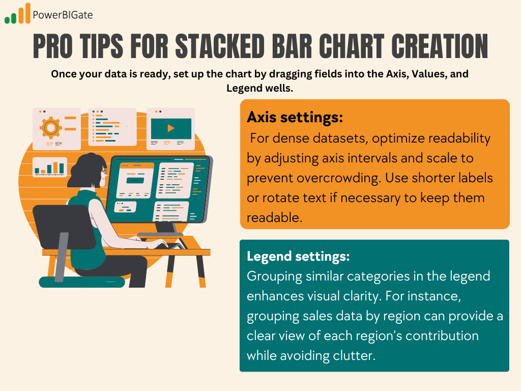
Pro Tips for Stacked Bar Chart Creation
Once your data is ready, set up the chart by dragging fields into the Axis, Values, and Legend wells.
- Axis settings: For dense datasets, optimize readability by adjusting axis intervals and scale to prevent overcrowding. Use shorter labels or rotate text if necessary to keep them readable.
- Legend settings: Grouping similar categories in the legend enhances visual clarity. For instance, grouping sales data by region can provide a clear view of each region’s contribution while avoiding clutter.

Performance Optimization
For large datasets, aggregations and DAX formulas can improve chart responsiveness. For instance, use aggregations to display summary data (like monthly totals) instead of daily details. Additionally, consider using DAX formulas to create calculated columns or measures that simplify complex calculations and improve load times.
By following these preparation and optimization steps, your stacked bar charts in Power BI will be visually clear, easy to navigate, and responsive, ensuring an insightful, high-performance visualization.
Customization Options: Deep Exploration
Customizing your stacked bar chart in Power BI is essential to improve readability, convey meaning effectively, and ensure accessibility for all users. Below are in-depth customization options to make your visualizations impactful and intuitive.
Color Schemes
Choosing an effective color scheme is crucial. Use contrasting colors to differentiate between segments within the stacked bar, ensuring readability, especially when the chart has many categories. For example, assigning green to indicate growth or positive performance and red for declines communicates trends quickly, making it easier for viewers to interpret results. Be mindful of accessibility by selecting colors that are colorblind-friendly; tools like color contrast checkers can help assess your palette. Additionally, Power BI allows you to apply conditional formatting to highlight specific values, such as high and low performers, using gradients or custom color rules.
Format Options
Format settings allow you to enhance chart readability with tools like data labels, axis settings, and label orientation adjustments. Data labels are particularly useful in stacked bar charts with small segments, where the value might otherwise be hard to discern. Power BI’s formatting pane enables you to adjust the font size, color, and positioning of labels, ensuring they don’t overlap or clutter the visualization. You can also adjust label orientation to fit longer labels—angled or horizontal options are helpful for dense datasets, making labels easier to read without sacrificing space.
Axis Modifications
Modifying the axes can significantly improve how data is interpreted, particularly in charts with multiple data points. For instance, adjusting the axis scale to fit a specific range ensures that all relevant data is visible without unnecessary white space. Additionally, adding a secondary axis is helpful when comparing two distinct metrics, such as revenue and percentage growth, within the same chart. Power BI provides options to synchronize axis scales, ensuring that values are comparable across both axes and enhancing the overall chart interpretability.
These customization tips help create clear, accessible, and insightful stacked bar charts that make data interpretation straightforward and actionable.
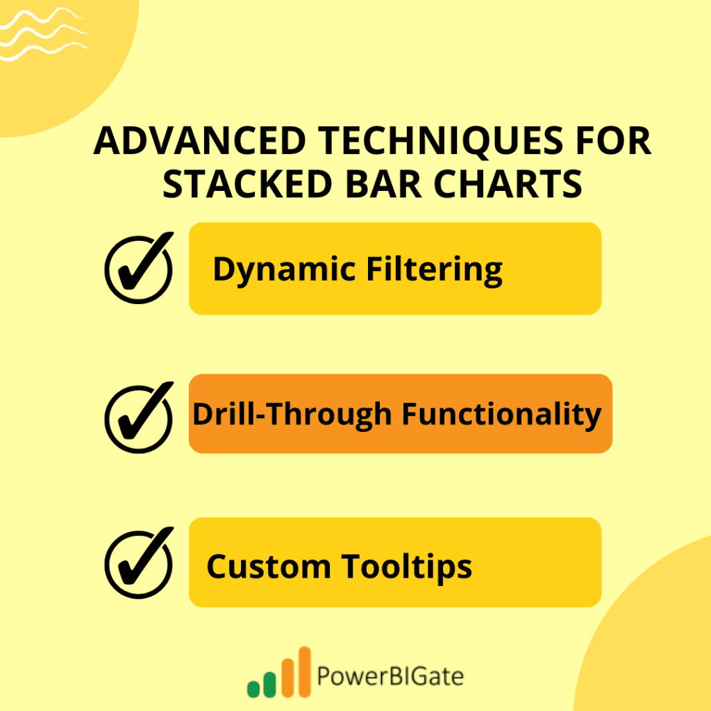
Advanced Techniques for Stacked Bar Charts
Using advanced techniques in stacked bar charts within Power BI can elevate your data storytelling by making it more interactive and informative. Here are three powerful ways to enhance stacked bar charts, providing richer user experiences and deeper insights.
Dynamic Filtering
Dynamic filtering allows users to focus on specific data segments or timeframes, creating a more customized view of the stacked bar chart. By linking filters with slicers and bookmarks, you can provide seamless navigation and data exploration. For example, you might add a slicer that filters by region or department, enabling users to view only relevant data. Bookmarks can be used to save specific filtered states of the chart, allowing users to quickly switch between views with different criteria—such as comparing monthly versus quarterly sales. This interactive approach not only streamlines data exploration but also makes it more engaging for users who need to toggle between various perspectives within the same dashboard.
Drill-Through Functionality
Drill-through functionality takes the stacked bar chart to another level by providing detailed insights on demand. For instance, if you’re analyzing total sales by region, enabling drill-through allows users to click on a specific region and see a deeper breakdown, such as sales performance by individual stores or product lines within that region. In a corporate setting, this could mean clicking on a department bar to see an employee-wise contribution to overall sales. This approach helps avoid overwhelming viewers with excessive details on the main chart, instead giving them the option to explore specifics as needed.
Custom Tooltips
Custom tooltips in Power BI offer another layer of insight directly on hover, helping users understand trends without leaving the visualization. Instead of simple data points, you can design tooltips with embedded mini-charts, icons, or trend arrows to indicate performance directions. For instance, a tooltip showing a trend arrow (up for growth, down for decline) or a small line chart visualizing monthly sales trends can give users context without needing separate visuals. Adding relevant icons or images—such as product thumbnails in a retail analysis—further personalizes the tooltip, making it a richer source of information at a glance.
Together, these advanced techniques make stacked bar charts in Power BI a versatile tool, enhancing user interaction, delivering depth, and turning data into actionable insights.

Best Practices for Stacked Bar Charts
Following best practices when creating stacked bar charts in Power BI ensures clarity, accessibility, and a positive user experience. Here’s how to enhance each aspect for maximum impact:
· Data Organization
Organizing categories in a logical order, such as alphabetically or by size (ascending or descending), can help users interpret data more efficiently. For instance, if a chart displays revenue by product line, arranging categories by sales volume provides a quick visual of top-performing products, making trends easier to spot. Alternatively, alphabetical ordering is useful when users need to locate specific categories quickly, such as regional performance by state.
· Labeling and Tooltips
Effective labeling and tooltips contribute to better readability and usability. Label placement is crucial; avoid overlapping labels by positioning them either above or within segments, depending on size. For accessibility, ensure labels are clear and high-contrast, supporting users with visual impairments. When configuring tooltips, provide essential context—such as percentages, trends, or related metrics—without overcrowding. For example, a tooltip showing each segment’s contribution percentage and an up/down trend arrow adds valuable detail while remaining visually simple.
These practices create a structured, informative stacked bar chart that not only looks professional but also guides viewers intuitively through the data.
Common Mistakes to Avoid
· Overcrowding: Overcrowded stacked bar charts with too many categories can become unreadable.
Tip: Simplify charts by focusing on top categories or summarizing data. For instance, in sales data, you might display only the top-performing products, consolidating smaller categories into an “Others” section to keep the visualization clean.
· Color Mistakes: Poor color contrast makes data hard to interpret and inaccessible to colorblind viewers.
Tip: Use contrasting colors and tools like color blindness simulators (e.g., Coblis) to test accessibility. Colors should be distinct; for instance, use blue and orange for categories instead of similar shades, and apply colors meaningfully (e.g., green for growth, red for decline).
· Misleading Scales: Starting scales at arbitrary points or using inconsistent intervals can distort data interpretation.
Tip: Use zero as a baseline for part-to-whole comparisons unless there’s a strong reason otherwise. For interval adjustments, make increments logical and ensure they reflect the data accurately to avoid skewing perceptions.
Advanced Features and Techniques
- Conditional Formatting: Use colors to emphasize data trends and alerts.
Scenario: In a sales dashboard, conditional formatting can flag categories falling below a certain sales threshold, while positive growth might use green. This makes it easy to spot underperforming areas without additional calculations.
- Bookmarks and Selections: Bookmarks allow users to save specific views, which is especially helpful in complex reports.
Scenario: For a user-specific dashboard, bookmarks can save filtered views for individual regions or departments, enabling quick switching between perspectives and reducing the need to adjust settings manually.
Troubleshooting Common Issues
- Optimizing DAX Calculations: Inefficient DAX formulas can slow down reports, particularly with complex datasets.
Tip: Use simplified, optimized formulas (e.g., CALCULATE with basic aggregations) and avoid repetitive calculations across visuals by using calculated columns and measures efficiently. Reducing formula complexity improves load time.
- Data Volume Management: Large datasets can overwhelm visuals, leading to delays and reduced interactivity.
Tip: Use aggregations to display high-level summaries, such as quarterly or annual figures, and limit interaction points within charts. This approach keeps the data manageable while preserving the chart’s effectiveness.
Integration with Other Visualizations
- Complementary Visuals: Pairing stacked bar charts with other visuals enhances the overall interpretability of dashboards.
Example: Pair a stacked bar chart showing regional sales with a line chart tracking total sales over time. Adding KPIs for key metrics like revenue growth provides high-level insights alongside the granular breakdown in the stacked bar chart.
- Interactive Elements: Cross-filtering and drill-throughs make data exploration dynamic and engaging.
Scenario: For an executive dashboard, cross-filtering allows viewers to click on a specific product category in a stacked bar chart, which then updates other visuals, such as line charts and maps, offering a holistic view of that category’s performance across different dimensions.
Real-World Applications
- Sales Analysis: Stacked bar charts allow sales teams to segment performance data by product, region, or time.
Insight: Breaking down sales by category and region, for example, can reveal geographic patterns, helping to identify which areas might need targeted campaigns or which products are region-specific hits.
- Project Management: Project managers use stacked bar charts to allocate resources or monitor phase-wise progress.
Insight: Tracking resources (e.g., labor hours) across project phases or milestones allows stakeholders to spot potential bottlenecks, balance workloads, and keep projects on track without overloading any single phase.
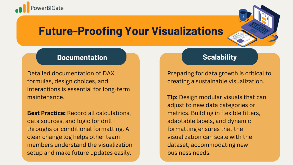
Future-Proofing Your Visualizations
- Documentation: Detailed documentation of DAX formulas, design choices, and interactions is essential for long-term maintenance.
Best Practice: Record all calculations, data sources, and logic for drill – throughs or conditional formatting. A clear change log helps other team members understand the visualization setup and make future updates easily.
- Scalability: Preparing for data growth is critical to creating a sustainable visualization.
Tip: Design modular visuals that can adjust to new data categories or metrics. Building in flexible filters, adaptable labels, and dynamic formatting ensures that the visualization can scale with the dataset, accommodating new business needs.

Conclusion and Discussion
Stacked bar charts are a versatile tool in data analysis, capable of displaying complex relationships in an accessible and visually appealing format. Their ability to show part-to-whole relationships, combined with advanced Power BI features, makes them indispensable for business reporting. By following best practices and advanced techniques, users can create insightful, scalable, and interactive visualizations that drive impactful decisions.
Discussion: We invite you to share your experiences! What challenges have you faced in using stacked bar charts, and what solutions have you discovered? Have you found innovative ways to leverage stacked bar charts that others could benefit from?
