In today’s rapidly evolving business landscape, the ability to visualize and analyze data over time is a critical skill. As companies embrace data-driven decision-making, tools that allow for in-depth exploration of temporal trends are increasingly valuable. Microsoft Power BI, a leading platform for business intelligence and analytics, offers a wide range of features for visualizing data, and one of the most powerful of these is the Power BI Timeline. This versatile visualization tool allows users to display data in a chronological format, making it easier to identify trends, understand historical context, and even forecast future developments.
In this comprehensive guide, we will delve into everything you need to know about Power BI Timeline—from the basics of setting it up to advanced techniques for customizing and enhancing your data storytelling. Whether you are new to Power BI or an experienced user looking to master timelines, this guide will provide you with actionable insights and practical tips to unlock the full potential of this visualization tool.
The Importance of Time-Based Visualizations
Before diving into the technical details of Power BI Timeline, it’s essential to understand why time-based visualizations are so critical in modern data analysis. Temporal data provides the backbone for many types of analysis, allowing us to track changes, understand historical trends, and even make predictions about future outcomes.
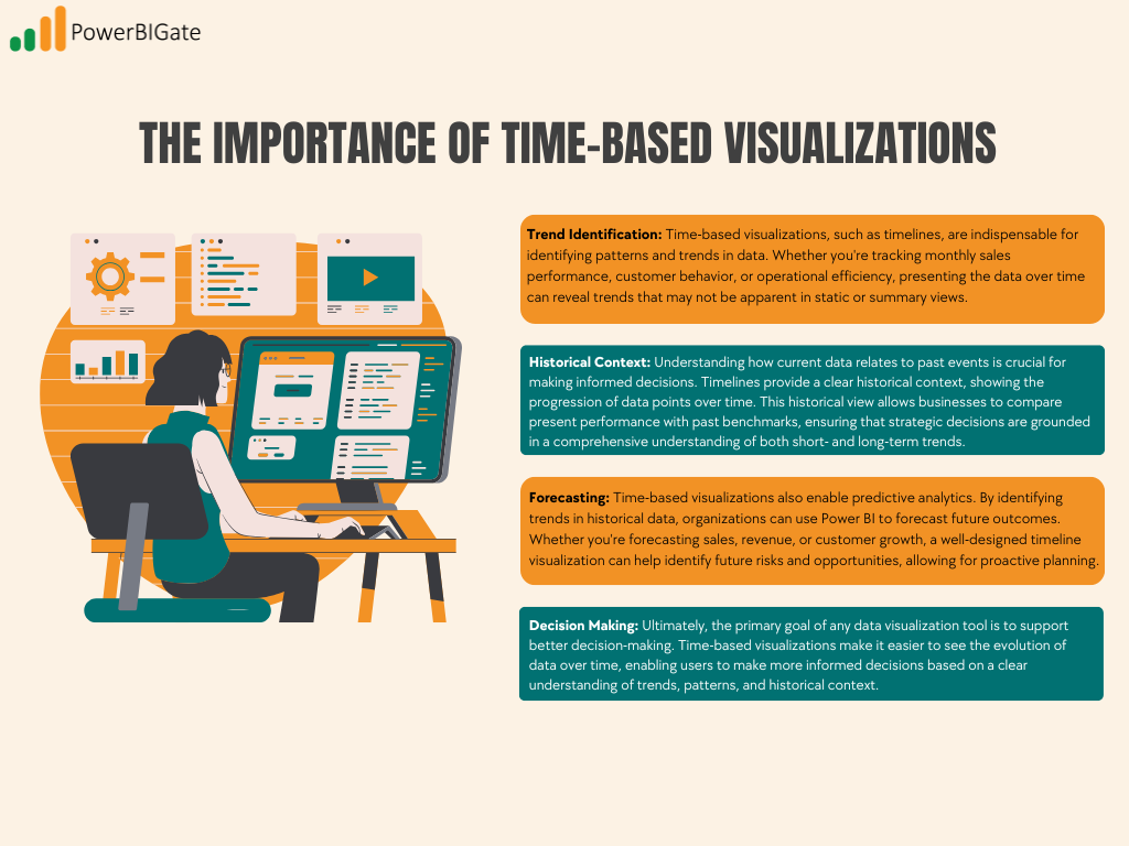
Trend Identification
Time-based visualizations, such as timelines, are indispensable for identifying patterns and trends in data. Whether you’re tracking monthly sales performance, customer behavior, or operational efficiency, presenting the data over time can reveal trends that may not be apparent in static or summary views. For example, a line chart or timeline might show a seasonal dip in sales, which could prompt further investigation and ultimately lead to strategic adjustments in marketing or staffing.
Historical Context
Understanding how current data relates to past events is crucial for making informed decisions. Timelines provide a clear historical context, showing the progression of data points over time. This historical view allows businesses to compare present performance with past benchmarks, ensuring that strategic decisions are grounded in a comprehensive understanding of both short- and long-term trends.
Forecasting
Time-based visualizations also enable predictive analytics. By identifying trends in historical data, organizations can use Power BI to forecast future outcomes. Whether you’re forecasting sales, revenue, or customer growth, a well-designed timeline visualization can help identify future risks and opportunities, allowing for proactive planning.
Decision Making
Ultimately, the primary goal of any data visualization tool is to support better decision-making. Time-based visualizations make it easier to see the evolution of data over time, enabling users to make more informed decisions based on a clear understanding of trends, patterns, and historical context. Whether you’re analyzing financial performance, operational metrics, or customer behavior, the Power BI Timeline can help transform raw data into actionable insights.

Getting Started with Power BI Timeline
If you’re ready to start using Power BI Timeline, the first step is to ensure that you have Power BI Desktop installed on your computer. If you haven’t already done so, download it from the official Microsoft website. Power BI Desktop is free to use and provides all the tools you need to create compelling time-based visualizations.
Once you have Power BI Desktop installed, follow these simple steps to create your first timeline visualization:
- Launch Power BI Desktop and load your dataset. You can import data from various sources such as Excel, SQL databases, and cloud services like Azure.
- Navigate to the Visualizations pane on the right side of the screen.
- Look for the Timeline icon, which resembles a horizontal line with dots marking time intervals.
- Click on the Timeline icon to add it to your report canvas. Once the timeline visualization is added, you can begin customizing it to fit your needs.
With these simple steps, you’ve laid the foundation for creating compelling time-based visualizations. Next, we’ll explore how to configure and customize your timeline for maximum impact.
Configuring Your Timeline: The Basics
After setting up the basic timeline visualization, the next step is to configure it with data. In Power BI, configuring a timeline is as simple as dragging and dropping the relevant fields into the right areas.
Step 1: Populating the Timeline with Data
To make your timeline meaningful, you need to populate it with a date field and the data you want to track over time. Here’s how:
- Drag your date/time field from the Fields pane to the “Date” section in the visual’s data configuration.
- Add a measure or value (e.g., sales, customer count, revenue) to the “Values” section. This will represent the data you want to visualize over time.
Step 2: Choosing the Right Date Granularity
Power BI offers flexibility when it comes to the granularity of your timeline. You can switch between years, quarters, months, or even days, depending on the level of detail you need. For example, if you’re analyzing long-term trends, you might use yearly or quarterly data, while short-term trends may require daily or weekly granularity. Here’s how you can adjust the date granularity:
- Click on the timeline visualization to select it.
- Navigate to the Format pane on the right side.
- Find the “Date Granularity” option and choose the appropriate level (e.g., year, quarter, month, day).
The key to an effective timeline is choosing the right level of detail to match your data analysis needs. Too much granularity can lead to cluttered visuals, while too little granularity may obscure important trends.
Step 3: Customizing the Timeline’s Appearance
You can further customize the appearance of your timeline using the Format pane. Power BI allows you to adjust colors, fonts, labels, and other visual elements to align with your brand or report theme. Here are a few customization options to consider:
- Colors: Choose a color palette that makes the data easy to read and aligns with your brand.
- Fonts: Adjust font sizes and styles to ensure that labels and data points are legible.
- Axis Labels: Customize the x- and y-axis labels to provide clarity on the data being presented.
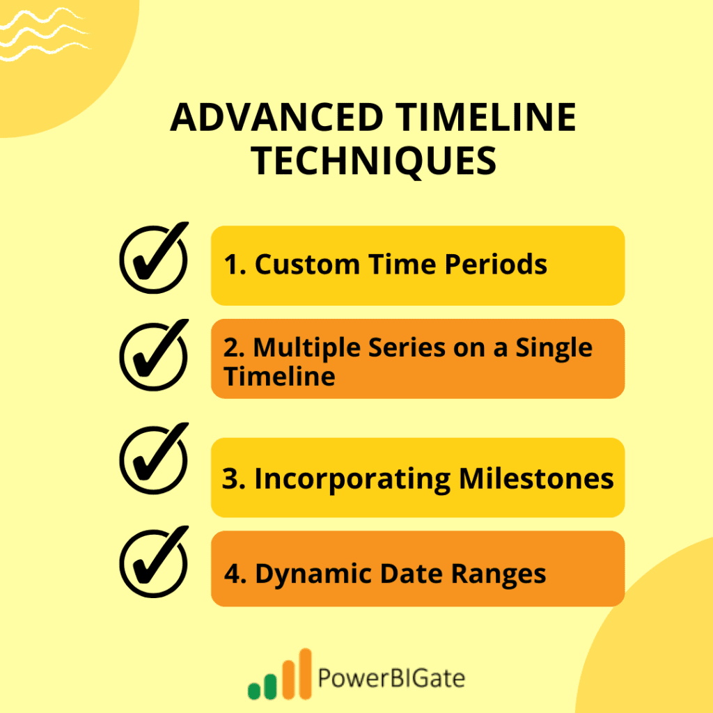
Advanced Timeline Techniques
Now that you understand the basics of Power BI Timeline, let’s explore some advanced techniques that can help you take your visualizations to the next level.
Custom Time Periods
Sometimes, the standard time intervals provided by Power BI don’t quite fit the needs of your analysis. In such cases, you can create custom time periods using DAX (Data Analysis Expressions), Power BI’s formula language. Here’s how:
- Go to the Modeling tab in Power BI.
- Click on “New Table” and use DAX to define your custom periods (e.g., fiscal years, custom weeks, project phases).
- Use these custom periods in your timeline to create a more tailored view that aligns with your business needs.
Custom time periods allow you to present data in a way that makes sense for your organization, making your timelines more relevant and actionable.
Multiple Series on a Single Timeline
One of the most powerful features of Power BI Timeline is the ability to compare multiple data series on a single timeline. For example, you might want to compare sales and profit over time, or track customer growth alongside website traffic. Here’s how you can add multiple series to your timeline:
- Drag additional measures or values (e.g., profit, customer count) into the “Values” section of the timeline.
- Use the Format pane to customize the appearance of each series. You can adjust colors, line styles, and data point markers to differentiate between the series.
For example, you might use a line chart to track sales and a column chart to track profit on the same timeline, creating a more informative and visually striking comparison.
Incorporating Milestones
Milestones can add valuable context to your timeline by highlighting significant events, such as product launches, regulatory changes, or marketing campaigns. To incorporate milestones into your timeline:
- Create a separate table in your dataset for milestone data (e.g., dates of key events).
- Use scatter plot visuals to overlay milestone markers on your timeline.
- Format these points using icons, distinct colors, or annotations to make them stand out.
Milestones are particularly useful for providing context to the data you’re presenting, helping your audience understand how external factors might have influenced the trends.
Dynamic Date Ranges
Power BI allows users to interact with timelines by adjusting the date range dynamically. This can be done using slicers, bookmarks, or buttons, making your timeline more interactive and user-friendly. Here’s how:
- Add a Date Slicer to your report to allow users to filter the timeline based on a selected range.
- Create Bookmarks for specific time periods (e.g., last quarter, last year) that users can navigate to with a click.
- Add Buttons to your report to allow users to switch between different date ranges (e.g., daily, monthly, yearly).
Dynamic date ranges make your timeline more flexible, allowing users to explore the data at their own pace and focus on the time periods most relevant to them.

Enhancing Readability and Impact
A well-designed timeline not only presents data accurately but also tells a compelling story. Here are some tips to enhance the readability and visual impact of your Power BI Timeline:
Thoughtful Color Schemes
Colors play a critical role in data visualization, helping to differentiate between data points and draw attention to key trends. Here are some best practices for choosing a color scheme:
- Consistency: Use a consistent color scheme across your report to create a cohesive look.
- Contrast: Use contrasting colors to differentiate between multiple data series or highlight important points.
- Accessibility: Consider color-blind friendly palettes to ensure that your timeline is accessible to all users.
Clear Labeling and Annotations
Labels and annotations provide essential context, guiding your audience through the data. Here are some tips for effective labeling:
- Axis Labels: Make sure both the x- and y-axes are clearly labeled, providing context for the data being displayed.
- Data Labels: Use data labels strategically to highlight key values without cluttering the visualization.
- Text Boxes: Consider adding text boxes or annotations to explain significant trends, events, or outliers in the data.
Responsive Design
As more users access Power BI reports on mobile devices, it’s crucial to ensure that your timeline visualizations are responsive. Power BI allows you to customize the layout of your reports for different screen sizes. Here are some tips for responsive design:
- Test on multiple devices: Use the “View” menu to see how your timeline looks on different screen sizes, including mobile.
- Adjust visual size: Ensure that your timeline remains legible on smaller screens by adjusting the size of fonts, labels, and data points.
- Consider mobile-specific versions: For very complex timelines, consider creating a simplified version optimized for mobile devices.
Integrating Power BI Timeline with Other Visualizations
While timelines are powerful on their own, their full potential is realized when combined with other Power BI visualizations. By integrating timelines with complementary visuals, you can create a more interactive and engaging data experience.
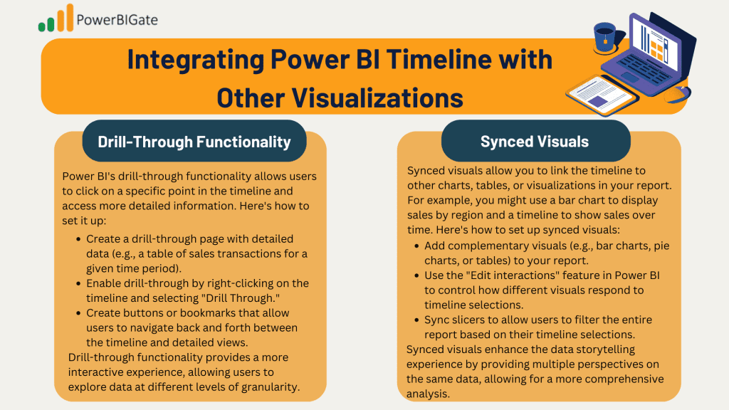
Drill-Through Functionality
Power BI’s drill-through functionality allows users to click on a specific point in the timeline and access more detailed information. Here’s how to set it up:
- Create a drill-through page with detailed data (e.g., a table of sales transactions for a given time period).
- Enable drill-through by right-clicking on the timeline and selecting “Drill Through.”
- Create buttons or bookmarks that allow users to navigate back and forth between the timeline and detailed views.
Drill-through functionality provides a more interactive experience, allowing users to explore data at different levels of granularity.
Synced Visuals
Synced visuals allow you to link the timeline to other charts, tables, or visualizations in your report. For example, you might use a bar chart to display sales by region and a timeline to show sales over time. Here’s how to set up synced visuals:
- Add complementary visuals (e.g., bar charts, pie charts, or tables) to your report.
- Use the “Edit interactions” feature in Power BI to control how different visuals respond to timeline selections.
- Sync slicers to allow users to filter the entire report based on their timeline selections.
Synced visuals enhance the data storytelling experience by providing multiple perspectives on the same data, allowing for a more comprehensive analysis.

Power BI Timeline Best Practices
To ensure that you’re getting the most out of your Power BI Timeline, it’s important to follow best practices. From data preparation to performance optimization, these tips will help you create timelines that are both informative and efficient.
Data Preparation
Clean and well-structured data is the foundation of any effective visualization. Before creating your timeline, ensure that your data is properly formatted and free of errors. Here are some tips for data preparation:
- Date Fields: Ensure that your date fields are properly formatted and contain no missing or incorrect values.
- Aggregation: Consider aggregating data to a higher level (e.g., monthly or quarterly) for clearer trends, especially when dealing with large datasets.
- Outliers: Address any outliers or anomalies in your data that could skew the timeline.
Performance Optimization
Large datasets can slow down your Power BI report, especially when working with time-based visualizations. Here are some tips for optimizing the performance of your timeline:
- Aggregations: Use aggregated data (e.g., monthly totals) rather than raw data to reduce the load on your report.
- Incremental Refresh: For very large datasets, use Power BI’s incremental refresh feature to keep your data up-to-date without requiring a full reload.
- DirectQuery: While DirectQuery can be useful for real-time data, it can impact performance when used with time-based visualizations. Use it sparingly or consider alternatives.
Regular Updates and Maintenance
To keep your timeline relevant and accurate, it’s important to schedule regular updates and maintenance. Here are some tips for keeping your timeline up-to-date:
- Data Refreshes: Schedule regular data refreshes to ensure that your timeline reflects the most current information.
- Design Review: Periodically review your timeline design to ensure that it still meets your analytical needs and incorporates any new Power BI features.
- Stay Informed: Stay up-to-date with Power BI updates and new features, as Microsoft frequently introduces improvements to timeline functionality.
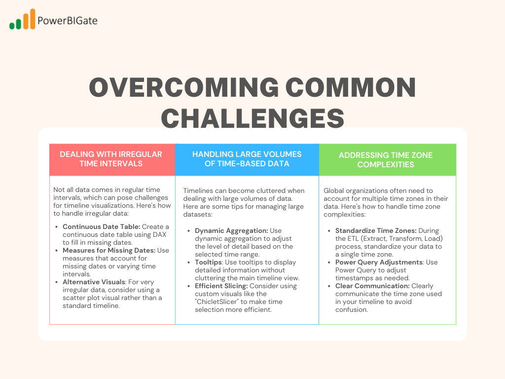
Overcoming Common Challenges
Even experienced Power BI users can encounter challenges when working with timelines. Here are some common issues and their solutions:
Dealing with Irregular Time Intervals
Not all data comes in regular time intervals, which can pose challenges for timeline visualizations. Here’s how to handle irregular data:
- Continuous Date Table: Create a continuous date table using DAX to fill in missing dates.
- Measures for Missing Dates: Use measures that account for missing dates or varying time intervals.
- Alternative Visuals: For very irregular data, consider using a scatter plot visual rather than a standard timeline.
Handling Large Volumes of Time-Based Data
Timelines can become cluttered when dealing with large volumes of data. Here are some tips for managing large datasets:
- Dynamic Aggregation: Use dynamic aggregation to adjust the level of detail based on the selected time range.
- Tooltips: Use tooltips to display detailed information without cluttering the main timeline view.
- Efficient Slicing: Consider using custom visuals like the “ChicletSlicer” to make time selection more efficient.
Addressing Time Zone Complexities
Global organizations often need to account for multiple time zones in their data. Here’s how to handle time zone complexities:
- Standardize Time Zones: During the ETL (Extract, Transform, Load) process, standardize your data to a single time zone.
- Power Query Adjustments: Use Power Query to adjust timestamps as needed.
- Clear Communication: Clearly communicate the time zone used in your timeline to avoid confusion.

Future Trends in Power BI Timeline Visualization
As data visualization continues to evolve, so too will the capabilities of Power BI Timeline. Here are some trends to watch for in the coming years:
AI-Powered Insights
Expect to see more AI integration in timeline analysis. Here are some AI-driven features that could become more prevalent:
- Anomaly Detection: AI can automatically detect and highlight unusual patterns or outliers in your timeline.
- Predictive Analytics: Power BI is likely to enhance its forecasting capabilities, allowing users to generate predictions directly within the timeline visual.
- Natural Language Queries: As natural language processing (NLP) becomes more advanced, users will be able to query timeline data conversationally, making it easier to extract insights without complex DAX formulas.
Enhanced Interactivity
As users demand more interactive experiences, expect timelines to become even more dynamic:
- Gesture-Based Controls: For touch-enabled devices, gesture-based controls could allow users to manipulate timelines more intuitively.
- VR and AR Integration: Imagine exploring time-based data in a virtual or augmented reality environment, where you can “walk” through time and interact with data points in 3D space.
- Real-Time Collaboration: Future timelines may offer real-time collaboration tools, allowing teams to analyze time-based data together, even when working remotely.
Customization and Extensibility
Customization options for Power BI Timeline are likely to expand as well, offering even greater flexibility:
- Custom Visuals: Expect more custom visuals tailored specifically for time-based data, offering new ways to display and interact with temporal data.
- Advanced DAX Functions: Power BI’s DAX language will likely continue to evolve, providing more advanced functions for time-based calculations.
- External Data Sources: Greater integration with external data sources will allow for richer contextual timelines, incorporating news, social media, and other real-time data feeds.
Conclusion: Harnessing the Full Potential of Power BI Timeline
Power BI Timeline is not just a tool for visualizing data over time—it’s a powerful way to uncover insights, tell compelling data stories, and drive informed decision-making. By mastering the techniques and best practices outlined in this guide, you will be well-equipped to create timelines that are both visually striking and analytically rich.
As you continue to work with Power BI Timeline, keep experimenting with new approaches and features. Stay curious about the evolving capabilities of the platform, and always keep your audience’s needs in mind. Whether you’re tracking sales trends, monitoring project progress, or analyzing historical patterns, Power BI Timeline offers the flexibility and power to transform your time-based data into actionable insights.
Thoughtful Question for Users:
How has incorporating Power BI Timeline into your data analysis workflow changed the way you understand and present temporal trends in your organization? Share your experiences and any unique ways you’ve used this feature to uncover insights or drive decision-making.
By following the guidance provided in this comprehensive guide, you will unlock the full potential of Power BI Timeline, turning your temporal data into a valuable resource for decision-making and storytelling.
