
Understanding KPI Dashboards and Their Significance
Key Performance Indicators (KPIs) are quantifiable metrics used to evaluate the success of an individual, department, or organization in achieving their goals. KPI dashboards are visual displays that present these metrics in a concise and easily digestible manner. They provide a snapshot of performance, enabling users to quickly assess progress, identify trends, and make data-driven decisions.The significance of KPI dashboards lies in their ability to:
- Focus on Key Metrics: Dashboards highlight the most critical success factors, ensuring attention is directed to areas with the highest impact.
- Visualize Data: Visual representations, such as charts and graphs, make complex data easier to understand and interpret.
- Monitor Performance: Dashboards provide real-time or near-real-time data, allowing for prompt identification of issues or successes.
- Drive Action: By presenting data in a digestible format, dashboards facilitate timely and informed decision-making.
- Align Strategies: KPIs ensure that efforts are aligned with organizational goals, promoting a unified direction.
- Improve Communication: Dashboards provide a common language for discussing performance, enhancing collaboration.
- Motivate Teams: Visualizing progress and achievements can motivate teams to strive for better results.
Defining Effective KPIs for Your Dashboard
Before creating your dashboard, it’s crucial to identify the right KPIs. Effective KPIs are:
- Specific: Clearly defined and focused on a particular aspect of performance.
- Measurable: Quantifiable and based on objective data.
- Actionable: Influenced by actions or decisions within the organization.
- Relevant: Aligned with organizational goals and strategies.
- Timely: Based on recent data, allowing for prompt action.
Here are some examples of effective KPIs:
- Sales Growth: Percentage increase in sales revenue over a defined period.
- Customer Satisfaction Score: Average rating from customer feedback surveys.
- Website Engagement: Bounce rate or average time spent on the website.
- Production Efficiency: Ratio of units produced to the standard production capacity.
- Employee Retention: Percentage of employees who remain with the company over a period.
Designing a Compelling KPI Dashboard in Power BI
Now, let’s walk through the process of creating a compelling KPI dashboard in Power BI:
- Identify Audience: First, consider the dashboard’s intended audience. Different stakeholders may have varying information needs.
- Select KPIs: Choose 5-10 KPIs that are critical to your audience. Too many KPIs can overwhelm users.
- Set Targets: Define targets or goals for each KPI. This provides context and helps assess performance.
- Choose Visuals: Select appropriate visual representations for each KPI. For instance, use a speedometer for progress toward a target or a trend line for changes over time.
- Layout and Design: Arrange visuals on the dashboard with a logical flow. Ensure a balanced layout that guides the user’s eye.
- Use Color Effectively: Colors can help highlight performance levels. Green for on-target, yellow for close to target, and red for off-target.
- Include Context: Provide labels, titles, and units to ensure users understand the data.
- Relevance and Timeliness: Ensure data is up-to-date and relevant to the audience’s needs.
- Less is More: Avoid cluttering the dashboard. Focus on the most critical information.
- Mobile Optimization: Consider how the dashboard will look on mobile devices, ensuring responsiveness.
Enhancing Your KPI Dashboard with Interactive Features
Power BI offers interactive features to engage users and provide deeper insights:
- Slicers and Filters: Allow users to filter data by specific dimensions, such as date ranges or departments.
- Drill Down: Enable users to explore data at different levels of granularity.
- Tooltips: Provide additional information on data points when users hover over visuals.
- Cross-Highlighting: Sync visuals so that selecting data in one visual highlights related data in others.
- Bookmarks: Let users save specific views or states of the dashboard for quick reference.
- What-If Scenarios: Allow users to input variables and see potential outcomes.
- Custom Visuals: Create unique visuals tailored to your KPIs, ensuring they stand out and convey information effectively.
Best Practices and Tips for Successful KPI Dashboards
To ensure your KPI dashboard is effective and engaging:
- Keep It Simple: Use plain language and avoid jargon. Ensure the dashboard is easy to understand at a glance.
- Visual Consistency: Maintain a consistent visual style, color scheme, and font throughout.
- Dynamic Data: Update data regularly to ensure the dashboard reflects the latest information.
- Size Matters: Adjust visual sizes based on the importance of the KPI. Highlight critical metrics with larger visuals.
- Clear Labels: Provide clear and concise labels for each visual, ensuring users understand the context.
- Mobile Optimization: Optimize for mobile devices, as users may access the dashboard on the go.
- Test and Refine: Regularly solicit feedback from users and iterate on the dashboard design.
- Storytelling: Arrange visuals in a logical flow, guiding users through a narrative that provides insights.
- Data Accuracy: Ensure data is accurate and reliable, as dashboards are only as good as the data they display.
- Security and Privacy: Protect sensitive data and ensure dashboard access is restricted to authorized users.
Case Study: Sales Performance KPI Dashboard
Let’s apply these concepts to a case study of a sales team using Power BI to track their performance.
Background
ABC Corp. is a B2B sales organization with a global presence. They use Power BI to monitor sales performance and drive strategic decisions.
Goals
- Track sales performance against quarterly targets.
- Identify top-performing sales regions and products.
- Monitor customer satisfaction and its impact on sales.
- Provide actionable insights to sales managers for strategy adjustments.
Dashboard Design
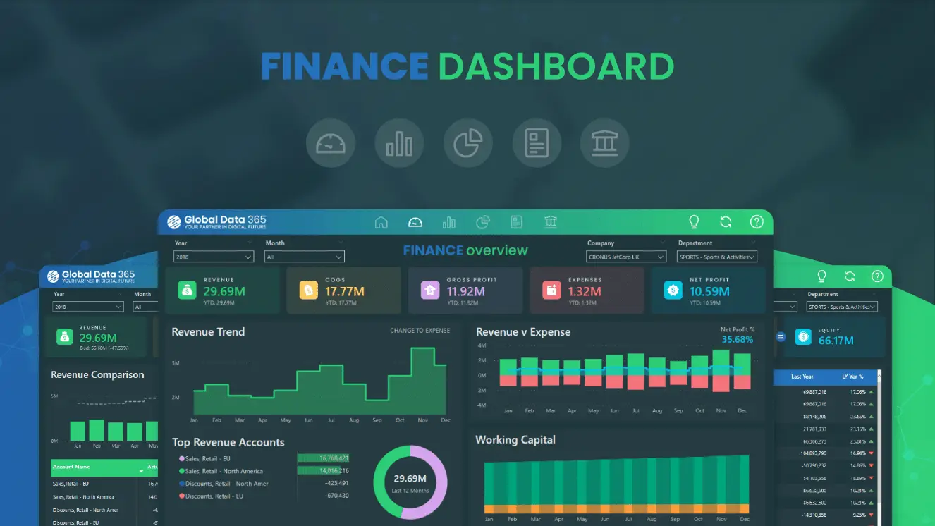
- Sales Performance: A speedometer visual shows progress toward the quarterly sales target, with a trend line for context.
- Regional Breakdown: A filled map highlights sales by region, with a treemap showing the top-selling products in each region.
- Customer Satisfaction: A gauge visual indicates the average customer satisfaction score, with a line chart showing the correlation between sales and satisfaction over time.
- Product Performance: A bar chart displays the top-selling products, with filters for regions and time periods.
- Sales Team Performance: A table visual ranks sales reps by performance, with drill-down functionality to explore individual rep achievements.
Outcomes
By implementing the KPI dashboard:
- Sales managers can quickly identify regions or products that require additional support, leading to more targeted strategies.
- The correlation between customer satisfaction and sales is visualized, emphasizing the need to maintain high satisfaction levels.
- With real-time data, managers can react promptly to market changes, adjust strategies, and provide timely guidance to their teams.
- The dashboard fosters a culture of data-driven decision-making, improving the efficiency and effectiveness of the sales organization.
Conclusion and Next Steps
In this article, we’ve demystified the process of creating KPI dashboards in Power BI. You should now feel equipped to design informative and visually compelling dashboards that provide valuable insights. As you continue on your Power BI journey, here are some questions to consider:
- How can organizations ensure their KPI dashboards drive action and impact decision-making?
- What strategies can be employed to maintain data accuracy and security while keeping dashboards dynamic and up-to-date?
- In what ways can storytelling techniques be incorporated into KPI dashboards to enhance user engagement?
- How might organizations use KPI dashboards to align strategic goals across different departments?
- Are there any challenges or limitations to using KPI dashboards, and how can they be addressed?
I encourage you to share your thoughts, experiences, and insights in the comments below. Let’s continue the conversation and explore the power of KPI dashboards further!