Introduction
In today’s data-rich business environment, effective communication of insights is key to success. Microsoft Power BI offers a compelling platform that not only provides robust data analysis tools but also enables users to create stunning and informative data visualizations. With its extensive suite of visual capabilities, Power BI ensures that data stories are presented in an engaging, accessible, and impactful manner. So, let’s embark on a visual journey through the world of Power BI data visualization!
The Rise of Data Visualization
Before delving into the specifics of Power BI, let’s understand the broader context of data visualization and why it has become an indispensable tool in modern business. Data visualization is a powerful art that transforms raw, complex data into meaningful and accessible information. It leverages our innate ability to interpret visual cues, making it easier to identify patterns, trends, and outliers that might otherwise remain hidden.
The explosion of data in recent years, driven by advancements in technology and an increasingly digital world, has fueled the demand for effective data visualization techniques. Businesses now recognize the critical role data plays in strategic decision-making, and thus, they seek tools like Power BI to help them make sense of the vast information at their disposal.
Power BI: A Comprehensive Solution
Microsoft Power BI is a leading business intelligence platform that offers an extensive set of data visualization tools alongside robust data analytics and reporting capabilities. With Power BI, organizations can connect to hundreds of data sources, model and transform data, and then visualize it in a myriad of ways. One of the key strengths of Power BI is its flexibility and ease of use. The platform caters to a diverse range of users, from data analysts and scientists to business users with little technical expertise. This accessibility is a driving force behind Power BI’s widespread adoption, empowering individuals and teams to unlock the power of their data.
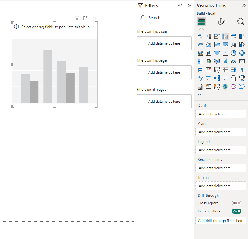
Visualizing Data with Power BI
Now, let’s explore the process of creating charts, graphs, and other captivating visuals in Power BI. The platform offers a rich library of visual elements, enabling users to craft compelling data stories that resonate with their audience.
Getting Started: Choosing Your Visualization
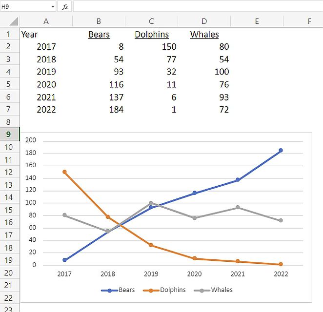
The first step in your data visualization journey is selecting the most appropriate visual element for your data. Power BI offers a vast array of options, including traditional charts and graphs as well as more specialized visuals. Take, for instance, the commonly used line chart. This visual is ideal for displaying trends and changes in data over time.
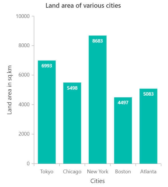
On the other hand, a bar chart might be more suitable for comparing discrete categories.
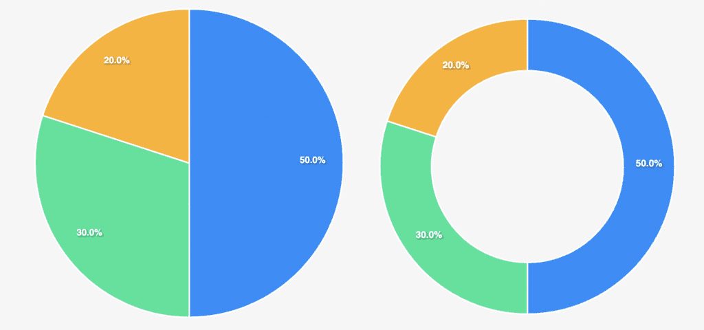
For part-to-whole relationships, a pie chart or donut chart can effectively convey proportions.
Power BI also offers more advanced visuals, such as treemaps for hierarchical data and scatter plots for identifying relationships between variables. The choice of visualization depends on the nature of your data and the message you aim to convey.
Connecting Your Data
The beauty of Power BI lies in its ability to connect to a multitude of data sources. Whether your data resides in Excel spreadsheets, on-premises databases, or cloud-based services like Microsoft Dynamics or Salesforce, Power BI can seamlessly integrate and bring your data together. The platform supports live connections, allowing your visuals to reflect real-time data updates. This ensures that your dashboards and reports are always current, providing accurate insights to users.
Customizing Your Chart Design
Once you’ve selected your visualization type and connected your data, it’s time to customize the design to make it truly yours. The customization options in Power BI are extensive, allowing you to tailor your visuals to align with your specific needs and branding. Here are some key elements you can modify:
- Colors: Choose from a diverse color palette to highlight specific data points or categories. You can also apply data-driven colors to draw attention to particular insights.
- Labels and Titles: Add clear and concise labels to your axes and data points, ensuring your chart is easily understandable.
- Data Point Formatting: Modify the shape, size, and style of data points to make them more distinctive and meaningful.
- Gridlines and Background: Adjust gridline settings and choose background colors to enhance the overall appearance of your chart.
Enhancing with Interactive Features
Power BI takes data exploration to the next level with its interactive capabilities. These features empower users to delve deeper into the data, uncover hidden insights, and make more informed decisions.
- Tooltips: Enable tooltips to display additional information when users hover over data points. This is a great way to provide context and specific data values without cluttering the visual.
- Drill Down: Allow users to drill down into specific data segments, revealing more detailed information. For instance, users can drill down from a country-level view to a state or city-level perspective.
- Slicers and Filters: Slicers and filters are dynamic tools that let users narrow down the data to focus on specific segments. This helps users quickly find the information they need.
Combining Visuals for Impactful Dashboards
While individual charts and graphs are powerful, combining multiple visuals on a single dashboard can provide a more comprehensive view of the data. Power BI allows you to sync interactions between visuals, creating a dynamic and cohesive data story. For example, you can have a map visual that filters data based on selections in a bar chart, or a line chart that highlights specific data points when hovering over a pie chart. These interactions engage users and encourage them to explore the data further.
Best Practices for Effective Data Visualization
To ensure your Power BI visuals are not only engaging but also clear and impactful, consider these best practices: Keep It Simple: Avoid cluttering your visuals with unnecessary elements. Embrace white space and ensure your data is the hero of the visual.
Consistency is Key: Maintain consistency in colors, fonts, and styles across your visuals and reports. This fosters a sense of cohesion and professionalism.
Color with Purpose: Use colors intentionally to highlight key insights or specific data categories. Color-coding can help users quickly identify patterns and relationships.
Clear and Concise Labels: Ensure labels are easy to read and provide context. Avoid jargon or complicated terminology that may confuse your audience.
Size and Proportion: Adjust the size of your visuals to fit the available space. Visuals should be prominent but not overwhelming.
Tell a Story: Arrange your visuals in a logical sequence, guiding viewers through the data narrative. This helps users grasp the bigger picture and makes your dashboard more memorable.
Advanced Data Visualization Techniques
For those seeking to push the boundaries of data visualization, Power BI offers a range of advanced techniques:
Custom Visuals: Create unique, tailored visuals with Power BI’s custom visual feature. Import custom visuals from the Power BI marketplace to add distinct elements to your dashboards.
Geospatial Analysis: Leverage maps and geographical data to gain location-based insights. Power BI’s mapping capabilities include geographic data types, shape maps, and ArcGIS integration.
AI-Powered Visuals: Tap into Power BI’s AI capabilities to generate quick insights and predictive analytics. Use AI to identify trends and patterns, enhancing your data story.
Mixed Reality: Explore 3D visualizations and augmented reality to bring your data to life. Power BI’s mixed reality features provide an immersive data experience.
Real-World Success Stories
The true testament to Power BI’s effectiveness lies in the success stories of businesses and organizations that have leveraged its data visualization capabilities. Consider the story of a global retail chain that used Power BI to visualize sales data across thousands of stores worldwide. With interactive dashboards, they gained insights into regional sales trends, identified top-performing products, and optimized their inventory management. Or the case of a healthcare provider that utilized Power BI to visualize patient data, leading to improved diagnosis and treatment decisions, enhanced resource allocation, and ultimately, better patient outcomes. These are just a few examples of how Power BI’s data visualization capabilities have transformed businesses and empowered data-driven decision-making.
Conclusion
Effective data visualization in Power BI is about more than just creating charts and graphs. It’s about unlocking the power of your data, uncovering insights, and driving meaningful action. With its user-friendly interface, extensive customization options, and advanced capabilities, Power BI enables organizations to harness the full potential of their data. As you embark on your own data visualization journey with Power BI, remember to keep your audience at the heart of your visuals and always strive to tell a compelling data story. So, how will you use Power BI to bring your data to life? What stories will your visuals tell? Share your Power BI data visualization experiences and insights in the comments below! Let your data shine with Power BI! 📊💡
For more in-depth tutorials, tips, and tricks on creating captivating visuals with Power BI, be sure to download Power BI and check out our dedicated Power BI section on our website. Stay tuned for more articles to level up your data visualization game! Now, over to you, readers! What are your experiences with Power BI? How has it transformed the way you work with data? Feel free to share your thoughts, feedback, and any inspiring Power BI data visualization stories you have!