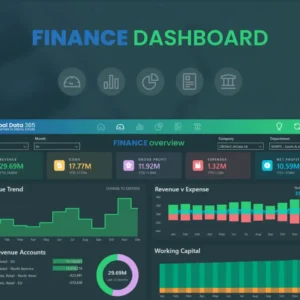
Power BI Dashboards are powerful tools that allow users to visualize and share key insights from their data in a concise and interactive format. In this blog, we will explore the process of creating and sharing impactful Power BI Dashboards. Join us as we delve into the key features of Power BI Dashboards, discuss best practices for designing effective dashboards, and explore the methods of sharing and collaborating on insights within your organization.
Understanding Power BI Dashboards:
Power BI Dashboards provide a consolidated view of important metrics and visualizations, enabling users to monitor performance, identify trends, and make data-driven decisions. Consider the following elements of Power BI Dashboards:
- Tiles: Tiles are individual visualizations or reports that represent key insights or metrics. Users can pin visualizations, charts, tables, or entire reports as tiles on their dashboards.
- Real-time Data: Power BI Dashboards can connect to various data sources, allowing for real-time or scheduled data refreshes. This ensures that the displayed information is always up to date.
- Interactivity: Dashboards in Power BI are highly interactive, allowing users to explore data in more detail, filter visualizations, and drill down to underlying reports or data sources.
Best Practices for Designing Effective Dashboards:
Creating impactful Power BI Dashboards requires careful planning and design. Consider the following best practices:
- Define Objectives: Clearly define the objectives of your dashboard. Identify the key metrics and insights that need to be highlighted and the target audience for the dashboard.
- KPIs and Visual Hierarchy: Prioritize the most important information by using Key Performance Indicators (KPIs) and visual hierarchy. Arrange tiles in a logical and intuitive manner, focusing on the most critical insights.
- Consistency and Clarity: Maintain a consistent layout, color scheme, and font usage across the dashboard. Use clear and concise titles, labels, and tooltips to enhance readability and understanding.
- Use Appropriate Visualizations: Choose the appropriate visualizations that effectively communicate the intended insights. Leverage the wide range of visualizations available in Power BI, such as charts, maps, and gauges, to represent data accurately.
Sharing and Collaborating on Power BI Dashboards:
Power BI allows users to share dashboards securely within their organization or with external stakeholders. Consider the following methods of sharing and collaborating:
- Publish to Power BI Service: Publish your dashboard to the Power BI Service, making it accessible to authorized users. Set permissions to control who can view or edit the dashboard.
- Embedding Dashboards: Embed Power BI Dashboards into other applications, such as SharePoint, Teams, or websites, to make insights readily available within existing workflows.
- Collaborative Features: Utilize collaboration features in Power BI, such as commenting, sharing snapshots, and creating data-driven discussions. This encourages collaboration and knowledge sharing among team members.
- Data Alerts: Set up data alerts to receive notifications when specific data thresholds or conditions are met. Data alerts help users stay informed and take prompt actions based on changes in the data.
Conclusion:
Power BI Dashboards offer a dynamic and visually appealing way to present key insights at a glance. By following best practices for designing effective dashboards and leveraging the sharing and collaboration features, users can maximize the value of their data and facilitate data-driven decision-making. Power BI Dashboards empower organizations to share actionable insights and drive meaningful outcomes.


