Power BI is a powerful tool in the hands of data analysts and business users, offering not just basic data visualization but also advanced analytics capabilities. The advanced analytics features in Power BI take your data exploration and storytelling to the next level, providing deeper insights and helping you make more informed decisions. In this article, we’ll unlock the secrets of Power BI’s advanced analytics by delving into its AI visuals and the Key Influencers visual, explaining how these features work and providing practical examples of their application. By the end, you should feel empowered to start utilizing these tools to uncover valuable insights from your data.
AI Visuals in Power BI
AI visuals are a set of powerful data visualization tools in Power BI that leverage machine learning and artificial intelligence to uncover patterns and insights from your data. These visuals go beyond simple charts and graphs by incorporating advanced analytical techniques, enabling you to explore and understand your data in entirely new ways.
Types of AI Visuals
Power BI offers a range of AI visuals, each designed for specific types of data analysis:
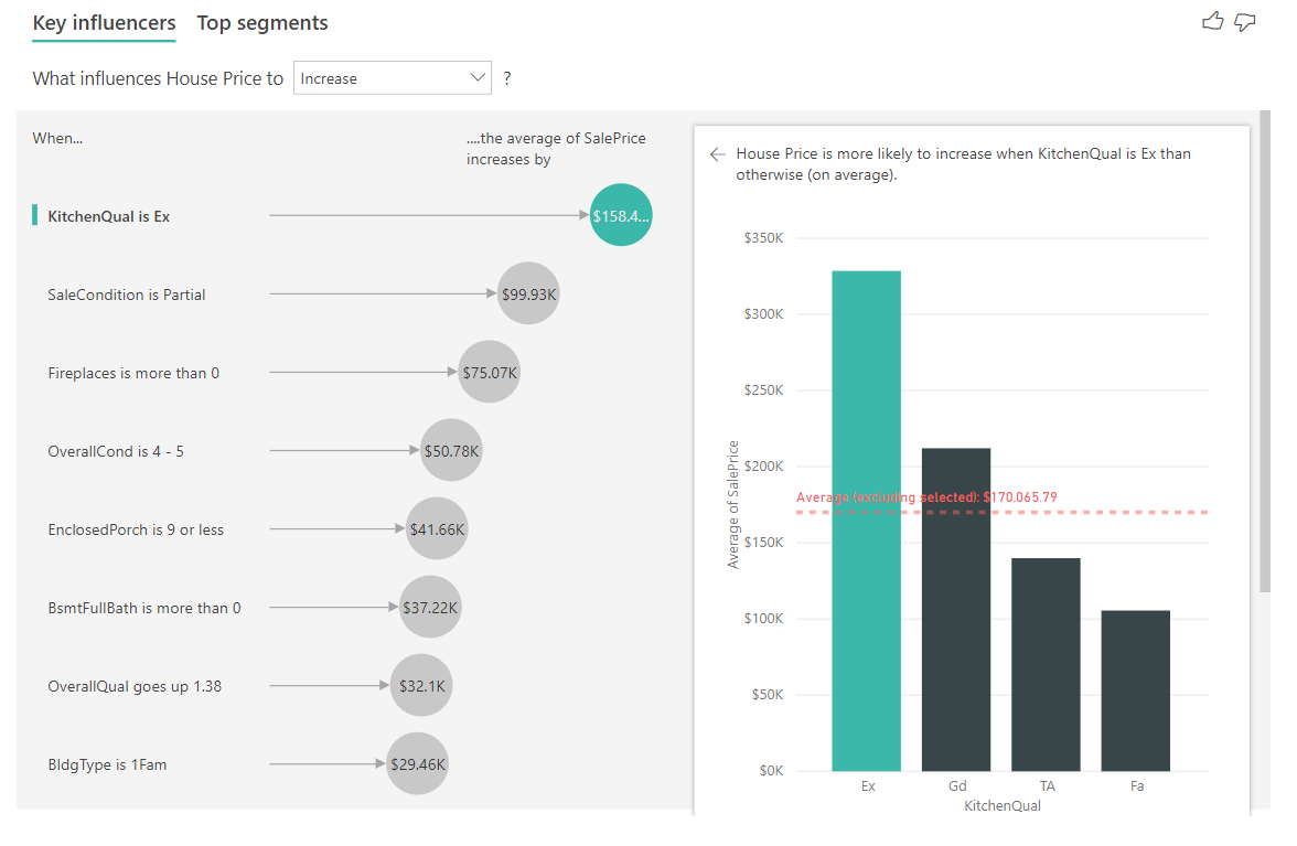
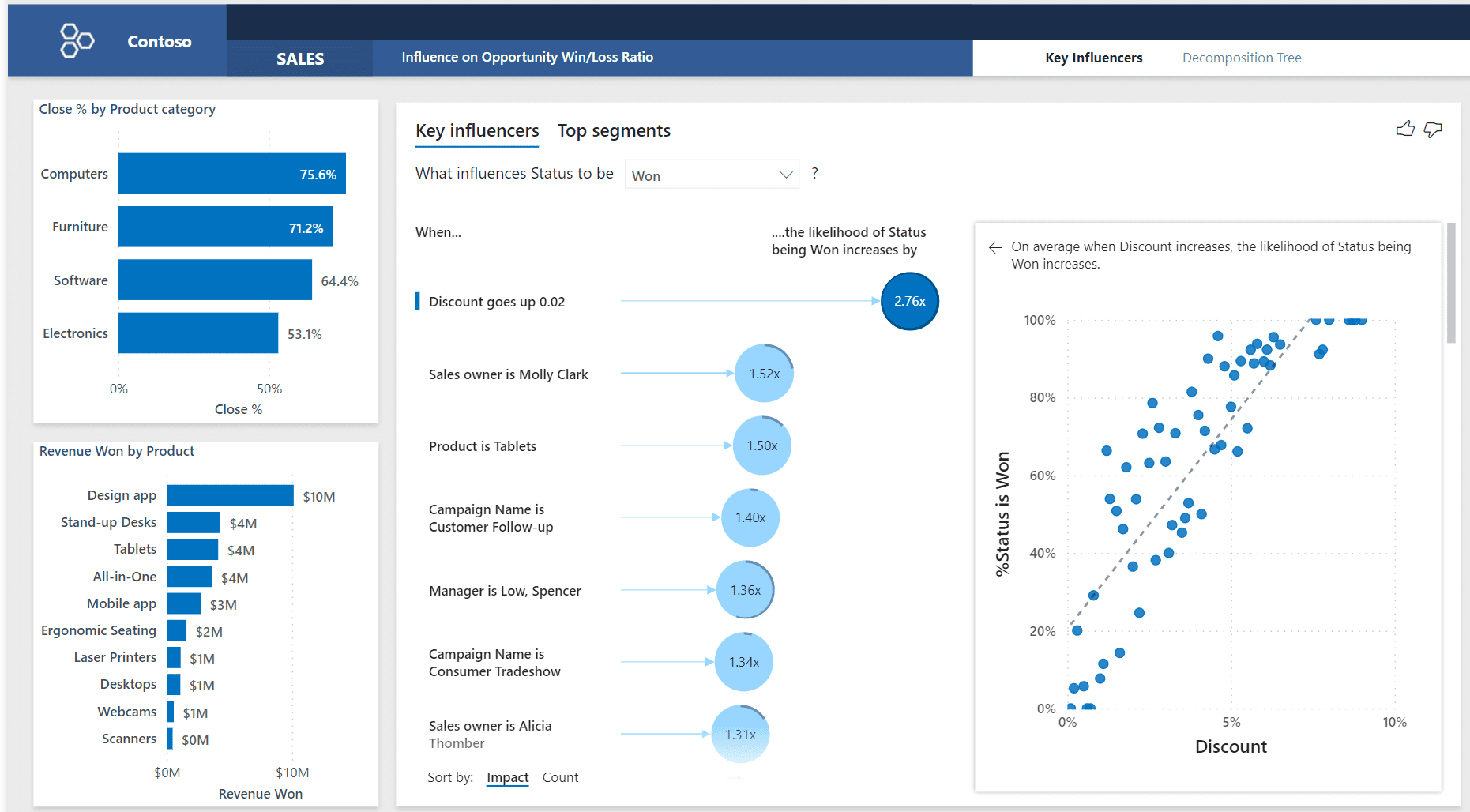
- Key Influencers visual: This visual uses machine learning to identify the key factors or variables that influence a specific metric or outcome. It helps you understand the relationships between different data points and identifies the factors with the most impact.
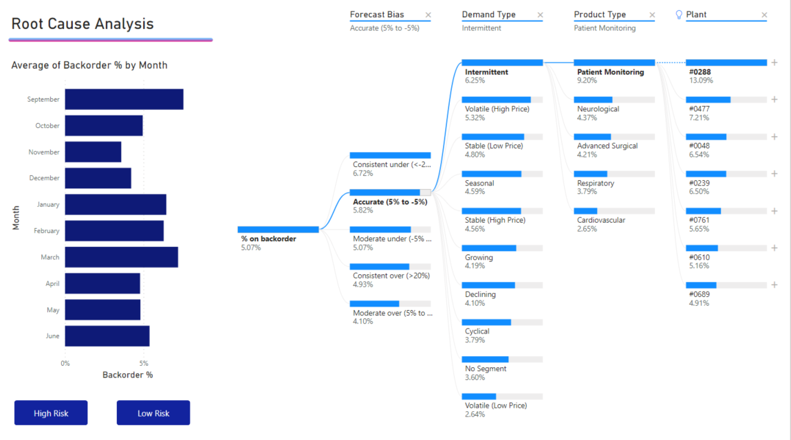
- Decomposition Tree: The decomposition tree visual allows you to explore hierarchical data and quickly identify patterns and trends. It breaks down data into various dimensions, enabling you to drill down into specific areas of interest and understand the drivers behind the numbers.
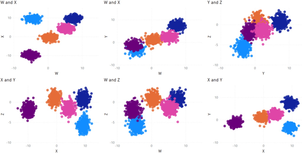
- Cluster Map: Cluster maps use clustering algorithms to group similar data points together, helping you identify patterns and relationships in your data. This visual is particularly useful for understanding customer segmentation or finding clusters of data that share similar characteristics.
- Player: The player visual is ideal for analyzing temporal data, such as sales over time or customer behavior patterns. It presents data as a video-like sequence, allowing you to play, pause, and step through the data to identify trends and anomalies.
- Text Analytics: Text analytics visuals help you derive insights from textual data, such as customer reviews or social media posts. These visuals can identify sentiment, key phrases, and language detection, providing a quantitative understanding of qualitative data.
Using AI Visuals Effectively
To get the most out of Power BI’s AI visuals, consider the following best practices:
- Understand your data: Before using AI visuals, take the time to understand the nature and structure of your data. Identify the key metrics and relationships you want to explore, as this will guide your choice of AI visual and the insights you can derive.
- Clean and prepare your data: AI visuals rely on high-quality data. Ensure your data is clean, consistent, and free from errors or missing values. Power BI provides data preparation tools to help with this process.
- Choose the right visual: Different AI visuals serve different purposes. Match the visual to the question you want to answer. For example, if you want to understand why sales spiked during a specific period, the decomposition tree visual would be a good choice.
- Provide enough data: AI visuals work best with sufficient data. Make sure you provide enough data points for the visual to identify patterns and relationships accurately.
- Iterate and refine: Start with a broad view and then refine your analysis. Begin with a visual that gives you an overview, and then drill down into specific areas of interest to uncover more detailed insights.
Unlocking Insights with the Key Influencers Visual
The Key Influencers visual is one of the most powerful tools in Power BI’s arsenal for understanding the factors driving specific outcomes. This visual uses machine learning to analyze a set of variables and determine which ones have the most influence on a chosen metric.
How the Key Influencers Visual Works
The visual operates by using advanced statistical techniques to measure the strength of the relationship between each variable and the outcome. It then ranks the variables based on their impact, providing a clear understanding of which factors are most important.
For example, let’s say you’re analyzing sales data and want to understand what influences high customer satisfaction. You can use the Key Influencers visual to analyze various factors such as price, product quality, staff knowledge, and store location. The visual will then identify which of these factors have the strongest relationship with high customer satisfaction, helping you focus your efforts on the areas that matter most.
Using the Key Influencers Visual
Here are some tips for getting the most out of the Key Influencers visual:
- Choose the right outcome: Start by selecting the metric or outcome you want to influence. This could be sales revenue, customer satisfaction, churn rate, or any other key performance indicator (KPI) relevant to your business.
- Select relevant variables: Identify the factors or variables that you believe could potentially influence the chosen outcome. These could be demographic characteristics, product attributes, environmental factors, or any other data points that might impact the outcome.
- Understand the results: The Key Influencers visual presents the top influencers and their impact on the outcome. It also provides a summary of the relationships, showing whether a factor has a positive or negative influence. Use these insights to make data-driven decisions and optimize your strategies.
- Drill down for more insights: The visual allows you to explore each influencer in more detail. You can see how the influencer impacts different segments of your data, helping you uncover nuanced insights. For example, you might find that a particular influencer has a stronger impact on a specific customer demographic.
Example: Analyzing Retail Sales Data
Let’s apply the Key Influencers visual to a practical example. Imagine you work for a retail company, and you want to understand what drives high sales performance in your stores. You have data on various factors, including store location, staff training levels, marketing spend, and customer satisfaction. Using the Key Influencers visual, you can analyze these factors to identify the top influencers of high sales:
- Outcome: High sales performance (defined as stores in the top quartile of sales revenue).
- Influencers: Store location, staff training levels, marketing spend, and customer satisfaction.
The Key Influencers visual might reveal the following insights:
- Store location is the top influencer, with a positive impact. Stores in high-traffic areas or near public transport hubs tend to have higher sales.
- Staff training levels also influence sales positively. Stores with well-trained staff who can provide excellent customer service see higher sales.
- Marketing spend has a mixed influence. While higher marketing spend generally correlates with higher sales, the visual reveals that the type of marketing and the specific channel used matter more.
- Customer satisfaction has a strong positive influence, indicating that happy customers are more likely to make purchases.
With these insights, the retail company can make data-driven decisions to optimize sales. They might focus on securing prime store locations, invest in staff training programs, and prioritize customer satisfaction initiatives. The Key Influencers visual has helped uncover the key drivers of sales performance, providing a clear direction for strategic planning.
Conclusion
Power BI’s advanced analytics features, including AI visuals and the Key Influencers visual, offer a powerful toolkit for data exploration and storytelling. By leveraging these tools, businesses can uncover valuable insights, identify patterns, and make data-driven decisions with confidence.
As you’ve seen in this article, the Key Influencers visual is particularly useful for understanding the factors that drive specific outcomes, providing a clear ranking of influencers and their impact. This visual, along with other AI visuals, helps to demystify complex data relationships and presents insights in a digestible and actionable manner. The applications of these advanced analytics tools are endless, and they can be applied to a wide range of industries and data types. The key is to understand the capabilities of these features and how they can be leveraged to address specific business questions and challenges.
So, how can you see yourself using Power BI’s advanced analytics features in your work? What specific insights or solutions do you think these tools could unlock for your organization?