Introduction:
In today’s data-driven world, the ability to interpret and present information effectively is crucial. Microsoft Power BI is a leading data visualization tool that empowers users to transform data into actionable insights. Among its many features, the capability to create custom visuals stands out as a game-changer, taking data presentation to the next level. In this article, we will delve into the importance of custom visuals in Power BI, providing a comprehensive guide on how to create, utilize, and benefit from this powerful feature.
Understanding Custom Visuals in Power BI:

Unleashing the Potential of Data Visualization
Before we dive into the specifics of custom visuals, let’s establish a clear understanding of data visualization and its significance. Data visualization is the process of presenting data in graphical or pictorial form, making it easier to interpret and extract valuable insights. In the context of Power BI, data visualization plays a pivotal role in transforming vast amounts of raw data into meaningful information that can drive decision-making.
Custom visuals are unique to Power BI and offer a higher level of customization compared to traditional visualization options. They provide the flexibility to create tailored visual representations that specifically address the needs and nuances of your data. With custom visuals, you can:
Enhance Data Comprehension: Custom visuals allow you to present data in a way that is not only visually appealing but also easier to understand. By transforming complex information into digestible visuals, stakeholders at all levels can grasp the insights being conveyed.
Tell Compelling Stories: Storytelling is an art, and custom visuals are your paintbrush. They enable you to craft narratives around your data, engaging your audience and guiding them through the insights you want to convey.
Uncover Hidden Trends: Custom visuals facilitate a deeper exploration of your data. By presenting information in innovative ways, you can uncover patterns, trends, and correlations that may have otherwise been obscured.
Drive Informed Decision-making: Effective data visualization bridges the gap between information and action. Custom visuals provide decision-makers with a clear understanding of the data, enabling them to make informed choices with confidence.
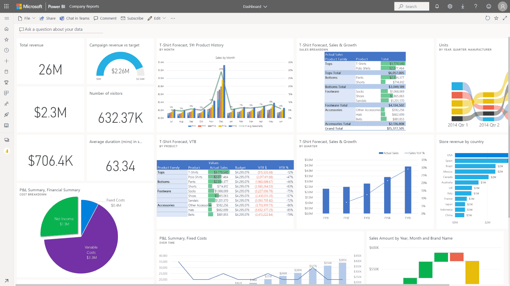
Example: Consider a retail business analyzing sales data. By using custom visuals, they can create interactive dashboards that showcase sales trends over time, highlight regional performance, and identify customer behavior patterns. This allows stakeholders to quickly grasp the overall health of the business, make data-driven decisions about inventory management, and develop targeted marketing strategies.
Exploring the Benefits of Custom Visuals in Power BI:
Elevating Your Data Visualization Game
Custom visuals in Power BI offer a myriad of advantages that elevate your data visualization practices. Here’s a deeper exploration of these benefits:
Flexibility and Customization: Custom visuals provide an unparalleled level of flexibility. You can customize every aspect of your visual, from colors and shapes to data labels and tooltips. This freedom allows you to create visuals that perfectly align with your brand, theme, or specific data story you want to convey.
Interactive and Engaging: Power BI’s custom visuals are designed to be interactive, encouraging users to explore and engage with your data. You can incorporate filters, drill-down capabilities, and dynamic updates, enabling users to discover insights and ask “what-if” questions. This interactivity enhances user experience and promotes a deeper understanding of the data.
Extended Capabilities: Custom visuals open up a world of extended capabilities. Power BI offers a rich library of built-in visuals, but sometimes, unique data requirements call for specialized visuals. With custom visuals, you can fill this gap, ensuring that your visualization toolkit is comprehensive and adaptable to diverse data scenarios.
Data-driven Design: With custom visuals, you can embrace a data-driven design approach. This means that the visual representation is tailored to the specific data set, ensuring that the chosen visual best conveys the underlying information. This results in more effective communication and interpretation of the data.
Consistent Branding and Theme: Custom visuals allow you to maintain consistent branding and theming across your reports and dashboards. You can easily apply your organization’s color schemes, logos, and style guides, ensuring a professional and unified look that resonates with your audience.
Community and Sharing: Power BI has a vibrant community of users and developers who collaborate and share their custom visual creations. This ecosystem fosters innovation and provides a wealth of resources for those seeking inspiration or specific visual solutions.
Example: A marketing agency using Power BI can create custom visuals to showcase client campaign performance. By designing interactive visuals that highlight key metrics like click-through rates, conversion rates, and return on ad spend, they can provide clients with a clear understanding of their campaign’s effectiveness. These visuals can be tailored to align with the client’s branding, making the reports more impactful and memorable.
Creating Custom Visuals in Power BI: A Step-by-Step Guide
Now that we’ve explored the benefits of custom visuals, let’s dive into the process of creating them in Power BI. Here’s a step-by-step guide to help you get started:
Identify Your Data Story: Before creating any visual, it’s crucial to understand the story your data needs to tell. Identify the key insights, trends, or relationships you want to convey. This will guide the design and customization of your visual.
Choose Your Data Set: Select the data set you want to visualize. Ensure it contains the necessary fields and information to support the insights you identified in step one.
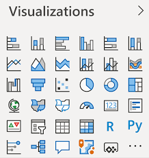
Explore Built-in Visuals: Before creating a custom visual from scratch, explore Power BI’s extensive library of built-in visuals. You may find that a standard visual suits your needs, saving you time and effort.
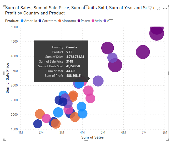
Select a Custom Visual Type: Choose the type of custom visual you want to create, such as a bar chart, scatter plot, treemap, or a more specialized visual like a Sankey diagram or chord diagram. Each visual type serves a unique purpose, so select one that best represents your data.
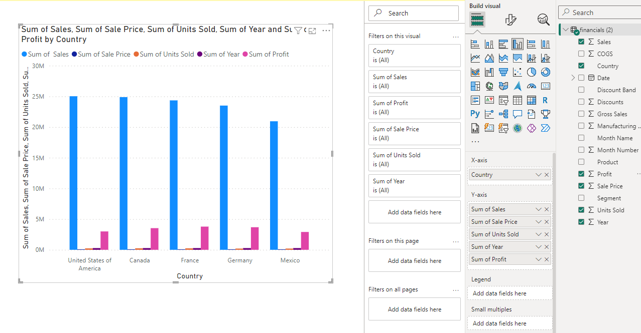
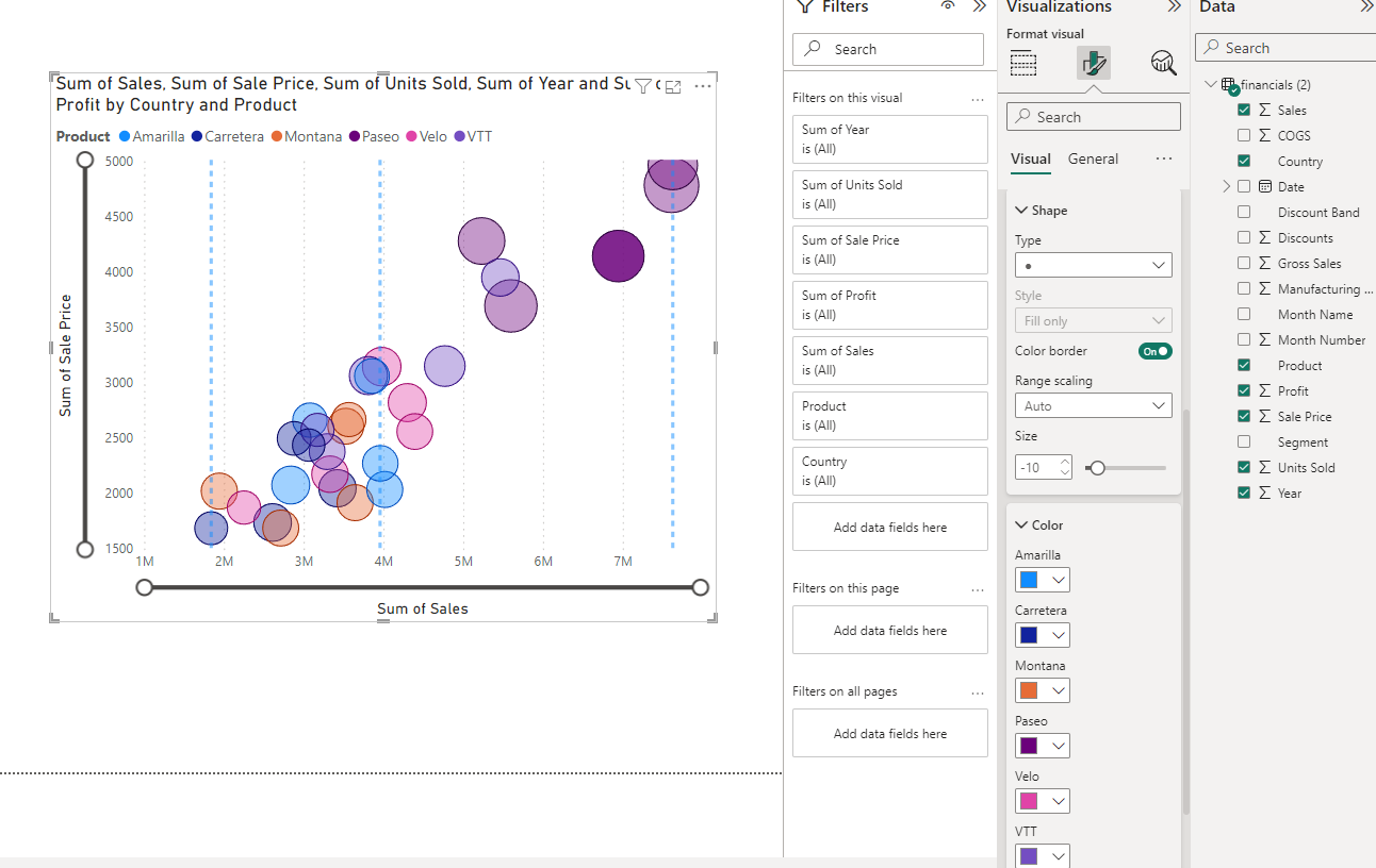
Customize Your Visual: This is where your creativity comes into play! Power BI offers a range of formatting options to customize your visual. You can modify colors, fonts, data labels, tooltips, and more. Ensure your visual is not only visually appealing but also clearly communicates the intended insights.
Apply Interactions and Animations: Engage your audience by incorporating interactions and animations. This could include drill-down capabilities, tooltips that provide additional information, or dynamic updates that respond to user actions.
Refine and Iterate: Don’t settle for your first creation. Refine and iterate your custom visual to ensure it effectively tells the data story. Seek feedback, test it with different data sets, and make adjustments as needed.
Save and Share: Once you’re satisfied with your custom visual, save it to your Power BI workspace. You can then easily insert it into reports or dashboards and share it with your colleagues or clients.
Example: Let’s say you want to create a custom visual to showcase employee performance data. After identifying the key insights you want to convey, you might choose a bar chart custom visual. You can then customize the colors to align with your company’s branding, add data labels for clarity, and incorporate interactive features like tooltips that display additional employee information when hovered over.
Unlocking Advanced Custom Visual Capabilities:
Leveraging the Power of DAX, M, and R
For those seeking to push the boundaries of custom visuals, Power BI offers the ability to harness the power of DAX, M, and R. These powerful languages and tools enable advanced customization and complex visual creations:
DAX (Data Analysis Expressions): DAX is a formula language used in Power BI to create custom calculations and measures. With DAX, you can define new calculations, manipulate data, and create dynamic visual elements. It allows you to extend the capabilities of standard aggregations and calculations, providing deeper insights.
M Language: M is a query language used in Power BI to transform and shape data. With M, you can extract, load, and transform data from various sources, preparing it for effective visualization. M enables you to clean, combine, and manipulate data to meet the specific requirements of your custom visuals.
R Integration: Power BI integrates with the R statistical programming language, allowing you to leverage the extensive capabilities of R for advanced data analysis and visualization. With R, you can create highly customized and sophisticated visuals, including heatmaps, dendrograms, and 3D plots.
Example: An e-commerce company using Power BI can leverage DAX to calculate customer lifetime value, incorporating complex metrics like average order value and customer retention rates. With M, they can extract and transform data from various sources, including sales databases and customer feedback platforms, to create comprehensive customer behavior visuals. R integration can be used to develop custom visuals that identify customer segments and predict purchasing patterns.
Best Practices for Creating Impactful Custom Visuals:
Tips for Success
To ensure your custom visuals are effective and engaging, consider the following best practices:
Keep It Simple: While custom visuals offer extensive customization, avoid the temptation to overload your visual with excessive elements or clutter. Simplicity and clarity are key to effective communication.
Choose the Right Visual for the Data: Match the visual type to the data you’re presenting. For example, use line charts for trends over time, bar charts for comparisons, and scatter plots for relationships between variables. The right visual will naturally guide your audience to the intended insights.
Prioritize Clarity in Labeling: Ensure your visual has clear and concise labels. Use data labels strategically, providing context without overwhelming the visual. Well-placed and thoughtfully designed labels enhance understanding.
Consider Color Theory: Color plays a crucial role in data visualization. Leverage color theory to create visually appealing and meaningful visuals. Use colors to highlight important data points, group related information, or convey specific messages.
Embrace Iteration and Feedback: Don’t be afraid to iterate and refine your custom visuals. Seek feedback from colleagues or clients to ensure your visual effectively communicates the intended message. Continuous improvement will lead to more impactful visuals.
Mobile Optimization: With the increasing consumption of content on mobile devices, ensure your custom visuals are optimized for different screen sizes and resolutions. Power BI provides responsive design capabilities to ensure your visuals are accessible and effective across various platforms.
Accessibility Compliance: Ensure your custom visuals are accessible to all users, including those with visual or auditory impairments. Power BI offers accessibility features, such as screen reader support and keyboard navigation, to make your visuals inclusive.
Example: When creating a custom visual to present financial data, consider using green and red colors to indicate positive and negative trends, respectively. This color coding immediately conveys performance insights to your audience. Additionally, incorporating data tooltips that provide additional context when users hover over data points can be valuable.
Conclusion:
Custom visuals in Power BI are a powerful tool that can transform the way you interpret and present data. By creating tailored visual representations, you can unlock insights, engage your audience, and drive informed decision-making. In this article, we’ve explored the importance of custom visuals, delved into their benefits, and provided a step-by-step guide to creating them.
Remember, the key to effective custom visuals lies in understanding your data and crafting a compelling story around it. With Power BI’s custom visuals, you can bring your data to life, making it accessible, actionable, and impactful. As you continue on your data visualization journey, I encourage you to experiment with custom visuals and unlock the full potential of your data.
So, what are your thoughts? How have custom visuals in Power BI influenced your data analysis and presentation? Share your experiences, insights, and any creative ways you’ve utilized custom visuals to bring your data stories to life!