Introduction
In today’s data-driven world, the ability to create compelling and complex reports and dashboards is a highly sought-after skill. Power BI, a powerful business intelligence platform, offers a plethora of advanced features that enable users to transform data into actionable insights. In this in-depth article, we will explore the world of advanced Power BI functionalities, providing a comprehensive guide to help you elevate your data analysis and visualization game. Buckle up as we take a deep dive into the world of Power BI, uncovering tips, tricks, and best practices for creating sophisticated and insightful reports and dashboards!
The Power of Advanced Power BI Features
Power BI provides a wide array of advanced features that empower users to go beyond basic data visualization and analysis. These features include:
- Power Query: A data transformation engine that allows users to clean, transform, and prepare data for analysis. With Power Query, you can connect to various data sources, apply custom transformations, and create robust data models.
- DAX (Data Analysis Expressions): A formula language integrated into Power BI that enables users to create custom calculations and measures. DAX offers a wide range of functions and operators to perform complex data analysis.
- Relationships and Data Modeling: Power BI allows users to establish relationships between different data tables, creating a robust data model. This enables sophisticated analysis and calculations across multiple data sources.
- Advanced Visualization Options: Power BI provides a rich set of visual tools, including custom visuals, mapping tools, and interactive graphs, allowing users to create dynamic and engaging dashboards.
- Quick Measures and Calculations: Power BI offers quick measures, pre-built calculations that simplify complex data analysis. Users can also create their own custom calculations to derive specific insights from their data.
- Report Themes and Formatting: With Power BI, users can customize the look and feel of their reports and dashboards, ensuring a consistent and professional appearance.
- Drill Down, Slice, and Dice: These features allow users to explore data at different levels of granularity, providing a detailed understanding of the underlying information.
Section 1: Data Preparation with Power Query
The Power of Power Query
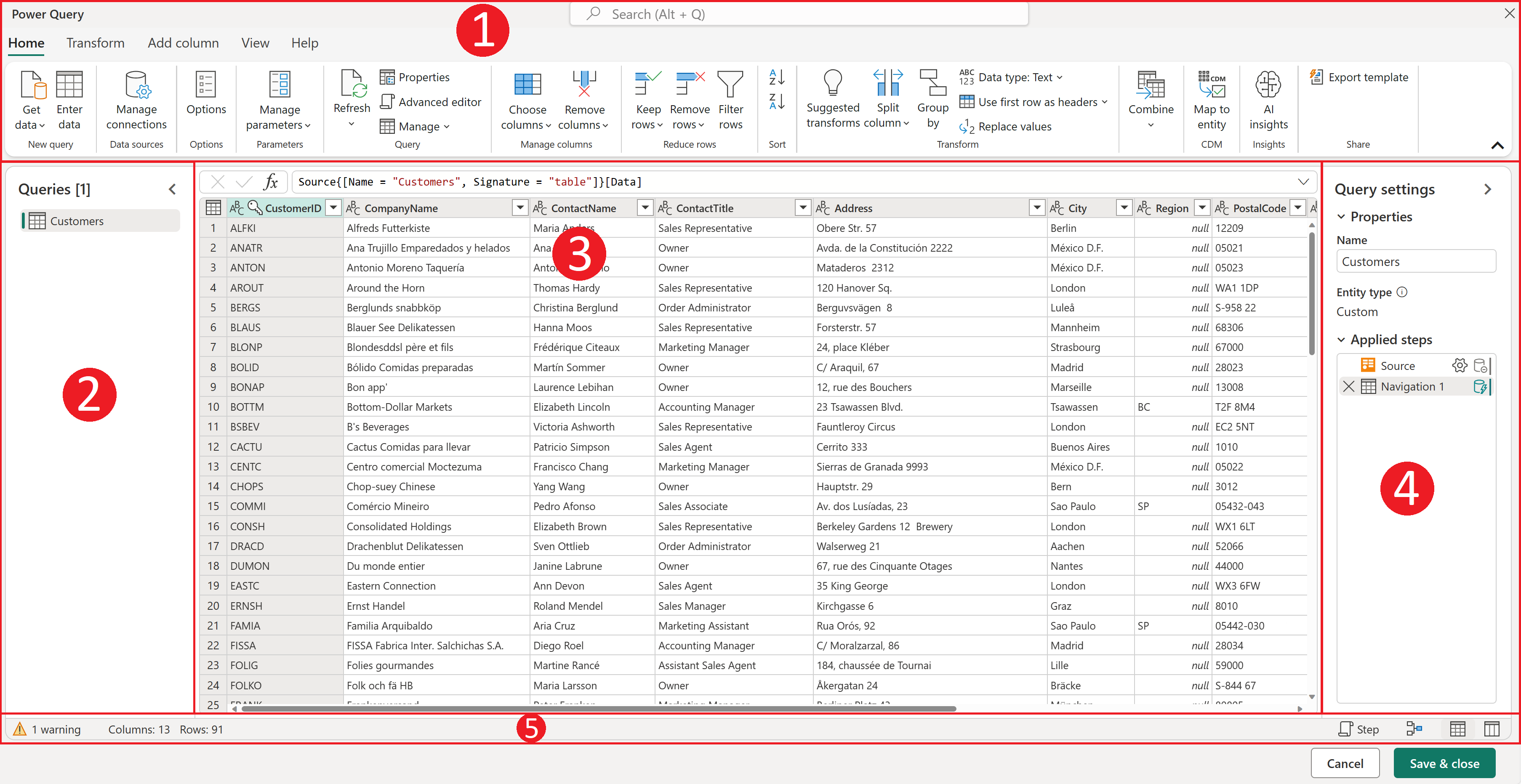
One of the most powerful features of Power BI is Power Query, which allows you to easily transform and prepare your data for analysis. With Power Query, you can connect to a wide range of data sources, from Excel spreadsheets to cloud-based databases. Let’s explore some key aspects of Power Query:
- Data Cleaning and Transformation: Power Query enables you to remove duplicates, handle missing data, and apply custom transformations to ensure your data is clean and consistent. For example, you can use the “Replace Values” function to standardize data formats or the “Fill” feature to handle missing data.
- Data Integration: Power Query shines when it comes to integrating data from multiple sources. You can merge, append, or shape data from different tables or files, creating a unified dataset for analysis.
- Query Folding: Power Query is smart enough to “fold” or optimize complex queries, ensuring that they run efficiently on the underlying data source. This results in faster query execution and improved performance.
Example: Transforming and Integrating Data with Power Query
Let’s say you work for an e-commerce company and you have data stored in separate Excel files for customer orders, product information, and shipping details. With Power Query, you can easily import these files, transform the data to ensure consistency, and then merge them into a single dataset. You can also use functions like “Unpivot Columns” to restructure data for easier analysis.
M Formula Language
Under the hood of Power Query is the M formula language, which allows for even more advanced data transformations. M provides a comprehensive set of functions and operators, giving you fine-grained control over your data. Here are some key aspects of M:
- Functionality: M offers functions for data manipulation, logic, and flow control, enabling complex transformations. For instance, the “List.Transform” function applies a custom function to each item in a list.
- Variables and Scope: M supports variables, allowing you to store and manipulate data within your queries. Variable scope ensures that your transformations are applied consistently throughout your query.
- flexibility:** M formulas can be used directly in the Power Query interface or within the Advanced Editor, providing flexibility for users of all skill levels.
Example: Using M to Create Custom Transformations
Imagine you need to calculate the total sales amount for each product category in your e-commerce dataset. With M, you can create a custom function that multiplies the unit price by the quantity sold for each order, and then sums up these values by category. This custom transformation can be easily applied to your data with just a few lines of M code.
Section 2: Data Modeling and DAX Measures
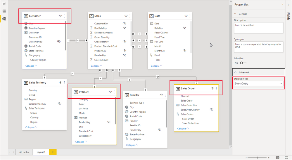
Building a Robust Data Model
At the heart of any complex report or dashboard in Power BI is a well-designed data model. This involves establishing relationships between tables and creating calculated measures to derive insights from your data. Let’s delve into the world of data modeling and DAX:
- Relationships: Power BI allows you to set up relationships between tables based on common columns, such as a customer ID or product ID. These relationships enable you to perform complex calculations and analyze data across multiple dimensions.
- Cardinality: Understanding cardinality is crucial when setting up relationships. One-to-many relationships are the most common, but many-to-many relationships can also be established using intermediate tables.
- Star and Snowflake Schemas: Power BI supports star and snowflake schema designs, where fact tables (containing metrics) are linked to multiple dimension tables (containing attributes).
Example: Data Modeling for a Sales Analysis Report
Consider a sales analysis report where you want to analyze sales data by product, customer, and time. You would set up relationships between a “Sales” fact table and “Product,” “Customer,” and “Date” dimension tables. This allows you to slice and dice sales data by various dimensions, creating dynamic reports.
Unleashing the Power of DAX Measures
DAX measures are custom calculations that go beyond simple aggregations like sum or average. They allow you to create dynamic metrics that respond to user interactions with your reports, such as filtering or slicing. Here’s what you need to know about DAX measures:
- Syntax and Functions: DAX has a vast library of functions for performing calculations on filtered data, time intelligence, and statistical analysis. The syntax is similar to Excel formulas, making it familiar to many users.
- Context: DAX measures are context-aware, meaning they automatically adjust their calculations based on the filters and selections in your report.
- Iterators: DAX provides iterators like SUMX and AVERAGEX that perform calculations on tables or rows, enabling flexible and dynamic measures.
Example: Creating a Dynamic Sales Growth Measure
You can create a sales growth measure that calculates the year-over-year change in sales. Using the CALCULATE function to compare sales in the current year to the previous year, and the RELATED function to access values from related tables, you can create a measure that dynamically adjusts as users slice the data by different dimensions.
Section 3: Visualizations and Interactive Features
Bringing Data to Life with Visualizations
Power BI offers a rich set of visual tools to help you present your data in engaging and informative ways. From simple bar charts to interactive maps, you can create stunning dashboards that convey complex information with ease:
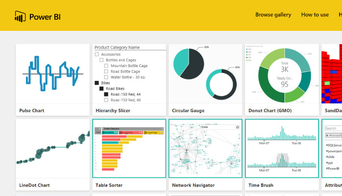
- Custom Visuals: Power BI provides a wide range of built-in visuals, but you can also explore custom visuals from the Power BI marketplace to find unique and specialized chart types.
- Formatting Options: Customize the appearance of your visuals with formatting options like data colors, axis settings, and data labels. You can also apply conditional formatting to highlight specific data points.
- Drill Down and Drill Through: Enable users to explore data at different levels of detail with drill-down capabilities or navigate to specific reports with drill-through actions.
Example: Creating an Interactive Sales Performance Dashboard
You can design a dashboard that showcases sales performance over time, with the ability to drill down to individual product categories and regions. Utilize a combination of line charts, treemaps, and card visuals to present a comprehensive view of sales data. Apply drill-down functionality to allow users to explore sales figures at the product level.
Enhancing User Interaction with Slicers and Filters
Slicers and filters are essential tools for enabling users to interact with your reports and focus on specific subsets of data:
- Slicers: Slicers provide a visual way to filter data, allowing users to select specific values or ranges. You can use basic slicers or explore more advanced options like the multi-select slicer or image-based slicers.
- Filters: Filters can be applied directly to visuals or pages, allowing users to narrow down the data displayed. You can also create complex filter logic using DAX functions.
- Sync Slicers: Power BI allows you to sync slicers across multiple pages, ensuring a consistent filtering experience throughout your report.
Example: Interactive Report with Slicers and Filters
Imagine you’re analyzing customer churn data and want to identify trends by customer segment and region. You can add slicers for “Customer Segment” and “Region” to your report, allowing users to quickly filter the data and identify patterns. Sync these slicers across pages to maintain a seamless filtering experience.
Section 4: Advanced Features and Customization
Quick Measures and Custom Calculations
Power BI offers a range of pre-built quick measures that provide common calculations with just a few clicks. However, you can also create your own custom calculations using DAX to address specific business needs:
- Quick Measures: Power BI suggests relevant quick measures based on the fields in your data, such as year-over-year growth or running totals.
- Custom Calculations: For more specialized insights, you can create your own DAX measures. For instance, you could calculate customer lifetime value or the average time between purchases.

Example: Calculating Customer Churn Rate
You can create a custom measure to calculate customer churn rate by dividing the number of customers lost by the total number of customers. This measure can then be used in a card visual to display the churn rate for a selected time period or customer segment.
Report Themes and Custom Formatting
Consistency and aesthetics are important aspects of report design. Power BI allows you to customize the look and feel of your reports to align with your brand or specific requirements:
- Report Themes: Apply a consistent theme across your report, including colors, fonts, and visual styles. You can use built-in themes or create your own custom theme.
- Custom Formatting: Fine-tune the appearance of your visuals with custom formatting options. This includes data colors, axis formatting, and conditional formatting to highlight specific data points.
- Page Layout: Organize your report pages with a logical flow, using containers and layout tools to create a user-friendly experience.
Example: Branding Your Report with a Custom Theme
You can create a custom report theme that matches your company’s branding guidelines, including specific colors, fonts, and visual styles. This ensures a professional and cohesive look throughout your report.
Section 5: Sharing and Collaboration
Sharing Insights with Dashboards and Reports
Once you’ve crafted your complex reports and dashboards, it’s time to share them with your audience. Power BI offers several options for sharing and collaboration:
- Publish to the Web: You can publish your reports publicly to the web, allowing anyone with the link to view them. This is a great way to share insights with external stakeholders or embed reports on websites.
- Share within Your Organization: Power BI provides options to share reports and dashboards with specific colleagues or teams within your organization. You can control access levels and permissions.
- Apps: Power BI Apps provide a packaged solution, allowing you to distribute dashboards, reports, and datasets to a wider audience.
Example: Collaborating on a Sales Dashboard
You can share a sales dashboard with your sales team, providing them with real-time insights into their performance. Enable editing permissions for team members to contribute their own insights and customize the dashboard to their needs.
Power BI Mobile Apps
Power BI offers mobile apps for iOS and Android devices, allowing users to access reports and dashboards on the go:
- Mobile-Optimized Reports: Ensure your reports are optimized for mobile viewing by using responsive visuals and considering screen size limitations.
- Mobile Layouts: Power BI allows you to customize the layout of visuals specifically for mobile devices, ensuring a seamless mobile experience.
- Alerts and Notifications: Users can set up alerts to receive notifications when specific data thresholds are met, helping them stay on top of their key metrics.
Example: Mobile-Friendly Sales Report
You can create a mobile-friendly version of your sales report, optimizing visuals and layouts for smaller screens. Enable alerts to notify sales reps when they reach sales targets or when specific customers require attention.
Conclusion
In this comprehensive article, we’ve explored the advanced features of Power BI and how they can be leveraged to create complex reports and dashboards. From data preparation with Power Query to custom calculations with DAX, and from interactive visualizations to sharing and collaboration, Power BI offers a powerful toolkit for data analysis and insight generation. Remember, the key to success with Power BI lies in understanding your data, utilizing the platform’s advanced capabilities, and designing reports and dashboards that provide actionable insights for your audience. Now it’s your turn! How do you plan to use Power BI’s advanced features to elevate your data analysis game? What specific techniques or use cases are you excited to explore further? Share your thoughts and insights in the comments below!