In the world of web analytics, the ability to visualize data effectively is crucial for making informed decisions and extracting valuable insights. Microsoft Power BI is a powerful tool that enables users to transform raw web analytics data into meaningful and visually appealing insights. This comprehensive guide will take you through the process of visualizing web analytics data with Power BI, covering everything from connecting data sources to designing stunning dashboards. By the end, you should be able to leverage the power of Power BI to enhance your web analytics and drive data-driven decisions.
Understanding Web Analytics and Its Significance
Web analytics is the process of collecting, analyzing, and interpreting data related to web traffic and visitor behavior on websites and web applications. It involves tracking various metrics and key performance indicators (KPIs) to assess the performance and health of a website. The significance of web analytics lies in its ability to provide valuable insights that can drive decision-making. By analyzing web analytics data, businesses can:
- Understand their audience and customer base, including their demographics, interests, and behavior.
- Optimize their website performance and user experience to increase conversions and revenue.
- Evaluate the effectiveness of their marketing campaigns and identify areas for improvement.
- Identify trends and patterns in user behavior to make data-driven decisions.
- Set benchmarks and goals to measure the success of their online ventures.
For example, e-commerce businesses can use web analytics to track user journeys, identify drop-off points in the checkout process, and optimize their website to increase conversions. Content-focused websites can analyze page views, bounce rates, and time spent on page to understand which content resonates most with their audience.
Introducing Power BI: A Powerful Visualization Tool
Microsoft Power BI is a leading data visualization and business intelligence platform that enables users to transform data into rich visual insights. With Power BI, you can connect to hundreds of data sources, model and transform data, and create stunning dashboards and reports to share with your audience. Here are some key features that make Power BI a powerful tool for visualizing web analytics data:
- Data Connectivity: Power BI offers a wide range of data connectors, allowing you to connect to and visualize data from various sources, including web analytics tools such as Google Analytics, Adobe Analytics, and Matomo.
- Data Modeling: Power BI provides a robust data modeling environment, enabling you to clean, transform, and shape your data to fit your specific analysis needs.
- Visualization Options: Power BI offers a vast array of visualizations, including charts, graphs, maps, and custom visuals, allowing you to present your data in a way that is both informative and engaging.
- Interactive Dashboards: You can create dynamic and interactive dashboards that provide a single pane of glass for your web analytics data, allowing users to explore and interact with the data.
- Customization and Branding: Power BI reports and dashboards can be fully customized to align with your brand guidelines, ensuring a professional and consistent look and feel.
- Data Security: Power BI provides robust data security and privacy features, ensuring that your web analytics data remains safe and accessible only to authorized users.
Step-by-Step Guide to Visualizing Web Analytics Data with Power BI
Now, let’s dive into a step-by-step guide on how to visualize web analytics data using Power BI. We’ll walk through the process of connecting to a data source, preparing the data, designing visuals, and creating a dashboard.
Step 1: Connect to Your Data Source
The first step is to connect Power BI to your web analytics data source. For this example, we’ll use Google Analytics as it is one of the most widely used web analytics platforms. In Power BI, select ‘Get Data’ and choose ‘Google Analytics’ from the list of data sources. You will be prompted to sign in to your Google account and authorize Power BI to access your Google Analytics data. Once connected, you can select the Google Analytics view you want to import and load the data into Power BI.
Step 2: Prepare and Transform Your Data
Once you have imported the data into Power BI, the next step is to prepare and transform it to ensure it is ready for visualization. This may involve cleaning the data, renaming columns, creating calculations, and defining relationships between tables. For web analytics data, common transformations may include:
- Filtering out bot or spider traffic to ensure accurate analysis of user behavior.
- Creating custom calculations for metrics such as bounce rate, session duration, or conversion rate.
- Pivoting or unpivoting tables to transform the structure of the data for specific report requirements.
- Defining relationships between tables, such as joining user data with pageview data or e-commerce transaction data.
Power BI provides a range of data transformation tools, including the Power Query Editor, which allows you to apply these transformations and more.
Step 3: Choose the Right Visualizations
The choice of visualizations depends on the type of data you are working with and the insights you want to convey. Power BI offers a vast array of visual options, and it’s important to select the most appropriate and effective visuals for your web analytics data. Here are some common visualization types and their use cases:
- Line charts: Line charts are ideal for showing trends over time, such as monthly user growth, daily page views, or weekly conversion rates.
- Bar and column charts: These visuals are perfect for comparing discrete data points, such as traffic sources, top-performing pages, or device categories.
- Pie and donut charts: These charts are useful for showing parts of a whole, such as the distribution of traffic across different channels or the breakdown of user types.
- Maps: Map visuals are great for displaying geographic data, such as user locations, site performance by region, or store locations for e-commerce businesses.
- Scatter plots: Scatter plots can be used to show relationships between two numerical variables, such as session duration vs. pages per session or revenue vs. quantity of items purchased.
- Funnel charts: Funnel visuals are ideal for analyzing user flows and identifying drop-off points, such as the steps in a checkout process or the progression from new user to customer.
When choosing visualizations, it’s important to consider the story you want your data to tell and select visuals that effectively convey that story to your audience.
Step 4: Design Visually Appealing Reports
In Power BI, reports are collections of visuals and data insights presented together on a canvas. When designing reports, it’s important to consider not only the individual visuals but also the overall layout and design of the report. Here are some tips for creating visually appealing reports:
- Use a consistent color scheme that aligns with your brand guidelines and ensures a professional look and feel.
- Apply report themes to standardize the design across multiple pages and visuals.
- Utilize report headers and footers to provide context and include titles, dates, and logos.
- Ensure visuals are sized appropriately and spaced evenly on the canvas for a balanced layout.
- Add data labels, tooltips, and legends to provide additional context and clarity.
- Incorporate interactive features such as slicers, filters, and drill-down options to allow users to explore the data.
- Leverage the use of shapes, text boxes, and images to enhance the visual appeal and provide additional insights.
Step 5: Create Dynamic Dashboards
Dashboards in Power BI are single-page, interactive views that display key metrics and provide a quick overview of the most important insights from your reports. They are designed to monitor data in real time and provide a high-level summary of your web analytics data. When creating dashboards, consider the following:
- Select the most critical metrics and KPIs that provide a snapshot of your web analytics. For example, this could include total website visits, conversion rates, top-performing pages, or user retention rates.
- Utilize the entire dashboard canvas by sizing and arranging visuals optimally.
- Ensure visuals are interactive, allowing users to drill down into specific reports for more detailed insights.
- Apply data-driven alerts to be notified when certain metrics exceed predefined thresholds.
- Use natural language queries with Power BI Q&A to enable users to explore data using conversational language.
- Keep the dashboard design clean and uncluttered, ensuring a quick and easy understanding of the data.
Enhancing Your Web Analytics with Power BI
Visualizing web analytics data with Power BI offers a range of benefits that can enhance your analysis and decision-making:
- Real-time Insights: Power BI allows you to connect to and visualize real-time data, providing up-to-the-minute insights into your web traffic and user behavior. This enables you to make timely decisions and take immediate actions.
- Interactive Exploration: The interactive nature of Power BI dashboards and reports empowers users to explore data dynamically. This facilitates a deeper understanding of the data and encourages data-driven culture.
- Custom Visuals: In addition to the wide range of built-in visuals, Power BI offers a marketplace of custom visuals that can be used to create unique and engaging dashboards. This allows you to present your data in innovative ways.
- Data Storytelling: With Power BI, you can create a narrative around your data, guiding users through a story and providing context to your insights. This makes complex data more accessible and memorable.
- Mobile Accessibility: Power BI offers mobile apps, allowing users to access dashboards and reports on the go. This ensures that important web analytics insights are always at your fingertips.
Best Practices and Tips for Visualizing Web Analytics Data
To ensure you get the most out of visualizing web analytics data with Power BI, consider the following best practices and tips:
- Understand Your Audience: Consider who will be consuming your reports and dashboards, and tailor the content and level of detail accordingly. For executives, focus on high-level KPIs, while analysts may require more granular insights.
- Keep it Simple: Avoid over-cluttering your visuals and reports. Simplicity and clarity are key to effective communication. Ensure your message is easy to understand at a glance.
- Use Consistent Terminology: Align the terminology used in your visuals with that of your web analytics platform and industry standards. This avoids confusion and ensures a consistent understanding of the data.
- Leverage Drill-Down Capabilities: Utilize the ability to drill down into data to provide additional context. For example, allow users to drill down from a high-level metric to see the underlying data or trends over time.
- Test and Validate Data: Before sharing reports, test and validate your data to ensure accuracy. This includes checking data connections, transformations, and calculations for errors or inconsistencies.
- Provide Context with Tooltips: Enhance your visuals with tooltips that provide additional information on data points. This can include definitions, calculations, or additional insights to aid understanding.
- Use Annotations to Highlight Insights: Annotations are a great way to draw attention to specific data points or trends. Use them to highlight key insights or provide explanations for unusual data fluctuations.
- Monitor Data Privacy and Security: Ensure that data privacy and security are a priority when working with web analytics data. Use Power BI’s security features to control access and protect sensitive information.
Case Study: Visualizing E-commerce Web Analytics with Power BI
Let’s consider a case study of an e-commerce business that utilizes Power BI to visualize and gain insights from their web analytics data. Scenario: Adventure Cycles is an online retailer specializing in outdoor adventure gear and cycling equipment. They have an extensive product catalog and a global customer base. The e-commerce platform is their primary sales channel, and they rely heavily on web analytics to understand their customers and optimize their online store. Web Analytics Goals:
- Track and analyze user behavior to optimize the website for conversions and sales.
- Understand customer demographics and preferences to tailor marketing campaigns effectively.
- Identify top-performing products and categories to refine inventory management and promotions.
- Monitor site performance to ensure a seamless user experience and reduce bounce rates.
- Measure the impact of marketing campaigns on website traffic and conversions.
Power BI Visualization Approach: Adventure Cycles connects Power BI to their Google Analytics and internal sales data sources to create comprehensive dashboards that provide insights across various aspects of their business.
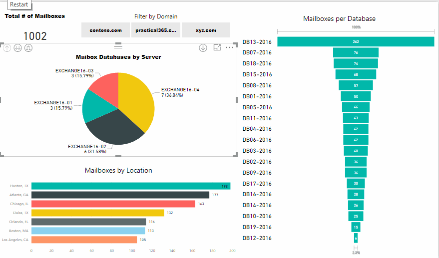
- Overview Dashboard: This dashboard provides a high-level summary of key metrics, including total website visits, conversion rates, average order value, and revenue. It utilizes line charts to show trends over time and map visuals to display sales and user locations.
- Marketing Dashboard: The marketing dashboard focuses on campaign performance and user acquisition. It includes bar charts to compare traffic sources, pie charts to show the distribution of new vs. returning users, and funnel charts to analyze the user journey from landing page to conversion.
- Product Performance Dashboard: This dashboard provides insights into product sales and performance. It utilizes bar charts to show top-selling products, scatter plots to analyze the relationship between price and quantity sold, and treemaps to visualize product category performance.
- Customer Insights Dashboard: Adventure Cycles uses this dashboard to understand their customer base, including demographics, interests, and behavior. It includes visuals such as donut charts to show customer age and gender distribution, maps to display customer locations, and line charts to track customer retention and repeat purchase rates.
- Site Performance Dashboard: Monitoring site performance is crucial for the business. This dashboard includes page load time charts, bounce rate trends, and correlation analysis between page speed and conversion rates.
By utilizing Power BI to visualize their web analytics data, Adventure Cycles gains valuable insights that drive decision-making across marketing, product management, and website development. They can quickly identify trends, optimize their online store, and ultimately improve the customer experience and increase sales.
Conclusion
Visualizing web analytics data with Power BI offers a powerful way to uncover insights, communicate information, and drive data-driven decisions. Through interactive dashboards and visually appealing reports, organizations can transform raw data into meaningful stories that engage and inform their audience. As web analytics continues to play an integral role in understanding user behavior and optimizing online ventures, the ability to effectively visualize and interpret data will become increasingly valuable. Power BI provides a robust and flexible platform to achieve this, enabling users to extract the full potential from their web analytics data.
Your Turn: A Question for Reflection
How do you currently visualize your web analytics data, and what challenges or limitations have you faced? What specific insights or improvements do you hope to gain by leveraging a tool like Power BI for your web analytics visualization needs? Share your thoughts and experiences in the comments below, and let’s explore the power of data visualization together!